The network for creativity
Join 1.25M professional creatives like you
Connect with clients, get discovered, and run your business 100% commission-free
Creatives on Contra have earned over $150M and we are just getting started

The network for creativity
Join 1.25M professional creatives like you
Connect with clients, get discovered, and run your business 100% commission-free
Creatives on Contra have earned over $150M and we are just getting started

Challenges
View all


Related posts

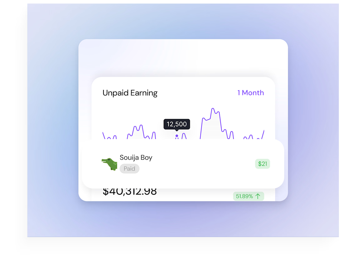
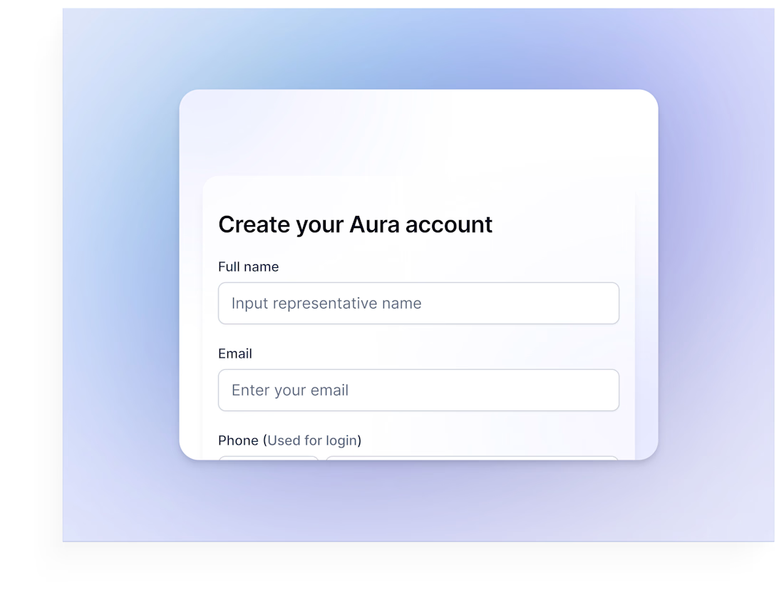
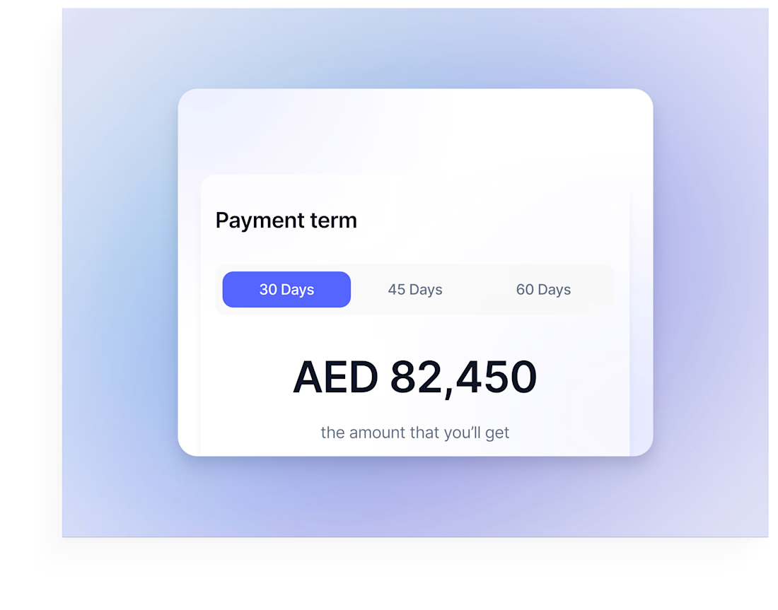
A set of UI components from Aura, a fintech platform that helps businesses get paid faster. Each piece focuses on clarity and trust: simple sign-up, flexible payment terms, and an easy-to-read view of earnings.
Which component would you improve first? 💬

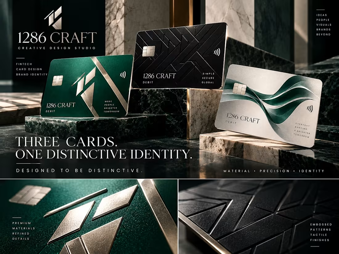
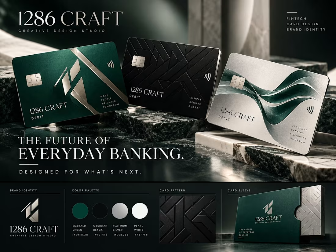
1286 CRAFT — Premium Fintech Brand Identity & Debit Card Design
A luxury fintech branding and graphic design concept created by 1286 CRAFT, showcasing a sophisticated visual identity for the future of digital banking.
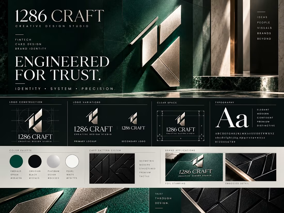
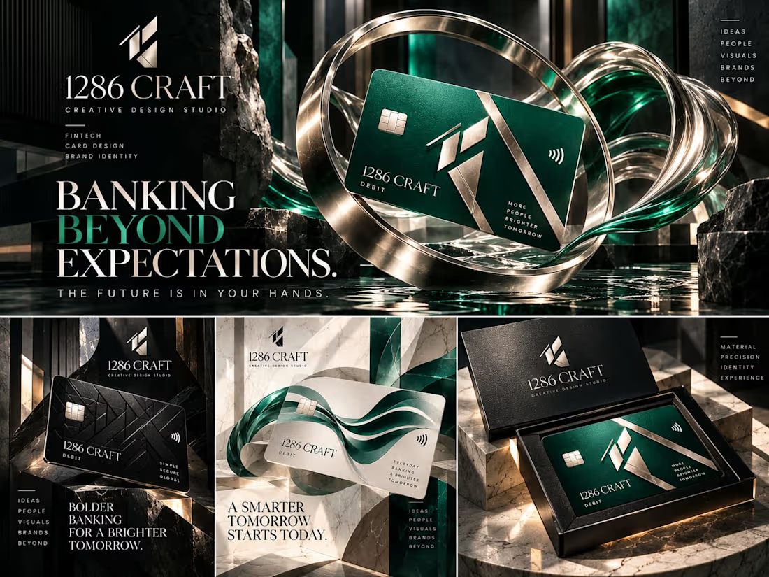
This creative project explores premium debit card design, geometric logo development, brand identity systems, packaging, and high-end advertising visuals.
The visual direction combines emerald green, obsidian black, platinum silver, and pearl white with refined typography, metallic finishes, architectural compositions, and cinematic product presentation.
Project Highlights:
Premium fintech brand identity and logo design
Luxury debit card design and product visualization
Color palette, typography, and geometric brand patterns
Premium card packaging and presentation
Creative advertising and visual storytelling
Designed to demonstrate expertise in Brand Identity Design, Graphic Design, Fintech Branding, Creative Direction, and Visual Communication.
1286 CRAFT | Creative Design Studio
Explore this original conceptual branding case study on my Contra portfolio, showcasing creative solutions for modern brands and digital experiences.



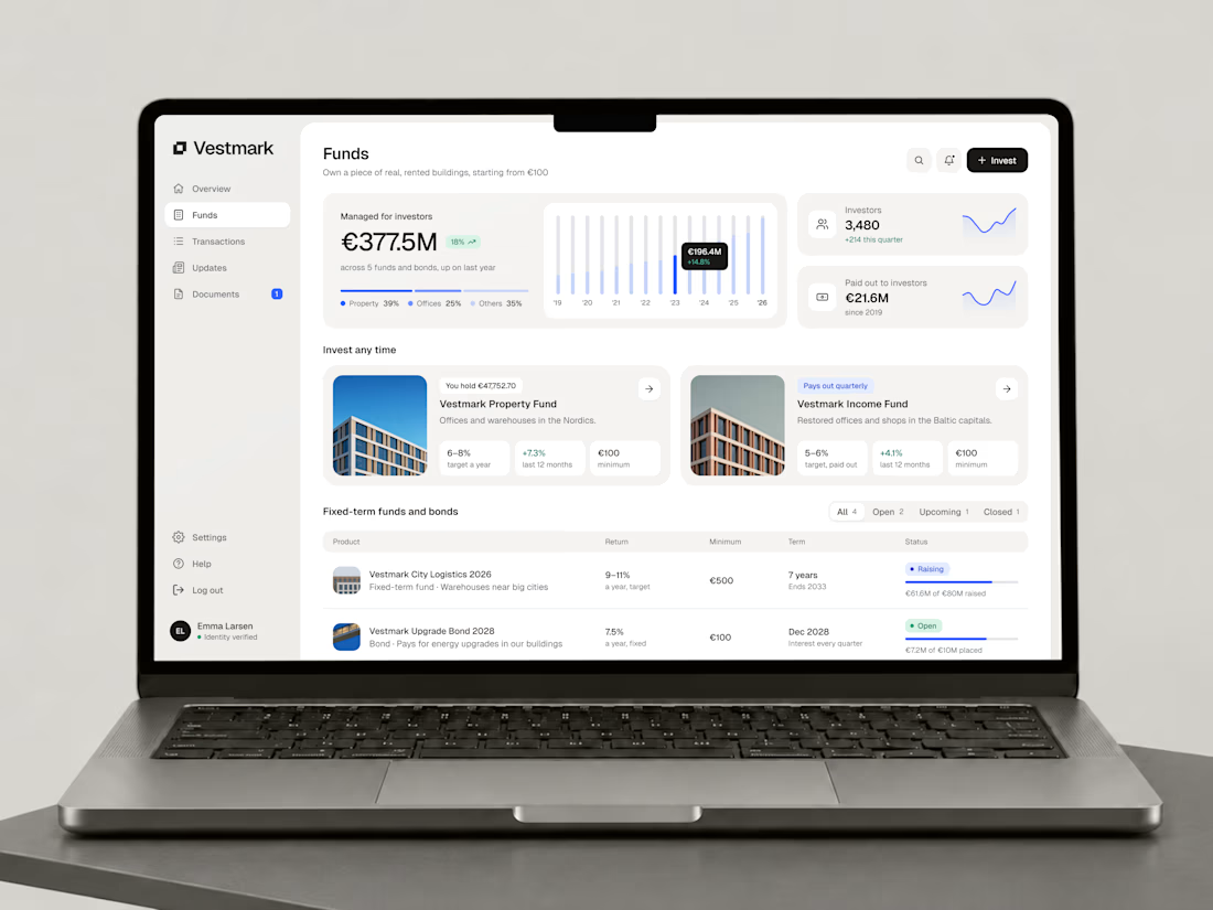
A funds overview for exploring open and fixed-term investment opportunities. Each fund connects to a detailed page and investment flow in the Vestmark working prototype.