The network for creativity
Join 1.25M professional creatives like you
Connect with clients, get discovered, and run your business 100% commission-free
Creatives on Contra have earned over $150M and we are just getting started


The network for creativity
Join 1.25M professional creatives like you
Connect with clients, get discovered, and run your business 100% commission-free
Creatives on Contra have earned over $150M and we are just getting started
Related posts

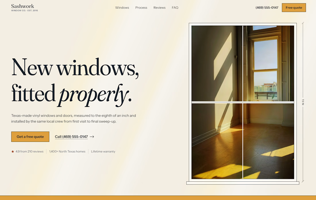
Hero for Sashwork, a concept window replacement brand. Serif type with an italic twist, a measured window frame around the hero shot, and trust signals placed right under the CTAs. Warm, crafted, and made to bring in quote requests.

Looking for cool products on ProductHunt and stumbled on Tobira.ai.
Loved the product, so I've redesigned the hero section as an exercise.


The serif type works well.

One fintech brand. Two different hero experiences. 🖤
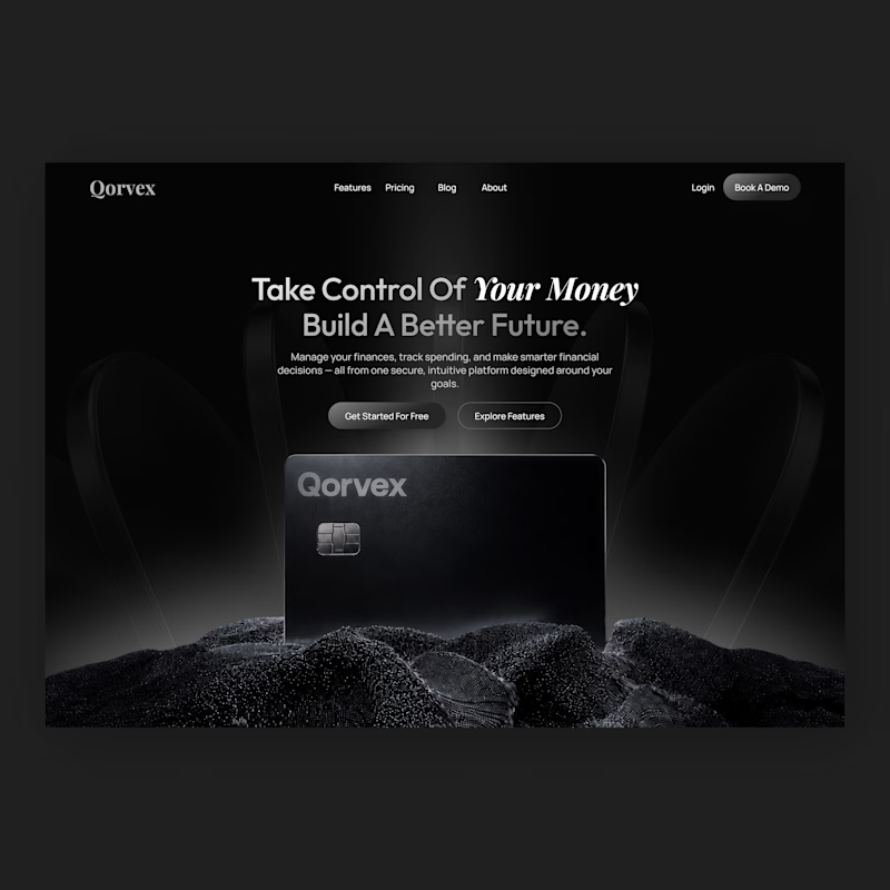
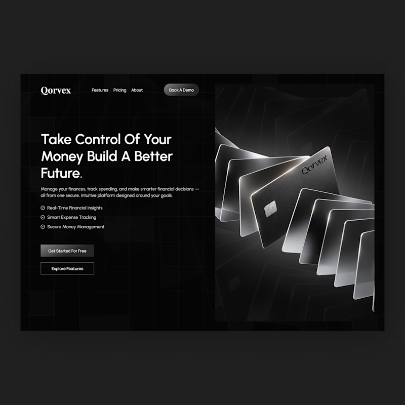
I designed two homepage hero concepts for Qorvex, a modern fintech platform, exploring two different ways to create a strong first impression.
Both concepts use a dark, premium visual direction with monochromatic tones, but each takes a different approach to presenting the brand.
Option 1 — Bold & Minimal
A centered hero layout with a strong headline, cinematic product visuals, and a clean, focused composition.
Option 2 — Modern & Structured
A split-screen layout with a bold headline, clear feature highlights, and a striking visual showcase of the fintech cards.
Which hero design would you choose for a premium fintech website?
Vote for Option 1 or Option 2 and tell me why in the comments. I'd love to hear your feedback!


2 voted
50%
2 voted
50%
4 votes
Closed



