The network for creativity
Join 1.25M professional creatives like you
Connect with clients, get discovered, and run your business 100% commission-free
Creatives on Contra have earned over $150M and we are just getting started
Back to feedPost

Cover the name. Is there still a logo left? 🧠
That's not a design question.
I'm not touching kerning or color, that's not my lane, and I'd never pretend otherwise.
It's the first thing I bring to a client before they approve a mark, because most rejections aren't about bad design. They're a client who can't tell the difference between a shape that's borrowed and one that's actually theirs.
1. THE SILHOUETTE TEST
Strip the color, hide the name. If a stranger can still tell whose it is, that's not decoration. That's the designer doing their job right.
2. THE LINEUP TEST
Put it next to ten competitors, names covered. If the whole set could get shuffled and nobody would notice, the problem was never the color the client didn't like.
3. THE VALUE OF STANDING STILL
A borrowed shape gets "redesigned" every two years, the moment the trend it copied goes stale. A mark that passes both tests only gets more valuable the longer you keep it.
A good designer already knows this. My job is making sure the client does too, before they ask for "something safer."
Next time a client says "I just don't love it," ask them to cover the name first.
The network for creativity
Join 1.25M professional creatives like you
Connect with clients, get discovered, and run your business 100% commission-free
Creatives on Contra have earned over $150M and we are just getting started







Related posts

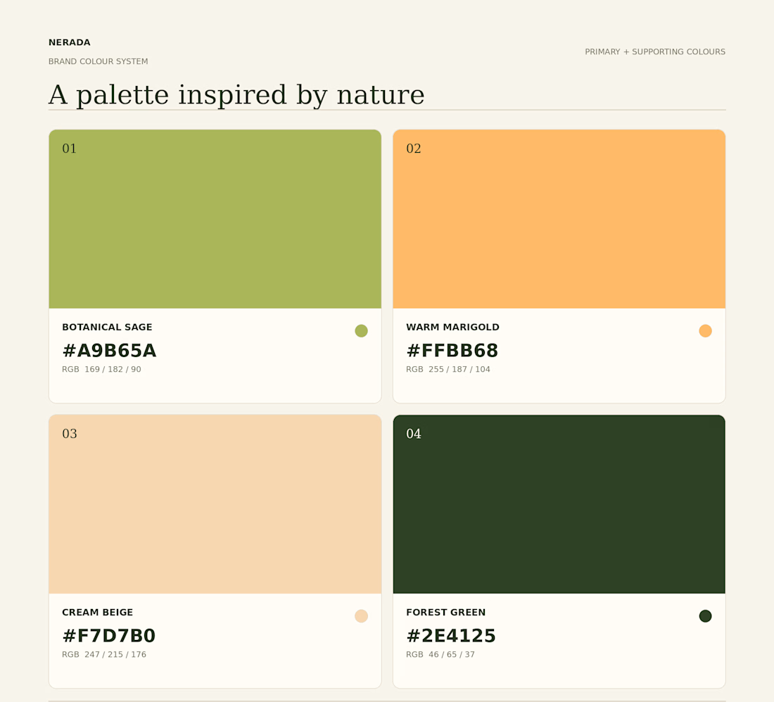
Created the complete brand identity for Nerada, a natural tea brand — developing the visual direction and design elements that shape how the brand looks and feels across every touchpoint. The goal was a clean, organic aesthetic that reflects the brand's natural positioning and builds a consistent, recognizable identity.


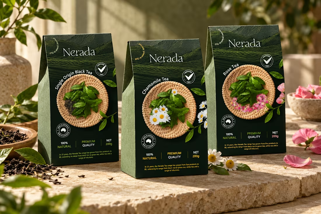
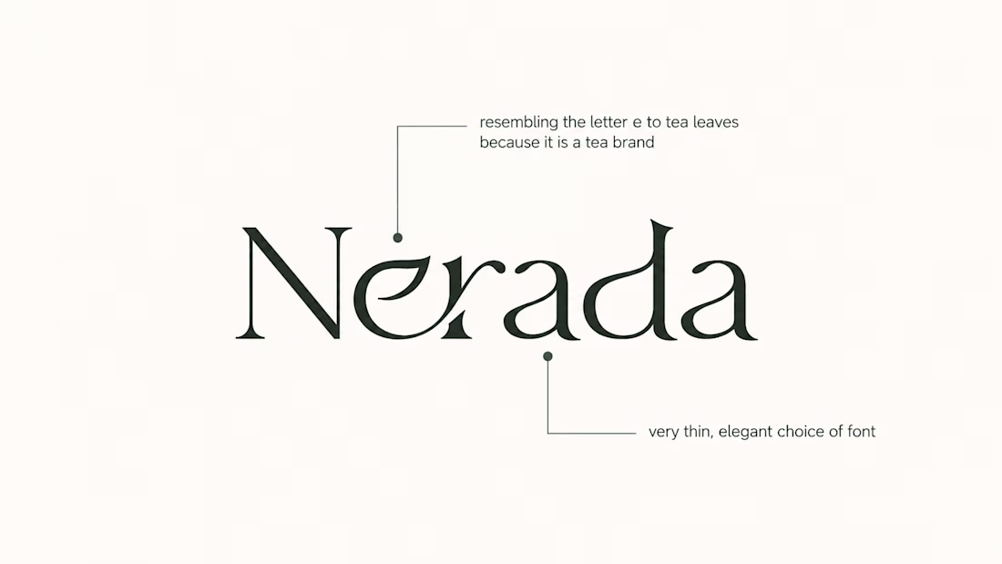
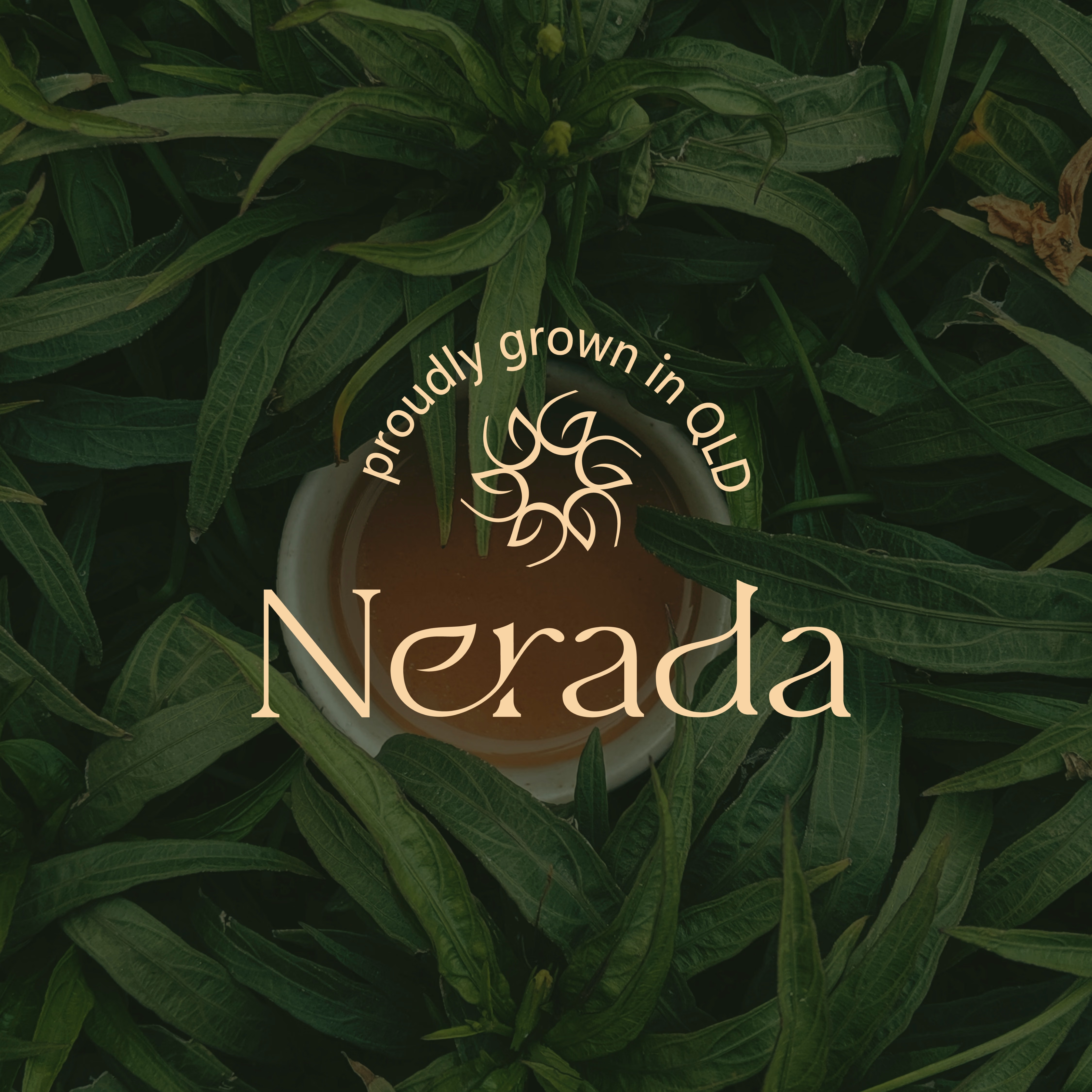

The mark feels grown rather than drawn, which is exactly right for a natural tea brand. Packaging is where tea brands win or lose. Does the identity change tone across blends, or stay one voice with different colours?

What type of combination is that?
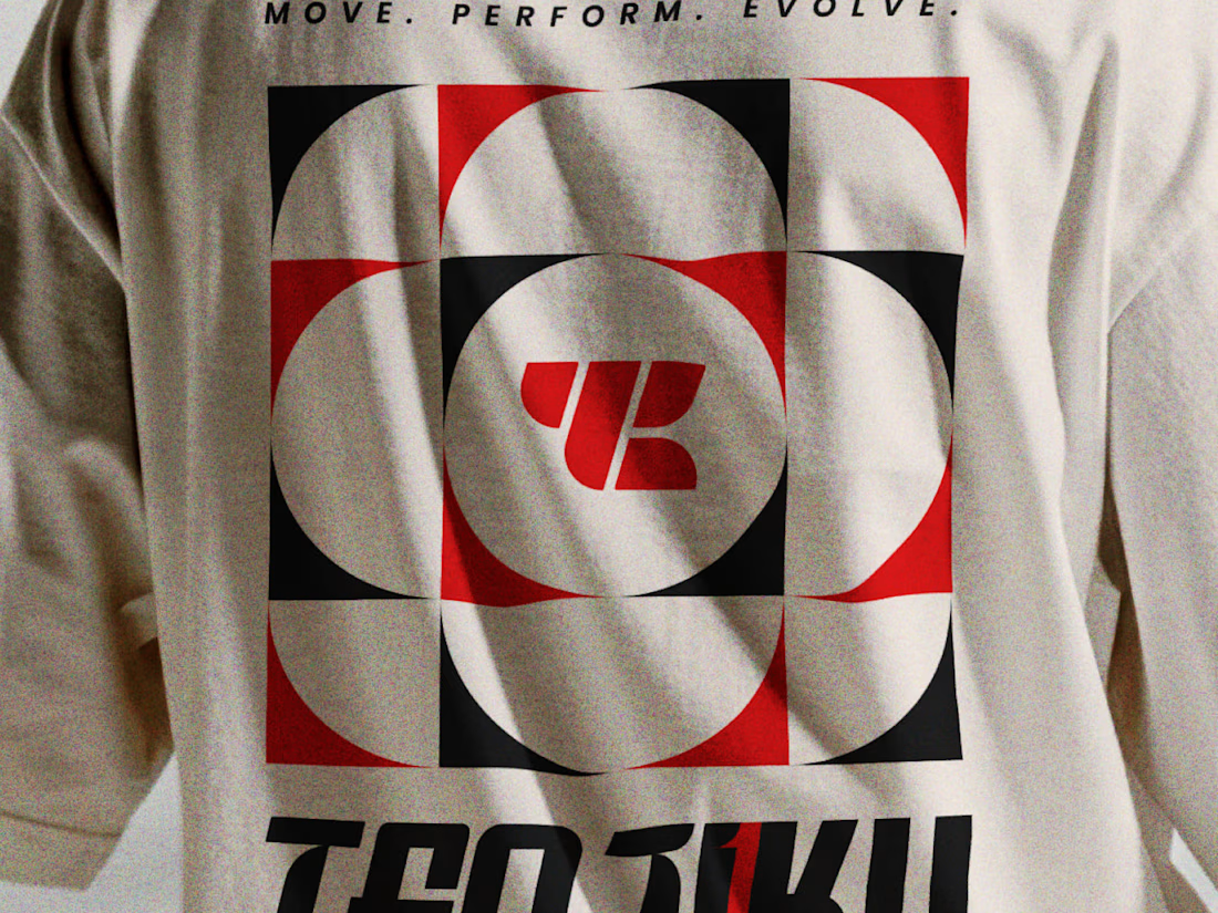
Indian spirituality × Japanese minimalism × personality-driven clothing.
That’s Tenjiku.
But getting this combination right wasn’t as simple as putting three ideas together. We started with research digging into what Tenjiku means, where the name comes from, its cultural roots, and how those ideas could shape a visual identity without feeling forced or predictable.
From that research came the logo, typography, symbols, and the overall visual language.
Every element has a reason behind it.
The logo is only the final result. The interesting part is how we got there.
We’ve documented the whole thinking & design process on Behance.
Go check out the story behind Tenjiku


The research showing through the design is what makes this work. Love the Indian x Japanese balance - not easy to pull off but you nailed it.

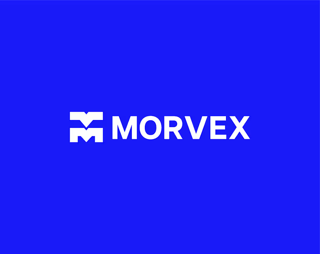
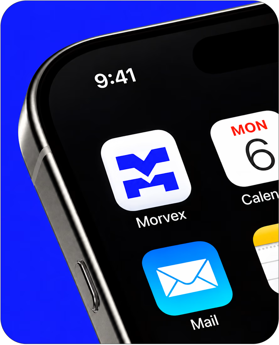
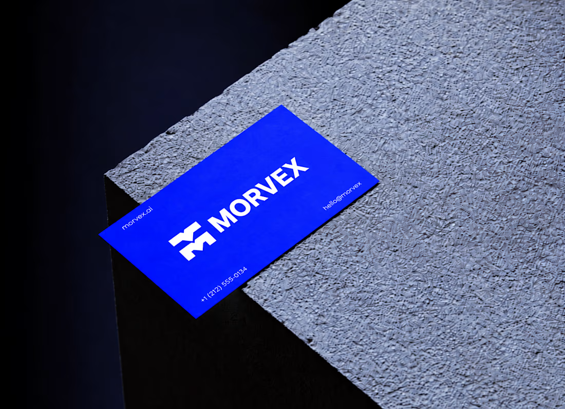
Morvex is a cybersecurity brand with a strong, bold visual identity. The idea behind the logo was to create something simple but recognizable, using a custom geometric M with sharp angles and carefully balanced shapes.
The identity brings together electric blue, bold typography, and a dark visual style to give the brand a modern, confident look. I carried the same design approach across the brand applications, keeping everything clean, consistent, and easy to recognize.


This is a really creative piece! I love how the visual elements come together to create something that feels distinctive rather than predictable. The composition, the overall visual direction, and the way the idea has been executed all contribute to making this stand out. It’s a...