The network for creativity
Join 1.25M professional creatives like you
Connect with clients, get discovered, and run your business 100% commission-free
Creatives on Contra have earned over $150M and we are just getting started
Back to feedPost

Over the last couple of months, I have been actively engaged in shaping the United Nations Environmental Program's AQMx Platform 🌏
AMQx (Air Quality Management Exchange Platform) is build as a source of truth and knowledge sharing platform to helping scientists, government representatives and air quality managers around the world shape their research and policy.
We just wrapped up Stage Two of the project:
➡️ 11+ Interviews with air quality managers, policy makers across 9 countries
➡️ 2 design sprints+workshops
➡️ Introduced a brand new smart search experience for the platform
➡️ Interactive decision output to help access air quality goals
More updates on the way once the platform goes live!


The network for creativity
Join 1.25M professional creatives like you
Connect with clients, get discovered, and run your business 100% commission-free
Creatives on Contra have earned over $150M and we are just getting started



Related posts

What if sending money felt a little more like giving a gift?
For Nova, I explored a banking app that brings payments, cards, and a bit of personality together. You can check your balance, browse recent transactions, send or request money, top up, and pay bills.
My favorite part is the digital postcard feature. Before sending a transfer, you can add a little illustrated card—a heart, a birthday greeting, or a playful character. A simple way to make birthday money or a thank-you feel more personal.
I carried that same 3D character into onboarding, pairing it with bold red gradients and large, clear payment details. There’s room for play, while the recipient and amount stay easy to check.
Would you add a postcard to a transfer? I’d love to know what occasion you’d use it for.






Did a motion for the Cockpit concept ⁕ 🔈 ON
Design & Creative Direction: Me
Motion & Sound: Claude Code
Cockpit is an AI agent management platform concept that helps teams:
- Set boundaries
- Monitor activity
- Manage approvals
- Track knowledge sources
- Measure performance and costs
It brings together five key AI UX challenges:
👉 Autonomy
👉 Observability
👉 Human Approvals
👉 Context
👉 Analytics
The idea is simple:
As AI agents become more capable, the experiences we design around them need to make their actions more transparent, predictable, and manageable.
Thanks!

Human approvals is the part most agent UIs skip. Good call making it one of the five challenges.

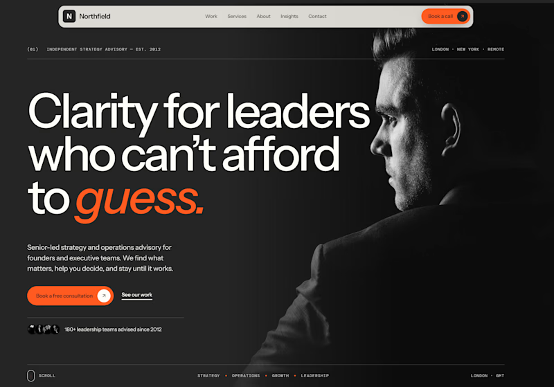
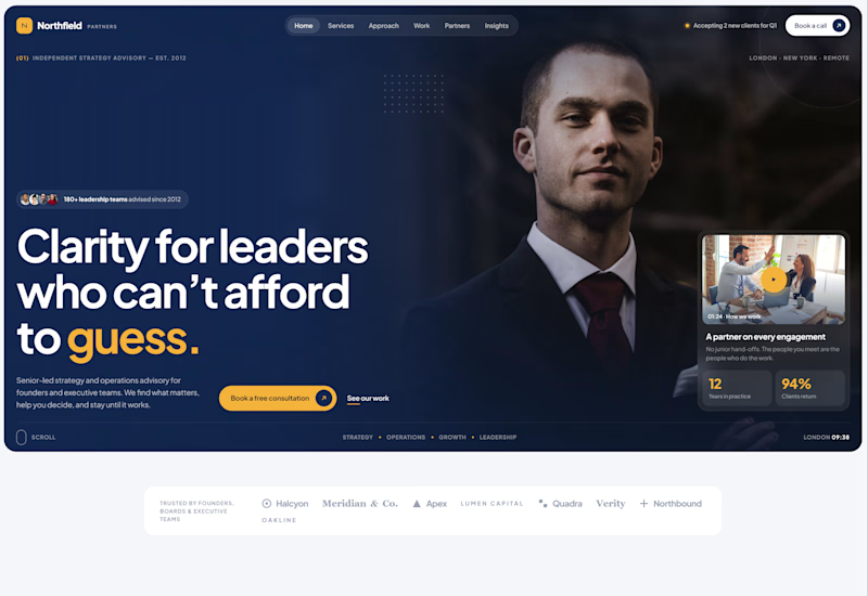
Exploring two different hero directions for a new project.
Same message, two completely different visual approaches.
Which one makes a stronger first impression?
A or B? Curious to hear your thoughts!

36 voted
90%
4 voted
10%
40 votes
Closed

Both are strong. I lean towards the dark version, because the orange accent on the italic "guess." pops and the profile portrait gives it a more editorial, confident feel. The navy one reads a bit more corporate, which could suit a more conservative audience. Nice exploration!