The network for creativity
Join 1.25M professional creatives like you
Connect with clients, get discovered, and run your business 100% commission-free
Creatives on Contra have earned over $150M and we are just getting started
Back to feedPost
Taste Test

Designed a few icons for my framer template
Does it look better on Light or Dark?

1 voted
17%

5 voted
83%

6 votes
Closed

Since the Logos contain white in their gradient, They sort of get lost in the white back grouns
The network for creativity
Join 1.25M professional creatives like you
Connect with clients, get discovered, and run your business 100% commission-free
Creatives on Contra have earned over $150M and we are just getting started



Related posts

Framer agent templates are out, and seven of mine are in 🔥
Plakat, Datum, Halation, Parallel, Tender, Signal and Oda.
An agent template is built for Framer's agent to work on. Every colour and text style has a name that says what it's for, there's a design system page, and skills that tell the agent how the site fits together.
So you can ask for a rebrand, a new section or a whole new page. The agent works with the template's own styles and components and doesn't have to guess.
All agent templates: https://www.framer.com/marketplace/templates/?agent=true
Mine, also in HTML and React: https://no-code.supply/templates

Naming every colour and text style by purpose so the agent knows what it's touching is the part I think most templates will need to catch up on. Congrats on getting seven in at launch, Lauri!




Dark makes the logo pop out more

Which hero would you choose — 1 or 2?
Two directions for Amber House, my real estate website template. The first pairs a closer architectural crop with an asymmetric layout. The second gives the building more breathing room, with a wide view and a centered headline.
Same template, two different first impressions. Which feels stronger to you, and why?
24 voted
59%
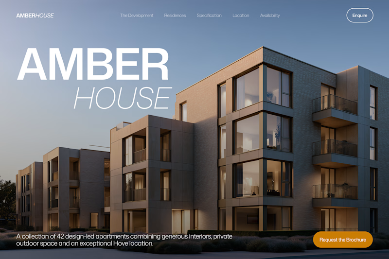
17 voted
41%
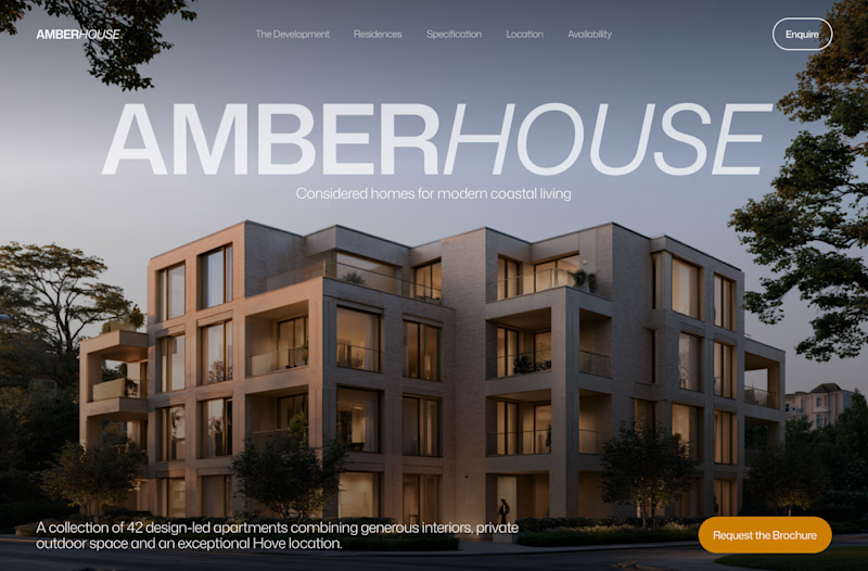
41 votes
Closed

I will go with Bold & Asymmetric!