The network for creativity
Join 1.25M professional creatives like you
Connect with clients, get discovered, and run your business 100% commission-free
Creatives on Contra have earned over $150M and we are just getting started
Back to feedPost

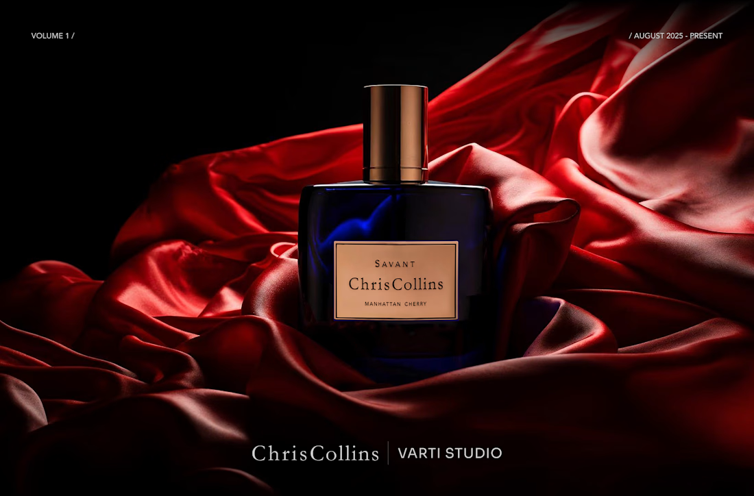
Building a consistent visual language for the brand's digital and retail presence. AI-generated imagery for email campaigns, social media and print materials. To see more, please check my portfolio.




Love how you’re building consistency across different touchpoints. A strong visual language really makes a brand feel memorable...

Great work Valentyn, this is really impressive! 👏
If you ever want to bring these product visuals to life with cinematic, hyperrealistic AI videos, I'd love to help. Feel free to check out my profile for a few samples. I think you'd like what you see.


The execution is flawless. Amazing job!
The network for creativity
Join 1.25M professional creatives like you
Connect with clients, get discovered, and run your business 100% commission-free
Creatives on Contra have earned over $150M and we are just getting started








Related posts

NURV® 🟠
Phase 39/35. Readiness 94%. 4/28 laps.
A swim, nutrition and supplement app where every number is made of dots and the only color is the one that matters.
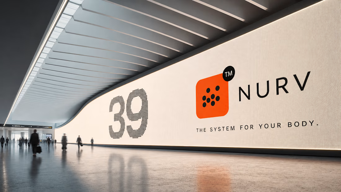

Dots as the only visual language with one orange accent is a bold, consistent call.

AI cinematic short film: Hide and Seek


Top notch
NURV® now has a home on the web 🟠
Same cream canvas, same dot-matrix numerals, same single orange. Scroll it and nine dots in the margin fill up one by one.
Pool to plate to pill, nine scenes, one system.