The network for creativity
Join 1.25M professional creatives like you
Connect with clients, get discovered, and run your business 100% commission-free
Creatives on Contra have earned over $150M and we are just getting started
Back to feedPost

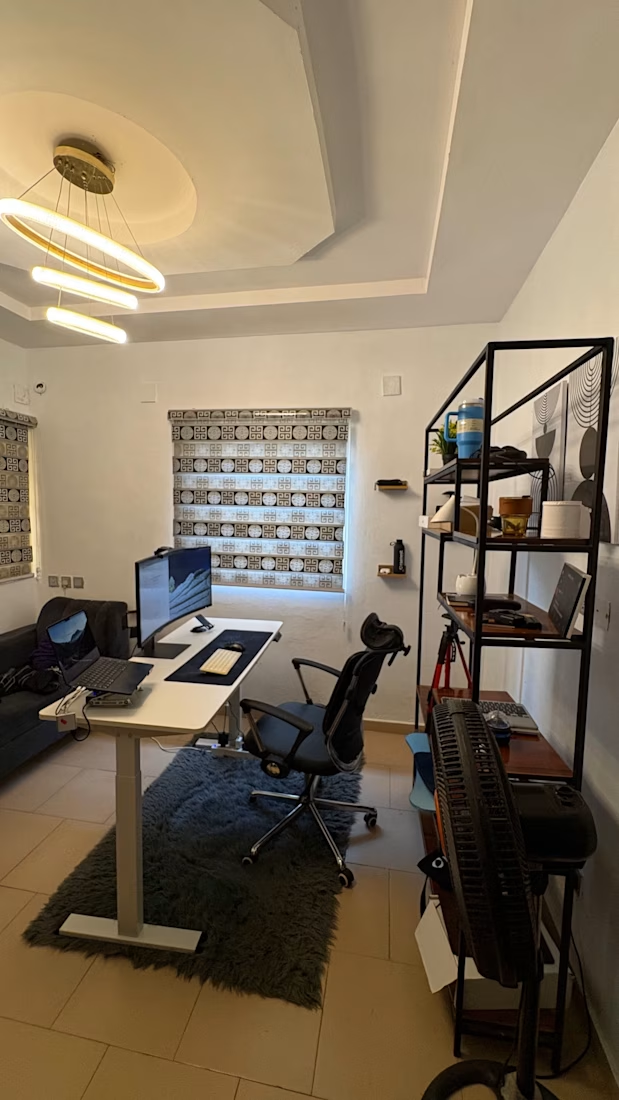
The view got better. The setup is different. The motivation to grow? Still the same.
Grateful for the journey so far.
Not done building yet.
The network for creativity
Join 1.25M professional creatives like you
Connect with clients, get discovered, and run your business 100% commission-free
Creatives on Contra have earned over $150M and we are just getting started








Related posts

Same product, three different visual directions.
Exploring alternative concepts for a single product over the weekend.
I started with a simple product shot on a plain background and used Krea 3 to reimagine it in three different settings: playful floating spheres, sculptural glass structures, and a miniature garden.
Which one is your favorite?


What I Built: Briefly


What I Built: Briefly
I built Briefly, a web app on Bubble.io that helps freelancers handle client pitches without the headache.
Smart Drafting: It takes a messy, casual client message and turns it into a clean, structured proposal with milestones and budgets.
Easy Sharing: Instead...

What if your landing page looked better, loaded faster, and scored 100 across every Lighthouse metric? 🚀
That was the goal behind this redesign.
I rebuilt the landing page with Astro, leveraging its lightweight architecture and minimal JavaScript by default to deliver faster loading, smoother interactions, and a better user experience.
The result? A cleaner design, improved performance, and 100/100 across all Lighthouse metrics.
