The network for creativity
Join 1.25M professional creatives like you
Connect with clients, get discovered, and run your business 100% commission-free
Creatives on Contra have earned over $150M and we are just getting started
Back to feedPost
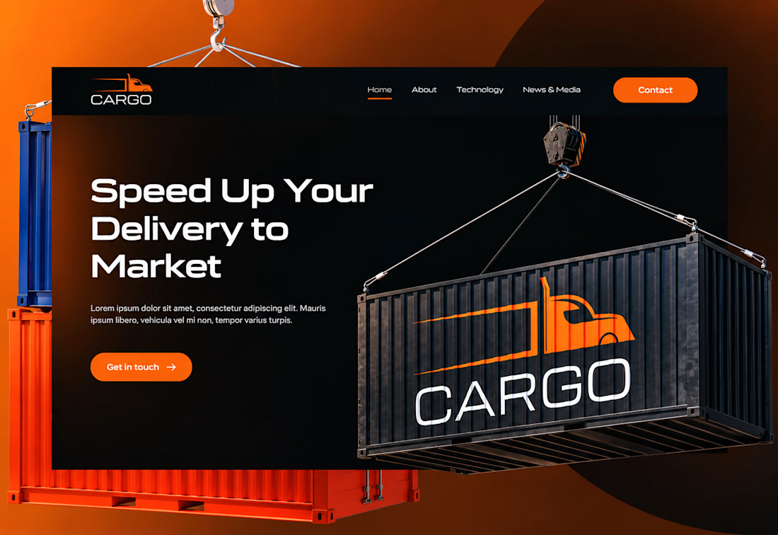
I designed the website for Cargo, a freight and delivery company. Logistics sites usually feel like a wall of grey stock photos. I wanted this one to feel fast, strong, and a little cinematic.
The headline is the pitch. “Speed Up Your Delivery to Market” is short, direct, and tells customers what the company does for them. The wide, geometric typeface feels engineered, like something built to move.
The brand is part of the scene. A shipping container hangs from a crane with the Cargo logo on its side, so the logo lives inside the imagery instead of sitting in a corner.
Orange is the only color that asks for a click. On a near-black background, the “Contact” and “Get in touch” buttons stand out immediately, and the same orange runs through the truck logo, so brand and action feel connected.
Simple navigation. Home, About, Technology, and News & Media. Four links, no clutter, so visitors find what they need fast.

Ye le Jani:
Nailed it Joshua! Love that take - logistics sites ARE a wall of grey stock photos and you flipped it. That orange + black contrast with the suspended cargo container visual is so cinematic and strong. "Speed Up Your Delivery to Market" is a killer headline too, super direct. Fast and bold vibes came through!

Really Appreciate the comment Sagar
Always bro! You earned it 🙌
The network for creativity
Join 1.25M professional creatives like you
Connect with clients, get discovered, and run your business 100% commission-free
Creatives on Contra have earned over $150M and we are just getting started











Related posts


Approved logo for a mental health and daily habit app built for seafarers and offshore workers.
Can't wait to share more.

Brand Expressions -- Olivir



Thats so crazy!!!!!! Seeing this I feel we humans are still far better than AI

Most early-stage brands play it safe and disappear after a while. For Drylendar, I did the opposite.
3 weeks from brief to full identity: logo, illustration system, app visuals, collectible cards and even merch.
AI makes things cheaper. Personality makes brands memorable.
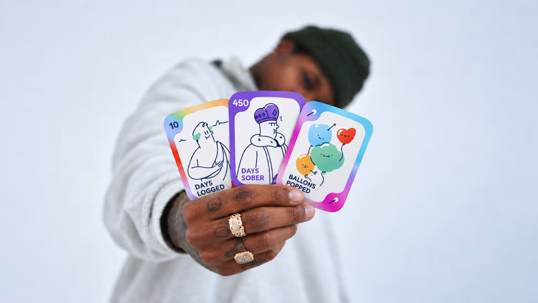
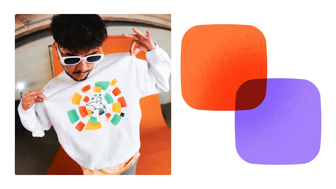
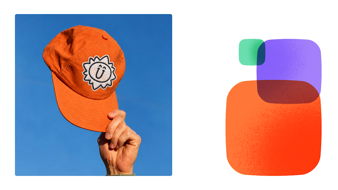
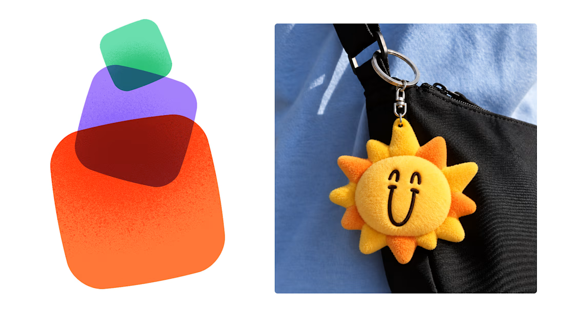
This is exactly what branding should be! 🔥 3 weeks for full identity, merch, cards - you really built personality, not just a logo. Love the Drylendar vibe. AI makes it cheap, but this makes it memorable - so true!