The network for creativity
Join 1.25M professional creatives like you
Connect with clients, get discovered, and run your business 100% commission-free
Creatives on Contra have earned over $150M and we are just getting started
Back to feedPost
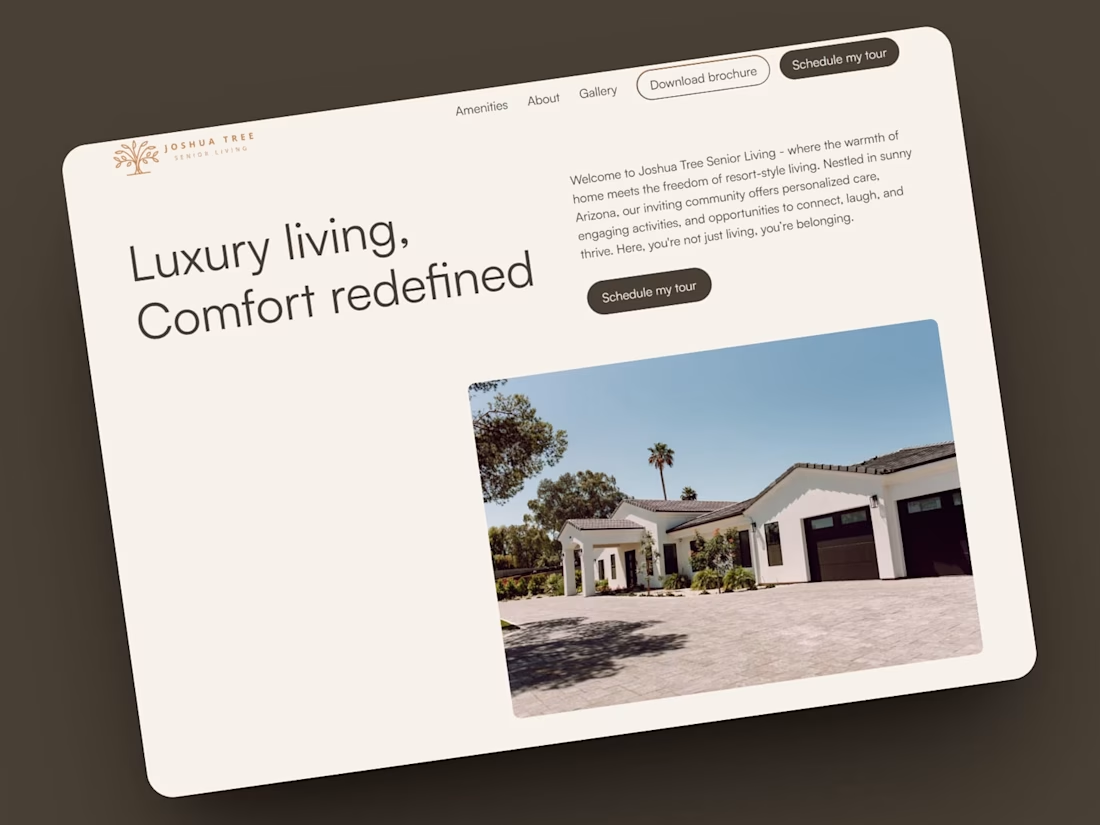
When Joshua Tree Senior Living approached me, they didn't need "another website."
They needed a website that made families feel something.
Choosing a senior living community is one of the biggest decisions a family will make. People aren't comparing features—they're looking for reassurance. They're asking:
"Will my loved one be happy here?"
That question shaped every design decision.
Instead of starting with colors and layouts, I started with the story.
We used the StoryBrand framework to reposition Joshua Tree as more than a place to live. It became a place to belong.
Here are a few of the key decisions behind the project:
🏡 We sold a feeling, not a facility.
The homepage doesn't begin with amenities. It begins with comfort, connection, and the promise of feeling at home.
🎯 Every section had one job.
Each section answers a different question visitors naturally have:
• Can I trust this community?
• Will my loved one be safe?
• Will they make friends?
• What's the next step?
Removing confusion makes taking action much easier.
🎨 The design reflected boutique hospitality.
Rather than the typical clinical blue healthcare palette, we built around the warmth of their terracotta brand color, soft neutrals, elegant typography, and generous white space to create an experience that feels welcoming and premium.
🖋️ Copy was treated as part of the design.
Beautiful layouts can't compensate for unclear messaging. Every headline was rewritten to speak to emotions before features.
📱 The experience was designed for two audiences.
The future resident and their adult children often visit the website together. The messaging needed to create confidence for both.
The final result is a boutique Webflow website that reflects the same warmth, care, and attention visitors experience when they walk through Joshua Tree's doors.
One reminder this project reinforced for me:
Good websites don't simply communicate information. They reduce uncertainty.
That's often the difference between someone leaving... and someone scheduling a tour.
Have you noticed a website that made you feel something before it tried to sell you something?
I'd love to hear your thoughts.
#Webflow #WebDesign #SeniorLiving #HealthcareMarketing #StoryBrand #Relume #WebsiteStrategy #UXDesign #BrandStrategy #ConversionDesign

Super cool work 🙌

Thank you👍

Beautiful work.
Thank you!

The StoryBrand framework applied to healthcare marketing is such an underused combo, most senior living sites still lead with amenities lists. Did the client push back at all on the terracotta warmth over the usual clinical blue, or were they already bought into that direction?
The client wanted to stray away from the traditional senior living website designs and they loved the new direction!

Lovely design!

Adorable design! Fresh and vibrant!

Designing the messaging for two audiences at once (the future resident and their adult children) is the part most people miss on senior living sites. Treating copy as part of the design instead of an afterthought clearly paid off here.
The network for creativity
Join 1.25M professional creatives like you
Connect with clients, get discovered, and run your business 100% commission-free
Creatives on Contra have earned over $150M and we are just getting started
Trending

Claude
Claude has entered the design space. How are you using it?

Contra University
Learn from expert creatives how to earn more using next-gen AI tools.
Brand Design
The best brand designers are on Contra. Scroll to see what's trending in brand design. What are you building?
creativeaiflow
Creative AI workflows are evolving. What tools do you use, and what are their strengths and weaknesses?
freelancerlife
Freelancer life is wins, pivots, and everything in between. What’s yours right now?





Related posts


need your eyes on this one :)
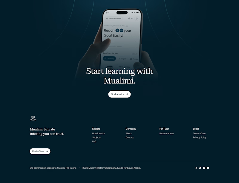
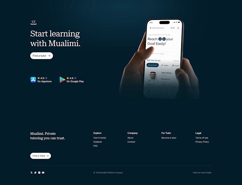
two hero options for a private tutoring platform we're working on at @effekt_design
left or right?

4 voted
15%
23 voted
85%
27 votes
Closed
Went with the right aligned version. Left aligned text is easier to scan first and the CTA doesn't have to compete with the phone mockup for attention like it does in the centered one.

New Framer component drop: Fisheye Flow!
A cinematic fisheye carousel built for artist lineups, portfolios, product showcases, creative campaigns, and image-led websites :)


Looks really nice and smooth!

New case study is live 🔥
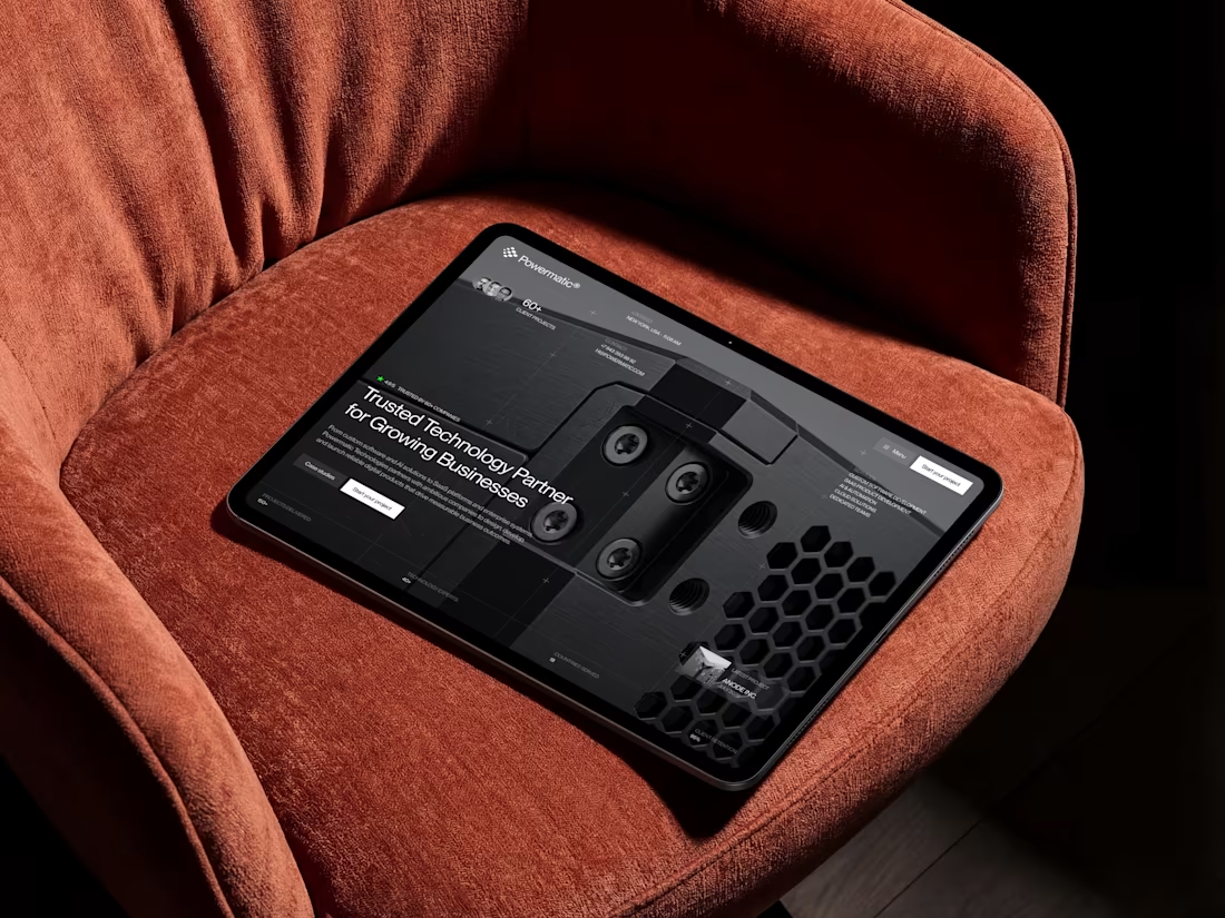
Just published a new case study for Powermatic Technologies.
Inside: the goals we started with, the thinking behind key design decisions, and the final result.


Man that is so incredible. You have great eye taste for sure!