The network for creativity
Join 1.25M professional creatives like you
Connect with clients, get discovered, and run your business 100% commission-free
Creatives on Contra have earned over $150M and we are just getting started
Back to feedPost

The fastest way to improve a homepage isn't better UI.
It's reducing ambiguity.
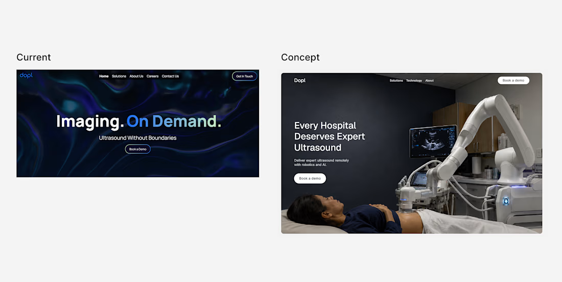
I came across a robotics startup whose homepage communicated innovation before it communicated the product.
So I explored a different direction for the hero:
1. Lead with the outcome, not an abstract tagline.
2. Show the product instead of relying on atmosphere.
3. Simplify the supporting copy.
4. Create a clearer visual hierarchy.
Great design isn't just about aesthetics, it's about helping people understand the value quickly.

The network for creativity
Join 1.25M professional creatives like you
Connect with clients, get discovered, and run your business 100% commission-free
Creatives on Contra have earned over $150M and we are just getting started





Related posts

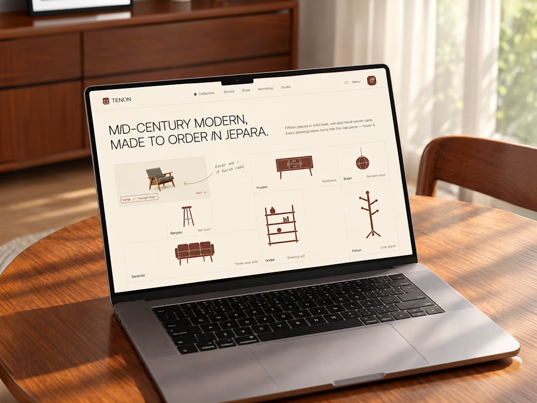
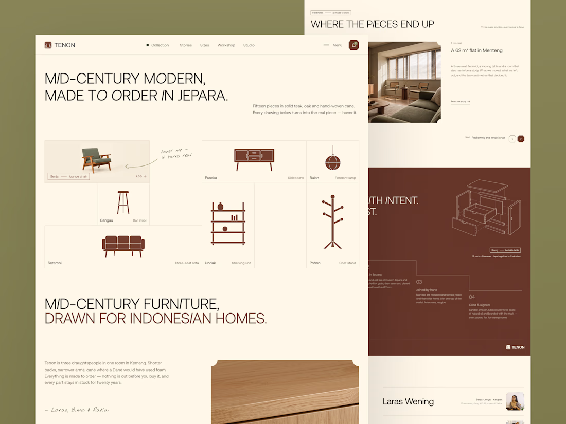
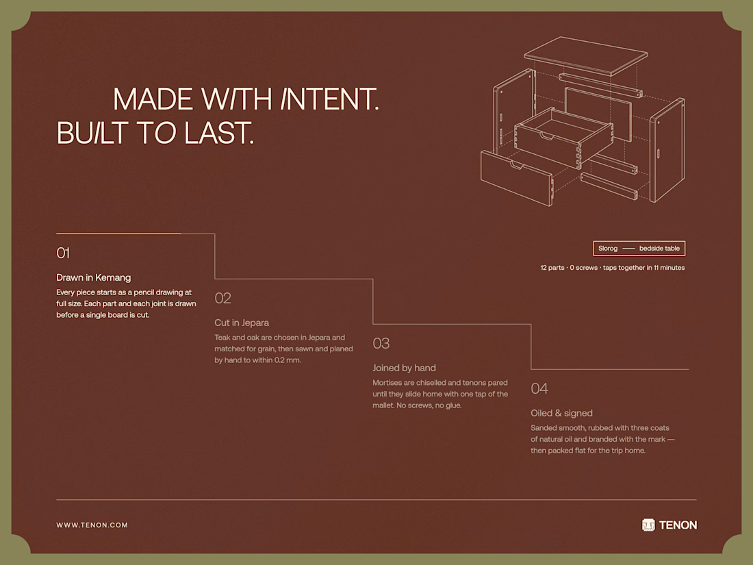
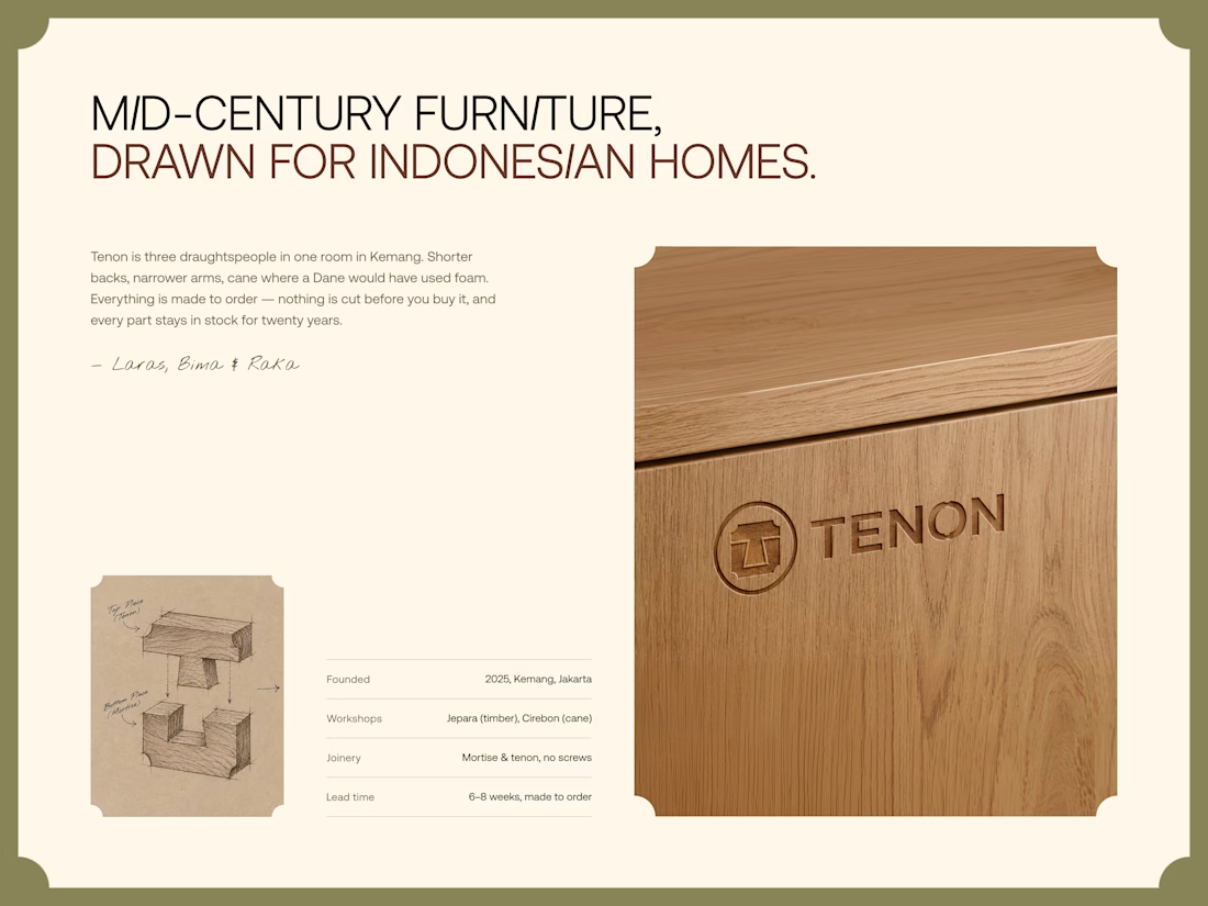
Tenon is Furniture Website Design
Exploring a digital experience for an Indonesian furniture brand inspired by mid-century modern design.
The website brings together product discovery, storytelling, and visual direction to make the digital experience feel as considered as the furniture itself.
Made to order. Made to last.


Love the color choice used


This is fire 🔥


Kajabi isn’t only for courses 👀
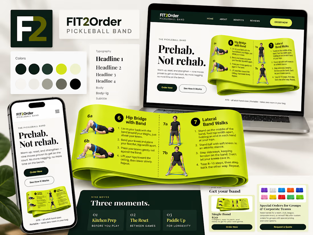
For Fit2Order’s new Pickleball Band, we created a complete product experience inside Kajabi – from the landing page and checkout to order forms, confirmations, and the post-purchase flow.
A fun one for us because it meant adapting Kajabi to work for a physical product while still keeping everything simple for the team to manage.


Prehab, Not rehab is a sharp headline for the band. The lime against deep green stays readable across all three devices.