The network for creativity
Join 1.25M professional creatives like you
Connect with clients, get discovered, and run your business 100% commission-free
Creatives on Contra have earned over $150M and we are just getting started
Back to feedPost

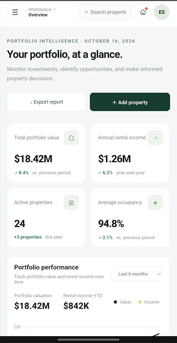
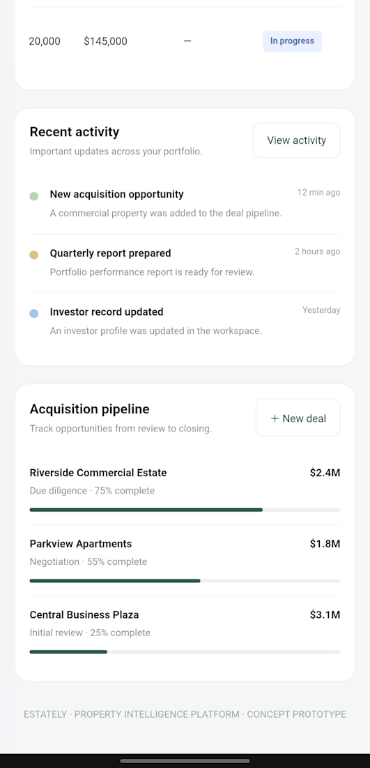
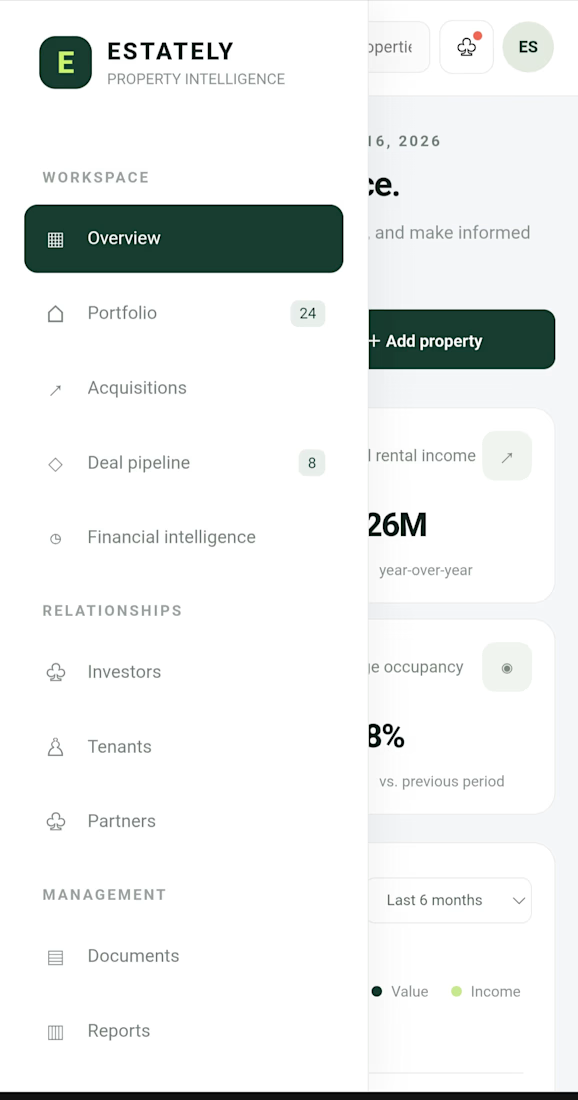
What if you could manage your entire real estate business from one workspace?
Property investments, portfolio performance, acquisitions, investors and financial tracking, all in one place.
I built ESTATELY as a concept for real estate investment firms.
If you run a property business, what feature would you want added to a platform like this?
Explore the demo:
https://magenta-capybara-b2d44c.netlify.app
#RealEstate #SaaS #WebDevelopment


The network for creativity
Join 1.25M professional creatives like you
Connect with clients, get discovered, and run your business 100% commission-free
Creatives on Contra have earned over $150M and we are just getting started











Related posts


A Recent Framer-Based Brand Experience for a Real Estate Company


Super clean brand system! 🤌 Love the mint on dark contrast and how the mark works across touchpoints - that ID card mockup is chef's kiss. Great Framer execution for real estate!

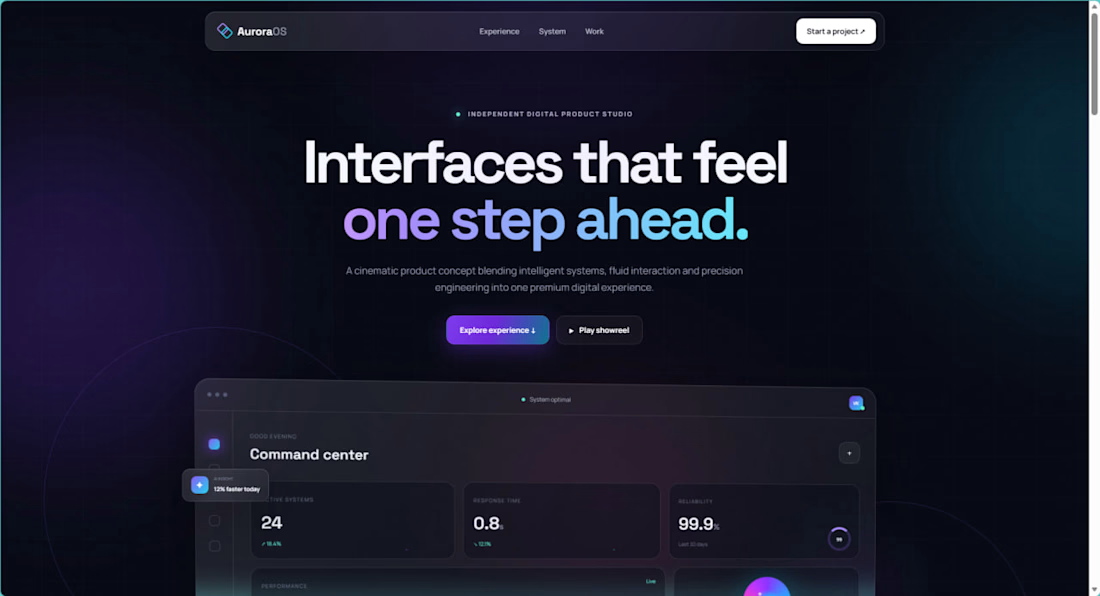
I recently launched AuroraOS, a self-initiated landing page concept exploring premium glassmorphism, responsive layouts, animated gradients, and interactive UI.
Built with HTML, CSS, and JavaScript.
I am currently available for landing page development, website redesigns, and responsive frontend projects.
Live project:


A cinematic AI-assisted real estate property showcase created to demonstrate how luxury properties can be presented through engaging video content.
This vertical video features cinematic exterior shots, detailed interior showcases, lifestyle amenities, and a professional call to action.
Services demonstrated:
AI Real Estate Video Creation
Cinematic Property Showcases
Social Media Reels
AI-Assisted Video Editing
Property Marketing Content
Created as a self-initiated portfolio project to showcase my creative capabilities in AI-powered real estate marketing.


That's really stunning Cinematic view is stunning Felicisimo🔥🔥


