The network for creativity
Join 1.25M professional creatives like you
Connect with clients, get discovered, and run your business 100% commission-free
Creatives on Contra have earned over $150M and we are just getting started
Back to feedPost
Northwood Academy: one school, two experiences 🏫
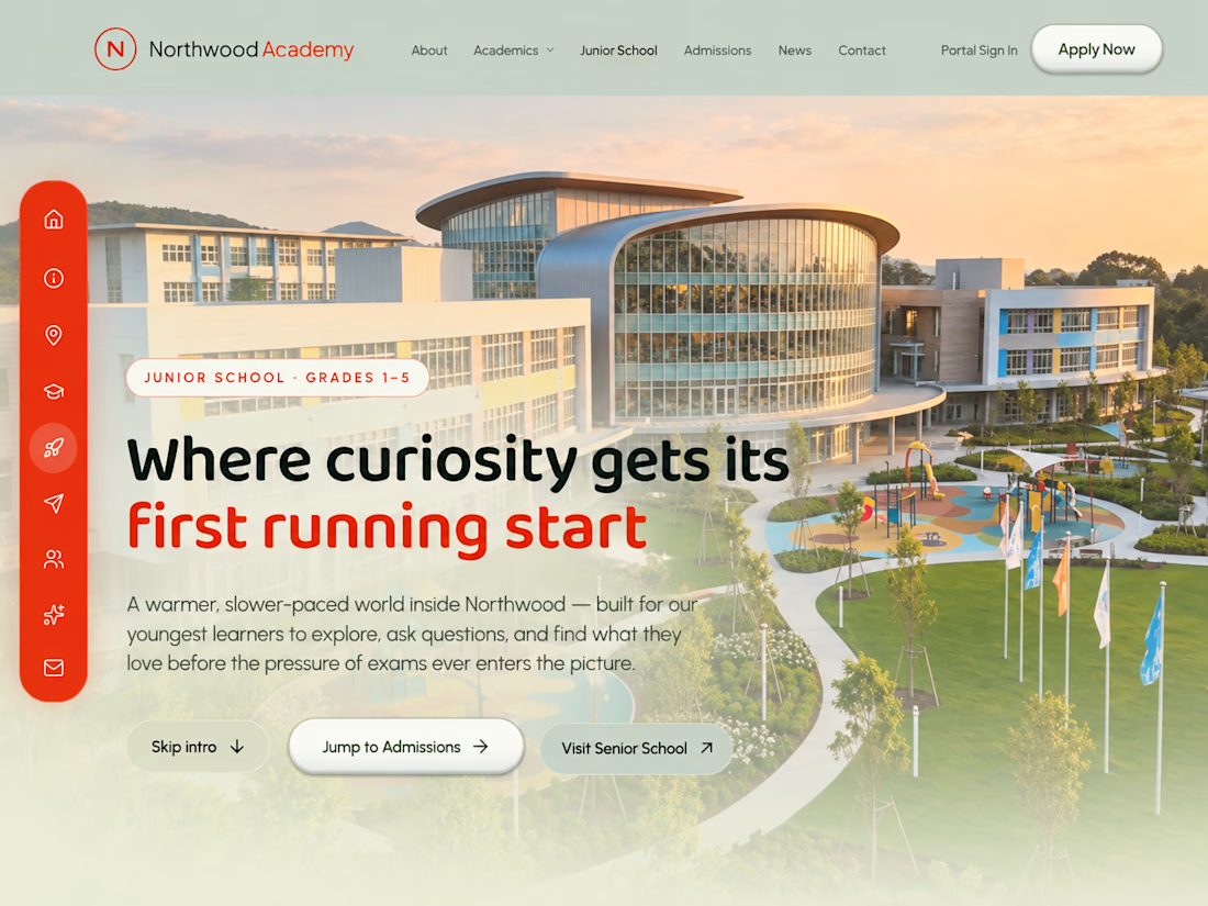
A school website that speaks to two different audiences. The Senior School and the Junior School each get their own interface and colour theme, so every visitor feels the site was made for them.
The goal: present the school's programmes, campuses and admissions in a polished, easy-to-follow way that builds trust at first glance.
What I designed and built:
✦ Senior School interface: a refined, mature look with a cinematic homepage and scroll-driven animation
✦ Junior School interface: a brighter, more playful design in its own colour theme, with a dedicated interactive layout
✦ Two distinct colour themes that clearly separate the Senior and Junior sections while staying part of one brand
✦ Clear navigation for academics, admissions and campus information
✦ A fully responsive design for phones, tablets and desktops
My role: UI/UX design and full front-end development, from concept to live site.
Built with: Next.js, React, Tailwind CSS and GSAP.
🔗 Live site: Northwood Academy: one school, two experiences 🏫
A school website that speaks to two different audiences. The Senior School and the Junior School each get their own interface and colour theme, so every visitor feels the site was made for them.
The goal: present the school's programmes, campuses and admissions in a polished, easy-to-follow way that builds trust at first glance.
What I designed and built:
✦ Senior School interface: a refined, mature look with a cinematic homepage and scroll-driven animation
✦ Junior School interface: a brighter, more playful design in its own colour theme, with a dedicated interactive layout
✦ Two distinct colour themes that clearly separate the Senior and Junior sections while staying part of one brand
✦ Clear navigation for academics, admissions and campus information
✦ A fully responsive design for phones, tablets and desktops
My role: UI/UX design and full front-end development, from concept to live site.
Built with: Next.js, React, Tailwind CSS and GSAP.
🔗 Live site: https://northwood.axiom-stem.com
Need a website that serves more than one audience, without looking like a template? Let's talk.
Need a website that serves more than one audience, without looking like a template? Let's talk.



Are the Junior and Senior sections sharing React components with different theme tokens, or are they separate layouts? Curious how you kept the navigation consistent between them.

Good question! It's a hybrid. The navigation, mobile drawer, icon rail and footer are shared components. They read the route (/junior-school vs the main site) and swap their links and styling accordingly, so the navigation stays consistent across both. The colour themes work...
I’d test Senior → Junior → Senior without a full reload, including opening the mobile drawer after each switch. That would catch any stale links or theme state.
The network for creativity
Join 1.25M professional creatives like you
Connect with clients, get discovered, and run your business 100% commission-free
Creatives on Contra have earned over $150M and we are just getting started





Related posts

A few things we’ve been working on this month.
Different industries, different problems, but the same goal: making complex products feel simple, clear, and trustworthy.
Fintech → Investment Banking → Geospatial AI
More projects are still in progress.
Full case studies coming soon.


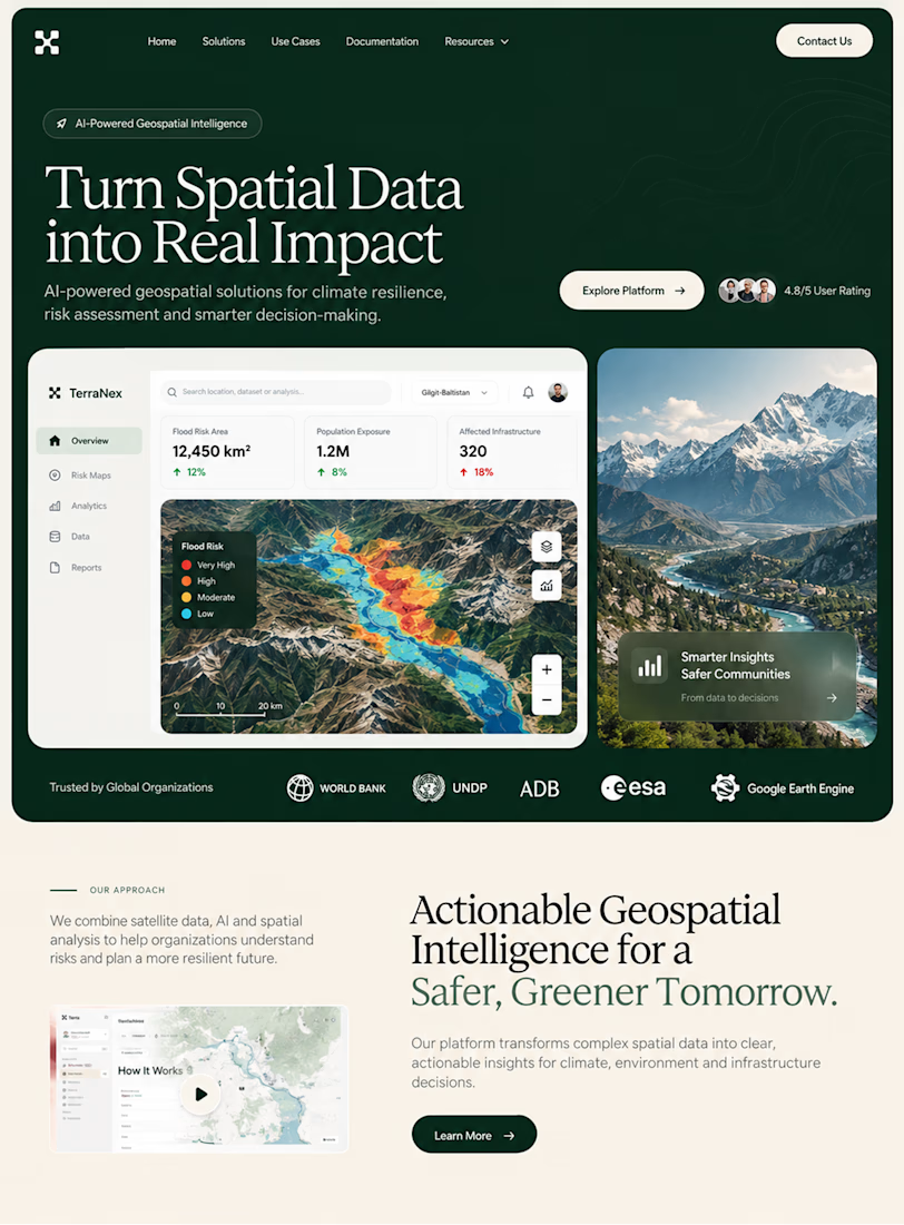
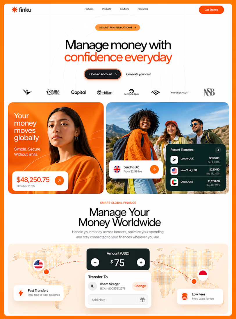
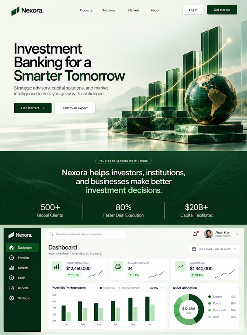

This is the kind of work I enjoy seeing — simple, focused, and actually thought through.

Same prompt. Two builders.
One site made with Lovable, one with Google AI Studio. A Flemish still-life snack brand, gilt frames, GSAP scroll, the works.
Which one is better?
33 voted
67%
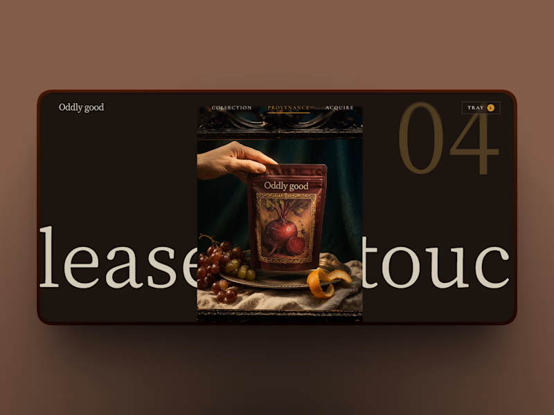
16 voted
33%
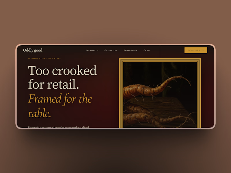
49 votes
Closed

