The network for creativity
Join 1.25M professional creatives like you
Connect with clients, get discovered, and run your business 100% commission-free
Creatives on Contra have earned over $150M and we are just getting started
Back to feedPost

Dynamic iOS Photos widget concept with smooth pop-in animations.


Like the perfect interaction
The network for creativity
Join 1.25M professional creatives like you
Connect with clients, get discovered, and run your business 100% commission-free
Creatives on Contra have earned over $150M and we are just getting started





Related posts


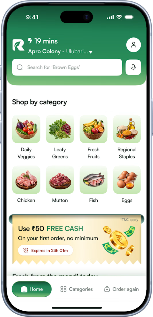
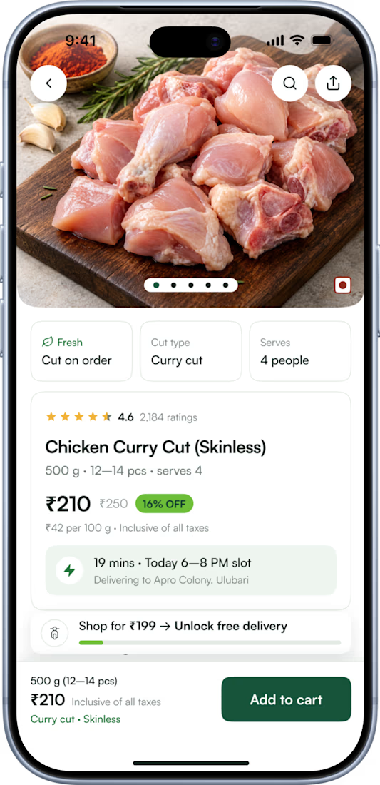
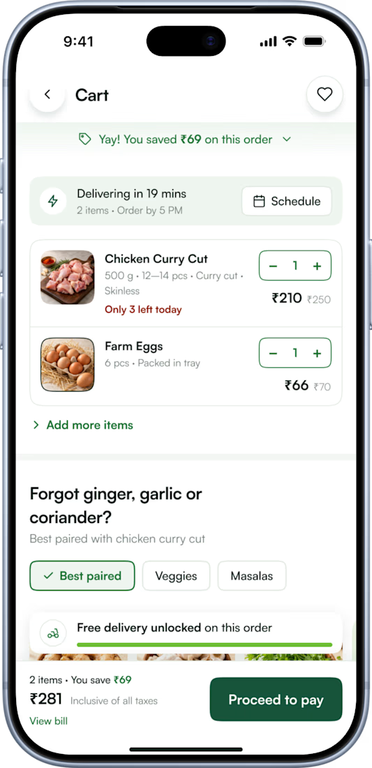

Pinterest bringing in a real local client is such an underrated channel! For the delivery partner app, are you keeping it on the same design system as the customer app, or going more utilitarian with big tap targets for riders on the move?

ScienceFuse — Employee & Volunteer App UI/UX
How can a mobile app make coordinating employees and volunteers feel more straightforward?
For this project, I designed an experience that brings events, team availability, and session information together in a clear, approachable interface.
The design balances ScienceFuse’s playful personality with practical needs: readable information, consistent components, and clear actions across screens.
Explore the full case study:
https://www.behance.net/gallery/258533647/ScienceFuse-Employee-Volunteer-App-UIUX-Case-Study
Have a team platform or mobile app that needs a clearer user experience? Let’s connect.


The playful illustrations and bright colors keep a scheduling app from feeling dry. How did you handle the events list on the smaller screens?

A little creative experiment I'm working on ✳️
Playing with bold typography, playful motion, and unexpected interactions for a UGC creator portfolio.
Still a work in progress, but having way too much fun with this one.


The big stacked WORK / RESULTS / RATES menu next to the loose purple stickers keeps the portfolio playful while the navigation stays easy to scan. Do the stickers react on hover, or are they tied to scroll?