The network for creativity
Join 1.25M professional creatives like you
Connect with clients, get discovered, and run your business 100% commission-free
Creatives on Contra have earned over $150M and we are just getting started
Back to feedPost
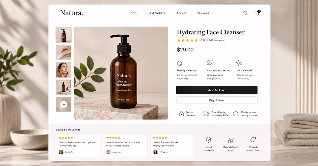
Most Shopify product pages are built to display products.
The best ones are built to sell them.
Here's the difference, and exactly what a high-converting product page needs:
Above the fold (what the visitor sees without scrolling):
→ 3-5 high quality images including one lifestyle shot showing the product in use
→ Product name in plain language, not your internal SKU name
→ Price visible immediately, no hunting for it
→ A short benefit-led description, not specs, benefits. Not "made from 100% cotton" but "soft enough to wear all day, durable enough to last 3 years"
→ Colour and size selector that actually works on mobile
→ Add to cart button that is impossible to miss, full width on mobile, high contrast colour
→ At least one trust signal right next to the button, "Free shipping over PKR 2,000" or "30-day returns"
Below the fold:
→ Full product description with the buyer's questions answered
→ Reviews — real ones, with photos where possible, placed before the footer
→ Complementary product suggestions, not random upsells, relevant ones
→ FAQ section addressing the top 3 objections your customers have
What most Shopify stores get wrong:
— Putting the reviews at the very bottom where nobody scrolls
— Writing product descriptions for Google instead of for the buyer
— Having an add-to-cart button that disappears when you scroll down on mobile
— No sticky add-to-cart on mobile (this single fix increases mobile conversions by 8-15%)
The product page is where buying decisions are made.
If yours isn't built around that moment, it's costing you sales every day.
DM me the word SHOPIFY and I'll review your product pages personally.
The network for creativity
Join 1.25M professional creatives like you
Connect with clients, get discovered, and run your business 100% commission-free
Creatives on Contra have earned over $150M and we are just getting started
Related posts
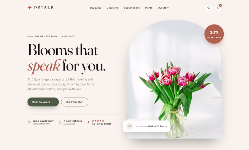
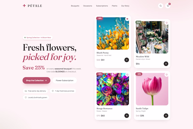
Two heroes. Same florist. Opposite strategy.
Editorial sells the feeling. Big serif line, one bouquet, trust badges below.
Bouquets sells the deal. No hero image. Straight into product grid, prices, promo code up top.
One asks you to fall in love. One asks you to buy now.
Flowers are impulse buys with emotional weight. Which wins more carts?
🌸 Editorial
🛒 Bouquets
Vote below.
24 voted
62%
15 voted
38%
39 votes
Closed
Editorial looks premium
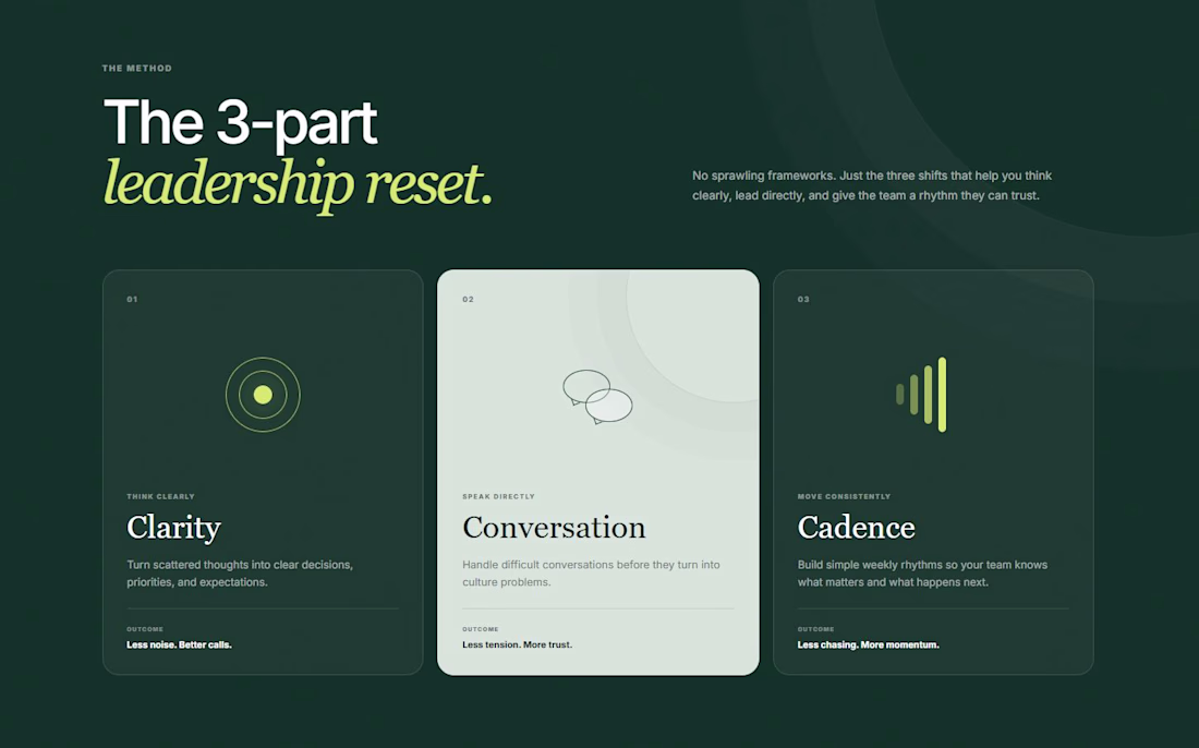
Coach websites do not need to explain the whole brain on the homepage.
This concept uses 3 words:
Clarity.
Conversation.
Cadence.
Easy to remember, trust and talk about on a sales call.
Modern and intuitive
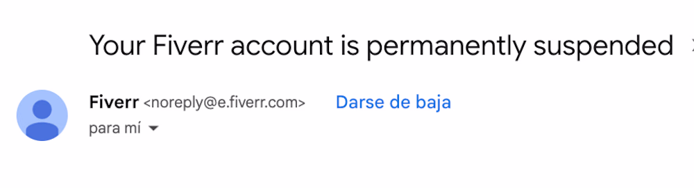
Well... Fiverr finally suspended my account. 😂
Honestly, I think we both moved on a while ago.
In the meantime, I brought some clients over to Contra, earned the referral bonuses, and now I get to focus on a platform that doesn't take 20% of every project.
Sometimes getting kicked out is just the universe helping you commit.
Even mine was permanently suspended, then I came across contra and have started my journey here.
Trending
Claude
Claude has entered the design space. How are you using Claude Design?
Contra University
Learn from expert creatives how to earn more using next-gen AI tools.
fifaworldcup2026
The World Cup is here and the whole world's watching. How are you designing for the world stage?
creativeaiflow
Creative AI workflows are evolving. What tools do you use, and what are their strengths and weaknesses?
freelancerlife
Freelancer life is wins, pivots, and everything in between. What’s yours right now?