The network for creativity
Join 1.25M professional creatives like you
Connect with clients, get discovered, and run your business 100% commission-free
Creatives on Contra have earned over $150M and we are just getting started
Back to feedPost
How do you bring the magic of children’s ballet studio into a website? 🩰
For this challenge, I gave a children’s ballet studio in my Munich neighborhood a complete digital glow-up.
The goal was to create a website that feels as joyful, playful, and welcoming as the world of ballet itself. I redesigned the visual world with a playful logo, the rounded and friendly Asap font, and soft, delicate colors to create a warm and approachable experience.
The new website includes:
· Online booking for classes & events
· A website assistant to answer questions instantly
· A simple inquiry form
· A clean backend where the owner can easily manage content and updates
· And of course, is responsive.
After: https://sanft-ballett.base44.app/preise
Before & After the website glow-up you can find in the video below!
Throughout this process, I was truly amazed by how @Base44 helped turn ideas into real, working products so quickly. This was one of my first website built with Base44 — but definitely not my last. Thanks for this amazing opportunity. 💙
#GiveItAGlow @Base44


After Website: https://sanft-ballett.base44.app/ 💯

Really a glow, now is surely more trustworthy and more soft I would say
Good luck with this challenge!
Thanks a lot Sergey!
The network for creativity
Join 1.25M professional creatives like you
Connect with clients, get discovered, and run your business 100% commission-free
Creatives on Contra have earned over $150M and we are just getting started



Related posts



AVYLO Skin Care Packaging Design


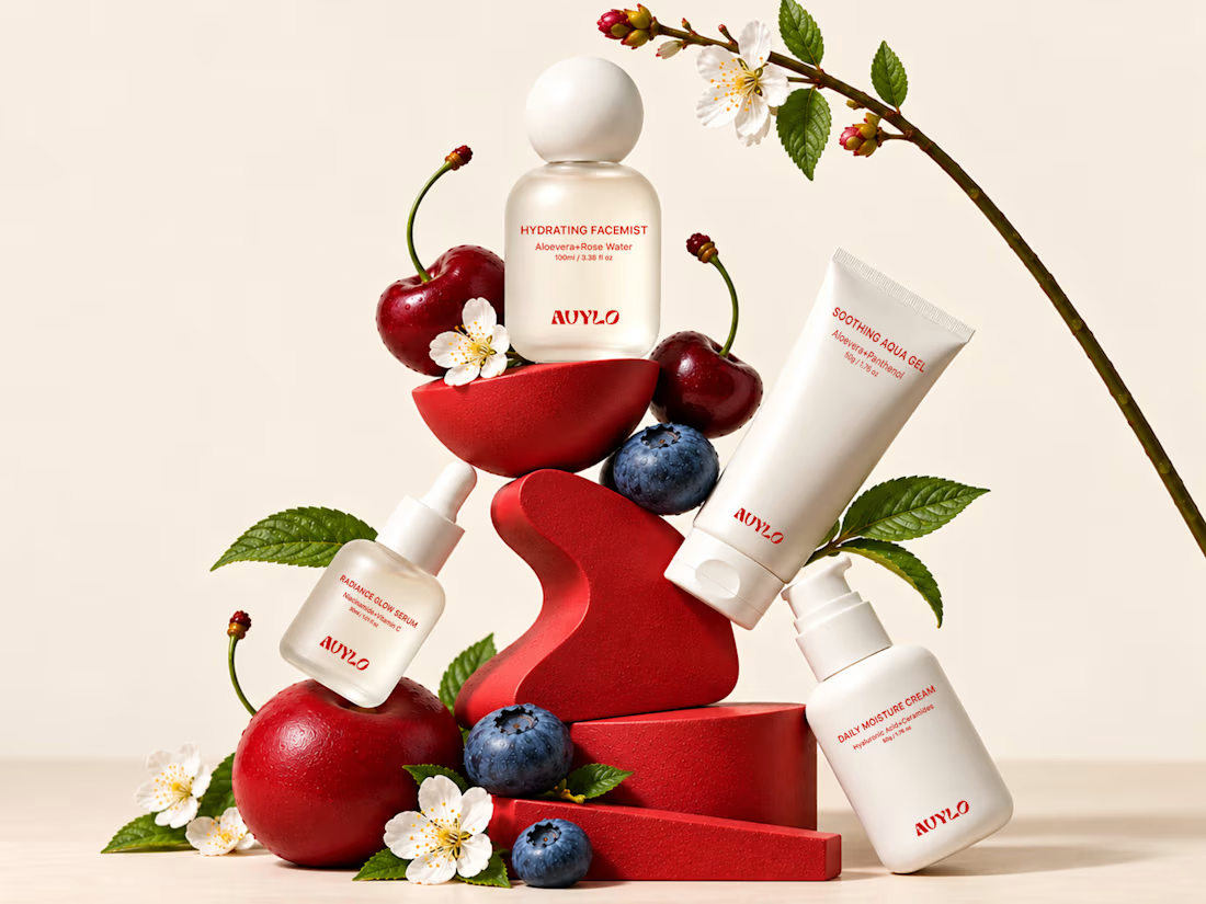
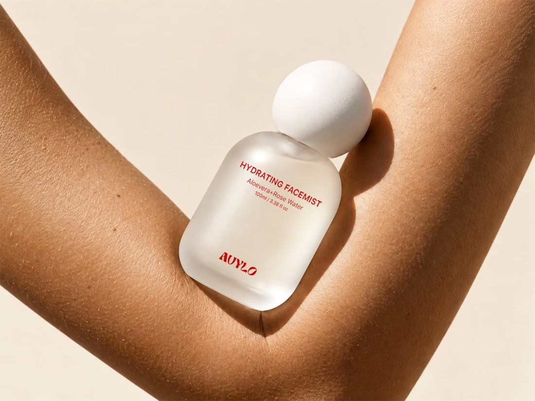
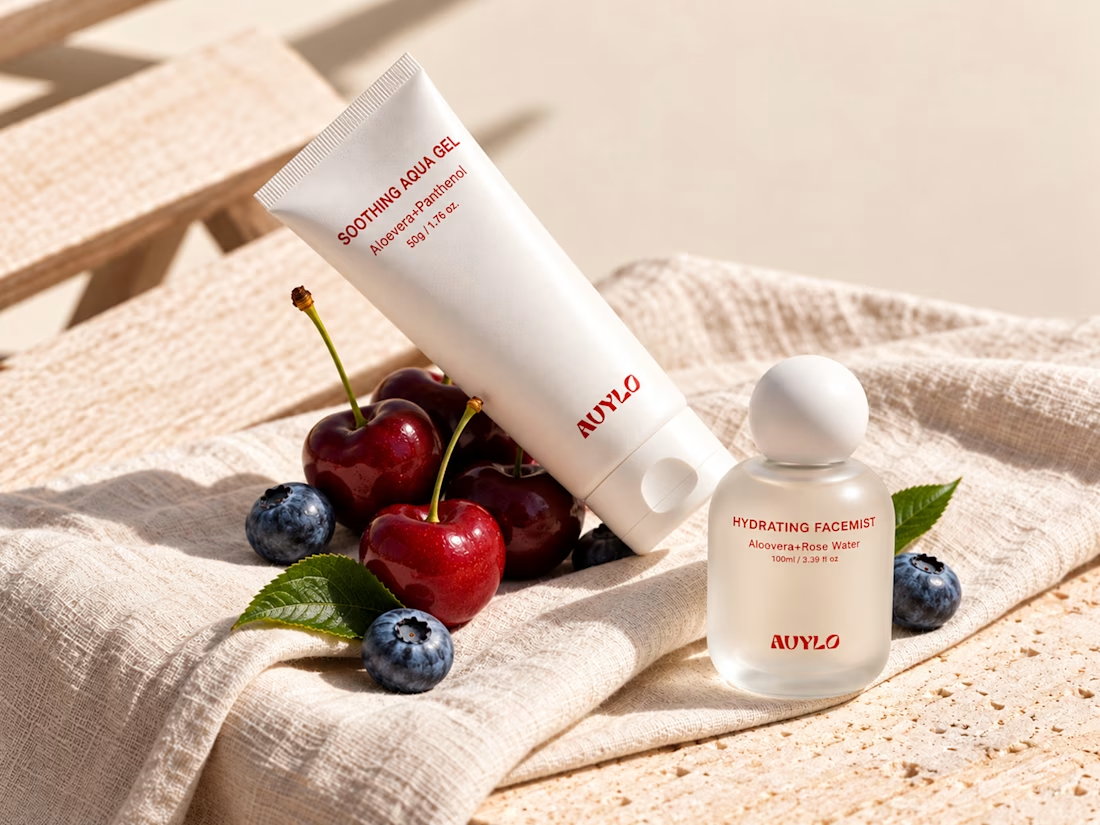

Good job

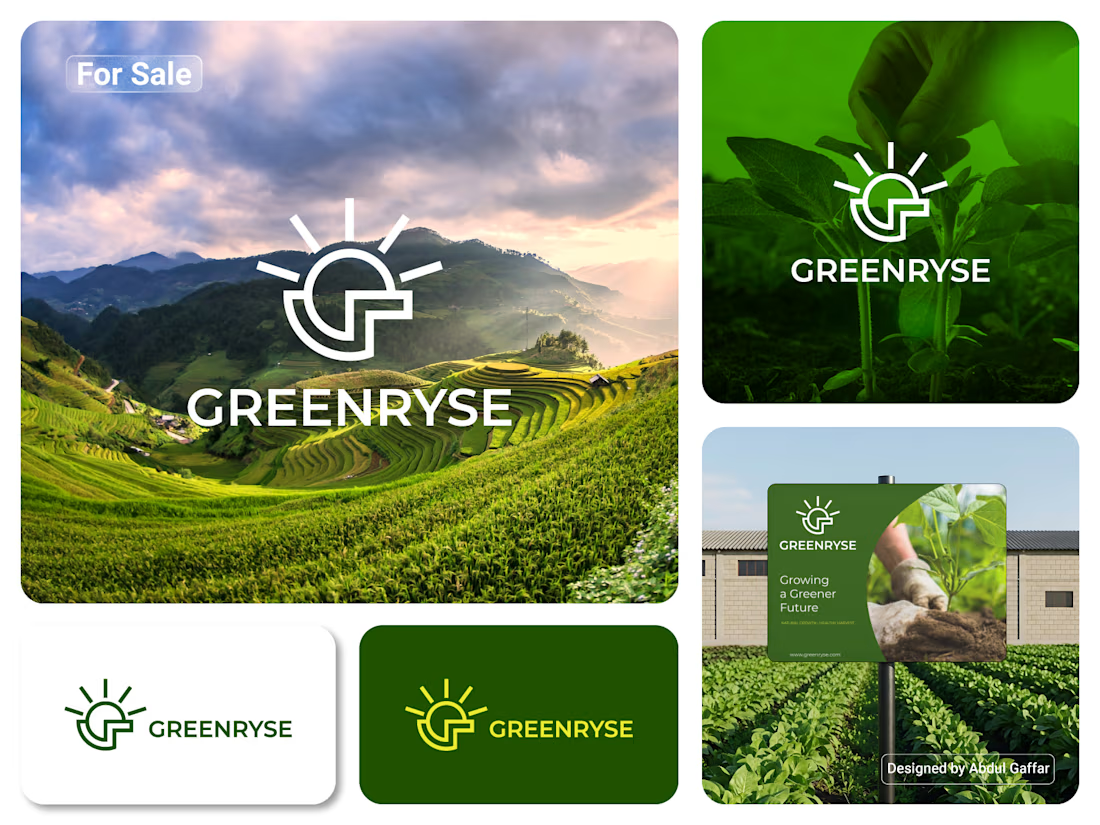
GREENRYSE – G Lettermark, Sun Logo Design, Sustainable Agriculture.
Introducing GREENRYSE, a modern logo concept inspired by nature, agriculture, and the power of growth. The symbol combines a geometric letter G with a rising sun, representing new beginnings, natural energy, and a brighter future for agriculture.
The presentation explores how the logo works across different backgrounds and applications, including agricultural landscapes, product imagery, and outdoor signage. Its clean geometric structure and fresh green color direction create a natural yet professional look.
Designed for agricultural companies, organic farming businesses, crop production, sustainable agriculture, and modern agritech ventures.
Stunning!