The network for creativity
Join 1.25M professional creatives like you
Connect with clients, get discovered, and run your business 100% commission-free
Creatives on Contra have earned over $150M and we are just getting started
Back to feedPost
Lumina — The simplest way to manage work.
A calm, focused workspace designed for modern teams who value clarity over clutter.


no-code, made entirely in @Framer.

Clarity over clutter is the hardest thing to actually pull off in a productivity tool, everyone says it and then ships a dashboard full of noise. That dark minimal motion sells the calm before you even read a word. Looks great.
Thanks for your kind words Pandey.
The network for creativity
Join 1.25M professional creatives like you
Connect with clients, get discovered, and run your business 100% commission-free
Creatives on Contra have earned over $150M and we are just getting started







Related posts


the cuff turns a full 360 and the metal goes translucent. seedance 2.5 for video and scrubbed by scroll position with a custom component.

This looks amazing


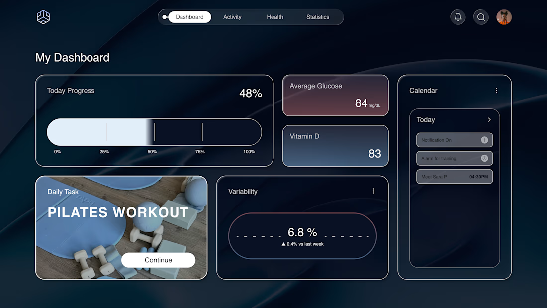
Why does a dashboard full of numbers still feel calm?
Bento grids are everywhere, and done right it's not a trend, it's information design. Each cell = one number, one meaning. The grid does the hierarchy for you.
Our three rules for a bento that works:
One idea per cell. Progress, glucose, one task. If a card needs two sentences, it needs two cards.
Mix the scale. One hero cell, a few mediums, one tiny stat, same gap everywhere.
One warm cell. A single card runs warm against the cool, dark screen; it carries the eye, and the rest stay quiet. No neon needed. Grids are calm. Content is loud. That's the whole trick.

Love the three rules. How do you handle this grid when it collapses to mobile without losing the hierarchy?


Experimenting with avatar animation using Figma + Motion ✨
Honestly, I never thought Figma Motion could generate motion this smooth, it’s starting to feel surprisingly close to what I’d normally achieve in After Effects.
Figma Motion is definitely making motion exploration much more accessible for product designers. 👀


This is getting surprisingly close to AE for quick motion exploration. Curious how well it holds up once the animations get more complex.