The network for creativity
Join 1.25M professional creatives like you
Connect with clients, get discovered, and run your business 100% commission-free
Creatives on Contra have earned over $150M and we are just getting started
Back to feedPost
Every bank. One login.
The challenge → show the simplicity of a banking tool in 10 seconds.
Ad for Incard, motion design + sound design by me.
Personal project, not affiliated with the brand.


Every bank. One login. is such a strong line for a banking tool, it sells the whole idea in four words. Showing the simplicity in 10 seconds is a brutal constraint and it looks like you nailed the pacing. Was the sound design doing as much work as the motion, or does the video hold up silent too?

Thanks! The sound design came after. It adds a nice rhythm, but the video was built to work without it.
The network for creativity
Join 1.25M professional creatives like you
Connect with clients, get discovered, and run your business 100% commission-free
Creatives on Contra have earned over $150M and we are just getting started


Related posts


When you forget that it's not 2005 and you don't work for 2Advanced... 😅
Designed and animated in Figma.
(it's about time to finally discover these new animation features).

That looks like an underwater design😊 Great Work!

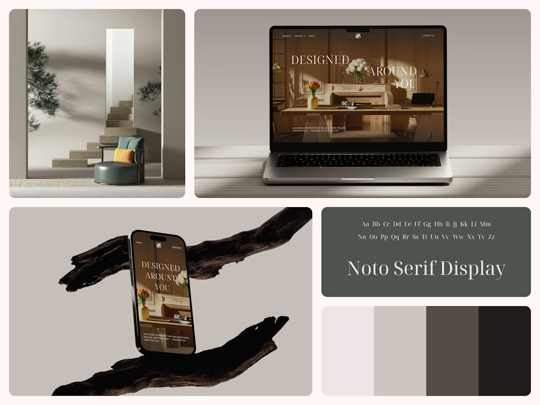
Interior Design Website
The white flowers on the mantel overlap the headline.
Thin Noto Serif Display capitals step down across one warm photo of a paneled room, so the space stays in view between the words. On the phone, the three words stack in a centered column, with Menu and Contact on either side of the monogram.
The palette runs from soft white to near black, which leaves the color to the photo: orange tulips and warm light on the walls.
The headline reads "Designed Around You", and the hero takes it literally, with the wall behind the type and the flowers in front of it.
Designed by the Hue & Machine team.
#InteriorDesign #InteriorStudio #WebsiteDesign #HomepageDesign #WebDesign #ResponsiveDesign #Typography #EditorialDesign #UIDesign #FigmaDesign


Nice!

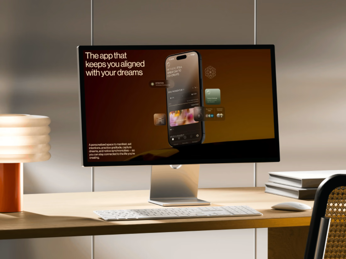
Promo video for a manifestation and wellness app. 48 seconds of kinetic type, UI motion and warm footage that show what the app does.


The warm footage really suits a wellness app, it keeps the kinetic type from feeling too techy. Lovely pacing for 48 seconds