The network for creativity
Join 1.25M professional creatives like you
Connect with clients, get discovered, and run your business 100% commission-free
Creatives on Contra have earned over $150M and we are just getting started
Back to feedPost
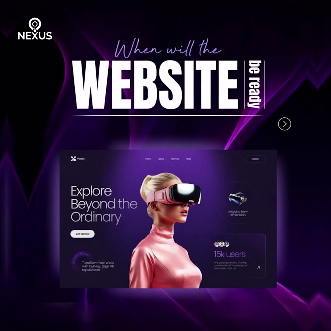
Why This Design Hits Hard: A VR Platform Teaser Analysis!
This promotional graphic from Nexus instantly screams VR/Metaverse platform launch! It’s a powerful teaser that perfectly builds excitement.
The Design Magic: Color Psychology: The mix of Deep Purple and Neon Pink creates a futuristic, high-tech, and luxurious vibe, the perfect look for a virtual world.
The Teaser Technique: The main question, "When will the WEBSITE be ready?", is the core trick. It sparks curiosity and keeps the audience waiting for the big reveal.
Clear Messaging: The line "Explore Beyond the Ordinary" clearly sells the platform’s main benefit: an experience far better than the status quo.
This strategic blend of color, questions, and bold messaging makes the design highly effective!
What are your thoughts on this futuristic design? Let me know below!
graphicsdesigningBrand DesignGraphic DesignSocial Content DesignAdobe IllustratorsocialmediasocialdesignAdobe PhotoshopFigma
The network for creativity
Join 1.25M professional creatives like you
Connect with clients, get discovered, and run your business 100% commission-free
Creatives on Contra have earned over $150M and we are just getting started
Challenges
View allTrending
Claude
Claude has entered the design space. How are you using Claude Design?
Contra University
Learn from expert creatives how to earn more using next-gen AI tools.
creativeaiflow
Creative AI workflows are evolving. What tools do you use, and what are their strengths and weaknesses?
portfolioreview
The best portfolios tell a story, not just show a grid. Share yours for feedback.
freelancerlife
Freelancer life is wins, pivots, and everything in between. What’s yours right now?