The network for creativity
Join 1.25M professional creatives like you
Connect with clients, get discovered, and run your business 100% commission-free
Creatives on Contra have earned over $150M and we are just getting started
Back to feedPost

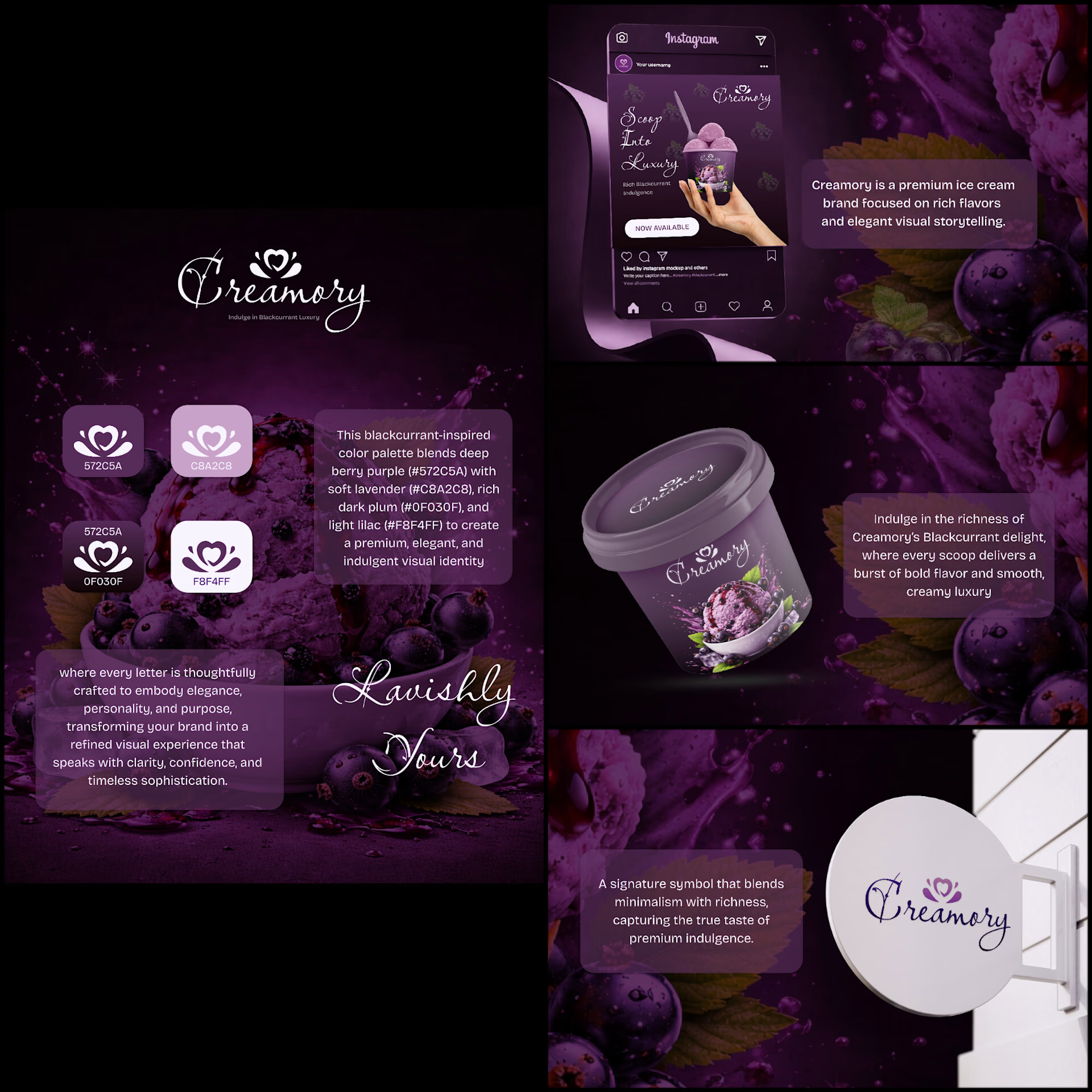
Creamory — where rich flavour meets refined design. 🍦💜
A premium ice cream brand identity inspired by the bold richness of blackcurrant, crafted with an elegant visual language, deep berry tones, and indulgent packaging.
From logo to packaging and social media, every detail was designed to create a luxurious and memorable brand experience.
#BrandIdentity #PackagingDesign #GraphicDesign #Branding #VisualIdentity

The network for creativity
Join 1.25M professional creatives like you
Connect with clients, get discovered, and run your business 100% commission-free
Creatives on Contra have earned over $150M and we are just getting started











Related posts




Aryna, that golden symbol pops so nicely against the plum background ✨

Behind the scenes of the Treal Studio brand film.
Built in one week, from creative direction to sound design.


Love the overall feel, looks amazing 👌🏼


Brilliant work