The network for creativity
Join 1.25M professional creatives like you
Connect with clients, get discovered, and run your business 100% commission-free
Creatives on Contra have earned over $150M and we are just getting started
Back to feedPost

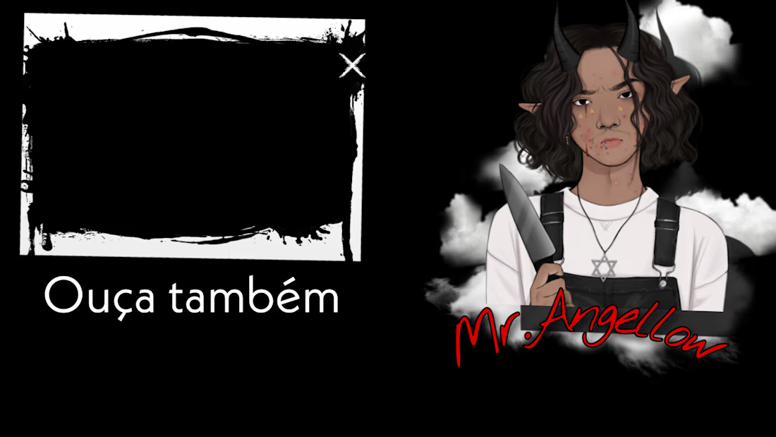
Background for the end of a YouTube video, or for any other platform or website; I help you build the idea and elevate it to its best form.

The network for creativity
Join 1.25M professional creatives like you
Connect with clients, get discovered, and run your business 100% commission-free
Creatives on Contra have earned over $150M and we are just getting started

Challenges
View all


Related posts


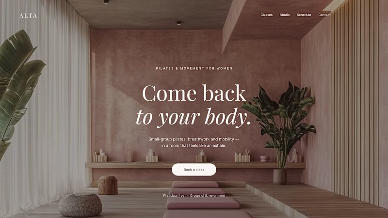
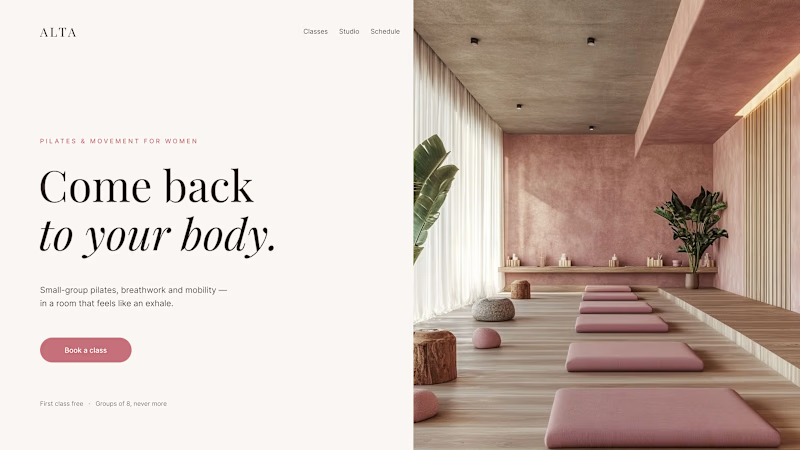
Where should the photo live - behind the words or beside them?
Same pilates studio, same headline.
01 - Photo as the background. Full-bleed atmosphere: the room wraps around the words. Immersive and cinematic, but the text only survives thanks to a darkening overlay laid over the image.
02 - Photo beside the text. A clean split: words on calm ground, the room in its own column. Everything readable at a glance, the trade is a little less drama.
One sells the feeling. The other sells the clarity. Which hero would make you book the class?

80 voted
75%
27 voted
25%
107 votes
Closed

1 nails it

These are some Thumbnail samples based on fragrance reviews, vlogs, and informative content.







Nice work but I would suggest that you clean up the AI images in Canva or Photoshop before posting them next time

My portfolio is coming together.
I’m building it to be more than just a collection of projects, it includes solid case studies, my background + experience, and a 40-sec showreel showcasing how I think, design, and build.
Slowly turning the work into a proper body of work.⚡️

The decision to pair solid case studies with a 40-second thinking-and-build showreel gives the portfolio a clear narrative. The dark layout and purple motion frame make the work feel cohesive without competing with it.