The network for creativity
Join 1.25M professional creatives like you
Connect with clients, get discovered, and run your business 100% commission-free
Creatives on Contra have earned over $150M and we are just getting started
Back to feedPost

I fixed a logistics user flow that was costing delivery drivers unnecessary time and effort.
Here's how.
Over the past two days, I've been designing a mobile app for a logistics company.
The goal was simple: make completing a package delivery as fast and frictionless as possible.
At the start of the project, I tried to think like a delivery driver. I put myself in their shoes and looked at the experience from their perspective.
That's when something stood out.
Delivery drivers spend most of their day outdoors, in the heat, rain, or cold. In those conditions, the last thing they want to do is keep tapping through multiple screens just to complete a delivery.
That led me to one question:
What if we could reduce the number of steps required to mark a package as delivered?
It seems like a small change, but it solves a real problem that often goes unnoticed.
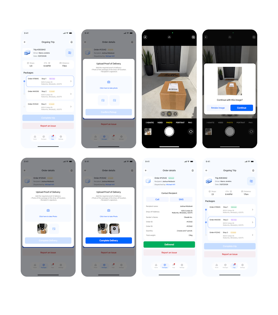
I won't cover the entire project, but here's one part of the flow we improved: the final delivery confirmation.
Our initial flow was similar to what many logistics apps use. It required 7 taps:
> Take package photo
> Upload
> Continue
> Capture signature
> Upload signature
> Continue
✅ Confirm delivery
Seven interactions just to finish one delivery.
After several iterations, we reduced it to 5 interactions by combining the process into a single flow:
>Upload package photo
>Upload signature
>Complete delivery
>AI validates both images simultaneously
✅ Success
No separate upload screens.
No individual validation steps.
Instead of validating the package photo and signature one after the other, we optimized the experience so both are validated at the same time.
It's a relatively small UX change, but when multiplied across hundreds of deliveries every day, it can save drivers a significant amount of time while reducing friction in their workflow.
The key takeaway is that Good UX isn't about making people do things faster.
It's about asking them to do less in the first place.
Sometimes the best interface isn't the one with the nicest animations or the prettiest colors.
It's the one that quietly gets out of the user's way.
Below are the final screens showcasing the flow.


The network for creativity
Join 1.25M professional creatives like you
Connect with clients, get discovered, and run your business 100% commission-free
Creatives on Contra have earned over $150M and we are just getting started
Trending
retrofuturism
Share your favorite designs from the past exploring the distant future. Or your own take on the aesthetic 🚀
halftone
Dots. Texture. Grain. Let's see your designs using the halftone technique.

Midjourney
Creatives are showing off what they're making with Midjourney.
colorgrade
Video editors sound off: How do you enhance the mood of your video in color grading?
Related posts


Amazing work

How do you make a logo feel alive without making it feel like a gimmick? 🤖
Quickchat AI builds no-code AI Agents that handle real work - customer support, sales, internal ops - reading docs and resolving conversations on their own. As the product scaled, the brand needed to catch up: something as sharp and credible as the tech itself, in a market where every AI startup looks the same.
I could have leaned into something loud - a mark morphing through wild transformations, motion for the sake of motion. Instead the direction was restraint. The wordmark reveals with one clean underline stroke. The icon wakes up letter by letter before landing on the final mark, closing on a small wink instead of a flourish 😉.
Every timing decision was intentional: fast enough to feel instant, controlled enough to feel trustworthy. That's the whole brief in one sentence.
The palette stayed just as disciplined 🎨 - one electric blue carrying the energy, one warm yellow breaking up the dark neutrals. Nothing decorative, everything load-bearing.
Where do you draw the line between motion that shows a product's personality and motion that's just there to show off?


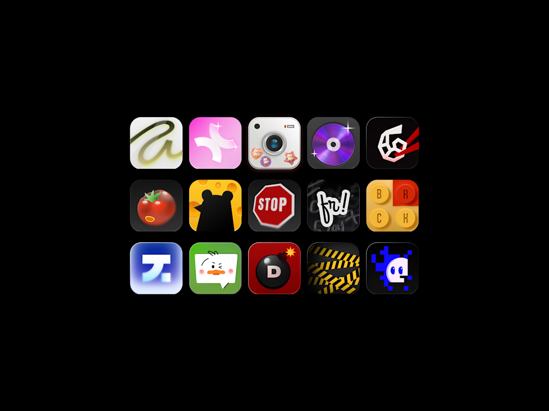
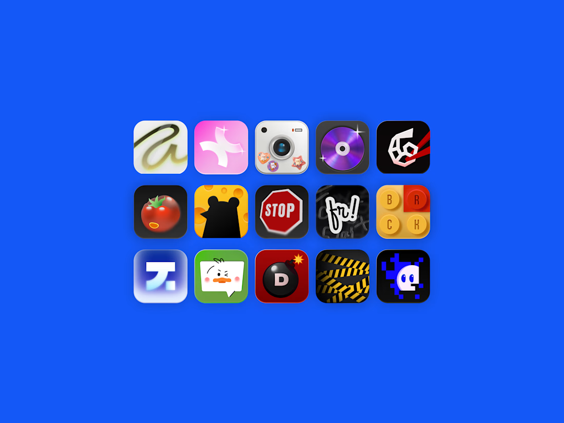
A set of mobile app icons exploring various visual styles from Y2K aesthetic and 3D skeuomorphism to retro pixel art and vector mascots.
Special thanks to Dana for helping out with one of the logos for the icons! 🙌

I'm so excited to be part of such an awesome project! Watch out for the bomb, Marho!🔥