The network for creativity
Join 1.25M professional creatives like you
Connect with clients, get discovered, and run your business 100% commission-free
Creatives on Contra have earned over $150M and we are just getting started
Back to feedPost
ECHO Brand Exploration
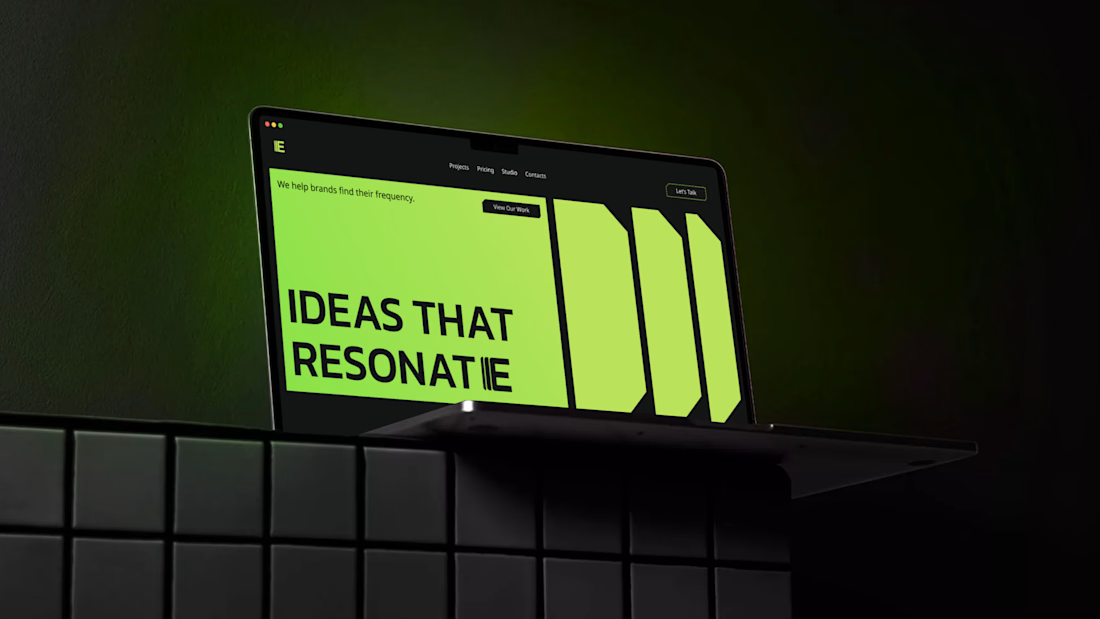
Tried something different with this one - mixing a bold, techy vibe with a clean, professional look.
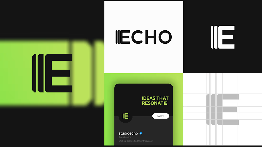
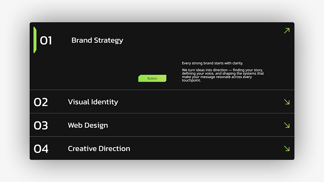
The whole direction revolves around amplification. I pulled repeating shapes from the “E” and used them everywhere - corner cuts, backgrounds, buttons - to keep everything in the same rhythm.
The color palette is simple: lime green, black, and white. Has that neon energy without feeling too futuristic.
Full Project Here



Good work!

Thanks!

Sick work, Daniela 🔥
Thank you 🙌

Look so nice @Daniela Hristova
Thanks, Murad!

nice logo mark
Thanks, glad you like it!

Great concept and a really nice design
Thanks!

good work
Thanks, Dani!
The network for creativity
Join 1.25M professional creatives like you
Connect with clients, get discovered, and run your business 100% commission-free
Creatives on Contra have earned over $150M and we are just getting started





