The network for creativity
Join 1.25M professional creatives like you
Connect with clients, get discovered, and run your business 100% commission-free
Creatives on Contra have earned over $150M and we are just getting started
Back to feedPost

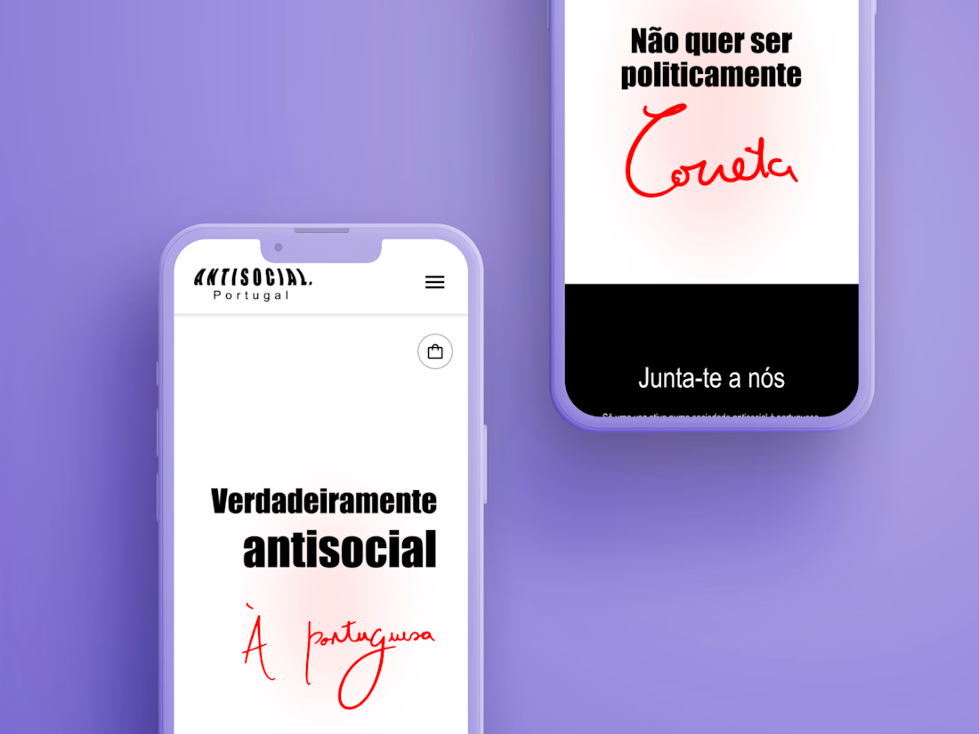
Web and e-commerce design for a Portuguese candle brand with a very sharp sense of humour.
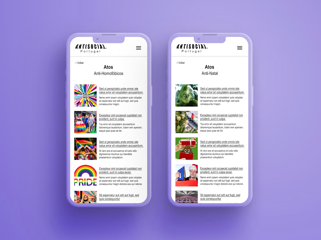
Antisocial is a Portuguese candle brand that doesn't sell "vanilla" or "fresh linen". Its candles are named after the things people are actually fed up with — anti-landlord, anti-French investment, anti-homophobes, anti-calories, anti-Christmas. Sarcastic, extremely local, and openly queer-friendly.
I designed the website and the e-commerce experience. The interesting problem wasn't the store — it was the voice. A brand this funny can't be sold through a polite, neutral shop template; the humour had to live in the interface, not just on the labels. So the design plays on contrast: a quiet, clean layout that lets the products talk, with the tone carried by typography and by the small moments most stores leave generic. The buttons, for instance, get struck through on hover — the same gesture the brand makes with everything it's against, turned into an interaction.
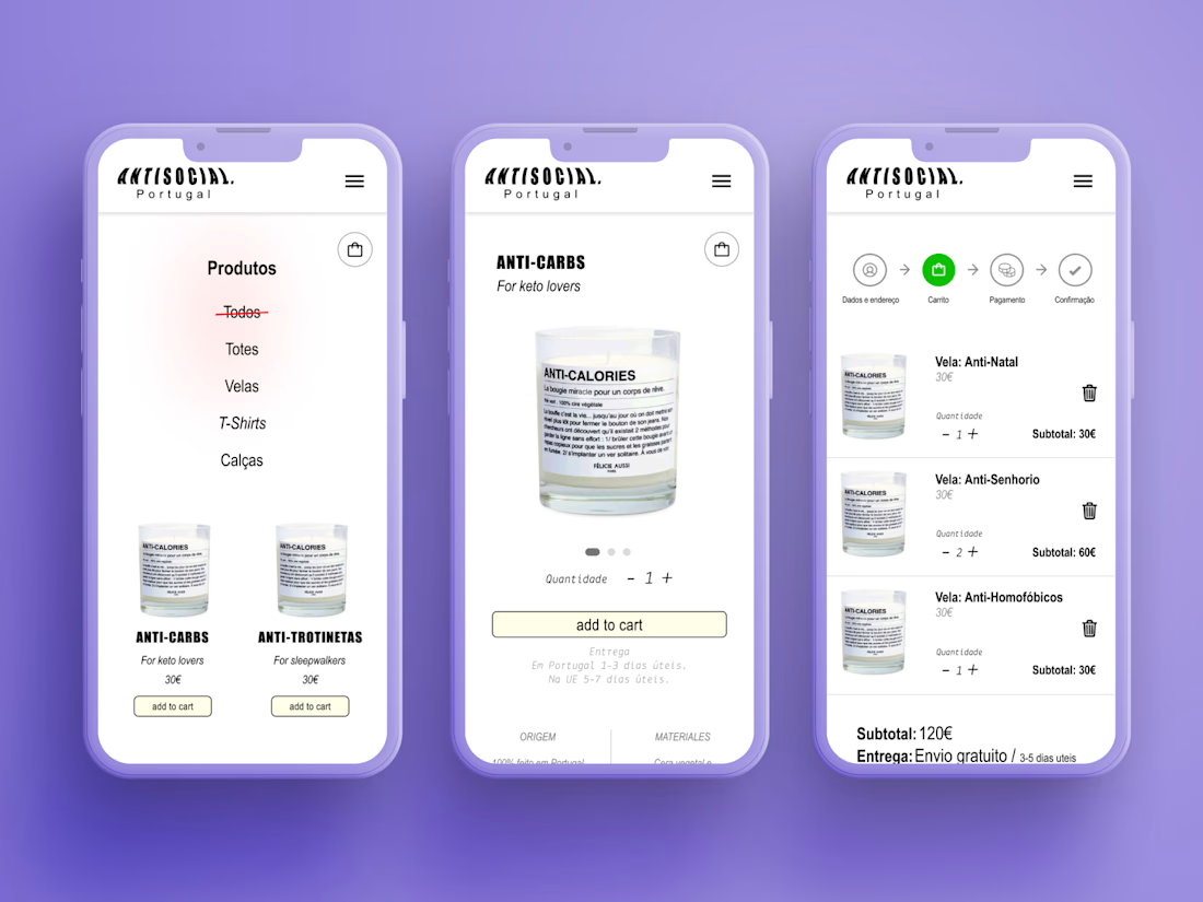
On the commerce side I designed the full flow: catalogue, product pages, cart and checkout, kept short and frictionless. Buying one of these is an impulse — you find the candle that names your exact annoyance, and you want it in two clicks.

The network for creativity
Join 1.25M professional creatives like you
Connect with clients, get discovered, and run your business 100% commission-free
Creatives on Contra have earned over $150M and we are just getting started

Challenges
View all


Related posts


@Figma to @Shopify with @Instant, feels like designing at light speed if you are fast enough, you can design each section while the next one gets built with
@Instant AI is the part I love the best while using AI, adding my human touch and personal taste
say NO to e-comm generic design flop
turn on sound 🔈


the faq block makes the page easy to use




Really happy with how this interaction turned out. Sound effects feel super satisfying as well


The interaction feels so satisfying. The sound effects are a really nice touch. 🔥