The network for creativity
Join 1.25M professional creatives like you
Connect with clients, get discovered, and run your business 100% commission-free
Creatives on Contra have earned over $150M and we are just getting started
Back to feedPost

I didn’t build Maya another app to manage.
I built her fewer things to do and a better way to manage her business.
Meet Milo & Moss — a fictional mobile dog grooming business in Decatur, Georgia.
And meet Maya. She’s the groomer. The driver. The scheduler. The customer service team.
So when a customer sends: “Do you have anything Saturday?” that one message can turn into:
address checks
pet details
calendar hunting
deposit collection
confirmation
reminders
rescheduling
follow-up
and trying to refill a cancellation
None of that is what Maya’s customers actually hired her to do.
So for the #lovablechallenge, I built Milo & Moss — a mobile-friendly web app designed around one product principle: Software handles the routine. Maya handles the exceptions.
For the customer, the experience is intentionally simple: Where are you? → Who’s your pup? → What do they need? → Pick a time → You’re booked. No app download. No giant calendar.
No account required just to manage a booking. Underneath, the product is doing more.
Smart Slots surfaces a few strong appointment options instead of making customers hunt through every available time.
A secure booking link lets them confirm, reschedule or cancel right from their phone.
And when a prime appointment opens up, AutoFill can offer it to someone waiting for the right time.
On Maya’s side?
No giant CRM.
No second inbox.
Just today’s route, the information that matters, and the things that actually need a human decision. That was the goal of the entire build: Not more technology. Less work.
Not: “Can I book?” followed by 14 messages.
But: “Can I book?” → “You’re booked.” And Maya gets back to what her customers actually hired her to do: care for their dogs. 🐾
Built in Lovable
Watch the demo: https://agentjoy.io/milo-moss
Explore the public build: https://milo-moss-auto-book.lovable.app
#lovablechallenge #productdesign #smallbusiness #automation #buildinpublic

The network for creativity
Join 1.25M professional creatives like you
Connect with clients, get discovered, and run your business 100% commission-free
Creatives on Contra have earned over $150M and we are just getting started



Related posts


Crenaly: a booking SaaS I designed and built end-to-end for appointment-based businesses in France: salons, barbers, beauty and wellness.
The core idea: when a client cancels, the freed slot is automatically offered to clients who asked for an earlier time. The first to accept gets it, their appointment moves in place, and the slot they leave is offered next. No double booking, no manual work.
Around it, a full product:
→ Branded booking page for each business, embeddable on their own site
→ Mobile-first booking flow, no account needed
→ Agenda, client management, team roles & permissions
→ Verified reviews, analytics, Stripe billing
Product, UX/UI, frontend and backend.
Next.js · TypeScript · NestJS · PostgreSQL · Redis


Automatically offering a cancelled slot to the next client is such a practical feature for salons and barbers. Designing and building Crenaly end to end must have made those flows much tighter.

Smart Glasses Landing Page
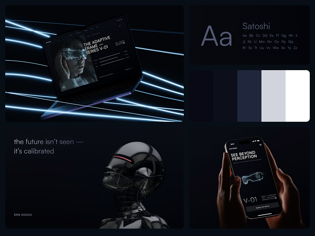
"See beyond perception." Three words on the phone, and the whole page had to earn them.
On desktop, the headline starts over the edge of a tall portrait of the glasses being worn, so the product name and the product in use read as one image. Next to it, reaction, light and depth sit as three thin gauge lines, each with a one-word reading. Specs, without a spec table.
On mobile, a 3D render of the frame sits between the headline and a single Explore the Series button. One image, one next step.
The palette stays in deep navy and soft gray, so the cool light on the frame stands out on every screen.
Designed by the Hue & Machine team.
#WebDesign #LandingPage #ProductDesign #WearableTech #DarkUI #UIDesign #TechProduct #ResponsiveDesign #UXDesign #FigmaDesign



Good work

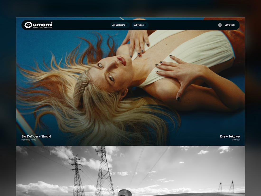
Umami Color & Finishing is an established color-grading studio in LA. Its work and reputation had outgrown its old site, and the studio was ready for one at the level of its work.
I designed and built it around the work itself: every project filterable by type and colorist, and every view with its own link, so the team can send a lead exactly what fits.
Case study
Live site: umamicolor.com

this is amazing work