The network for creativity
Join 1.25M professional creatives like you
Connect with clients, get discovered, and run your business 100% commission-free
Creatives on Contra have earned over $150M and we are just getting started
Back to feedPost

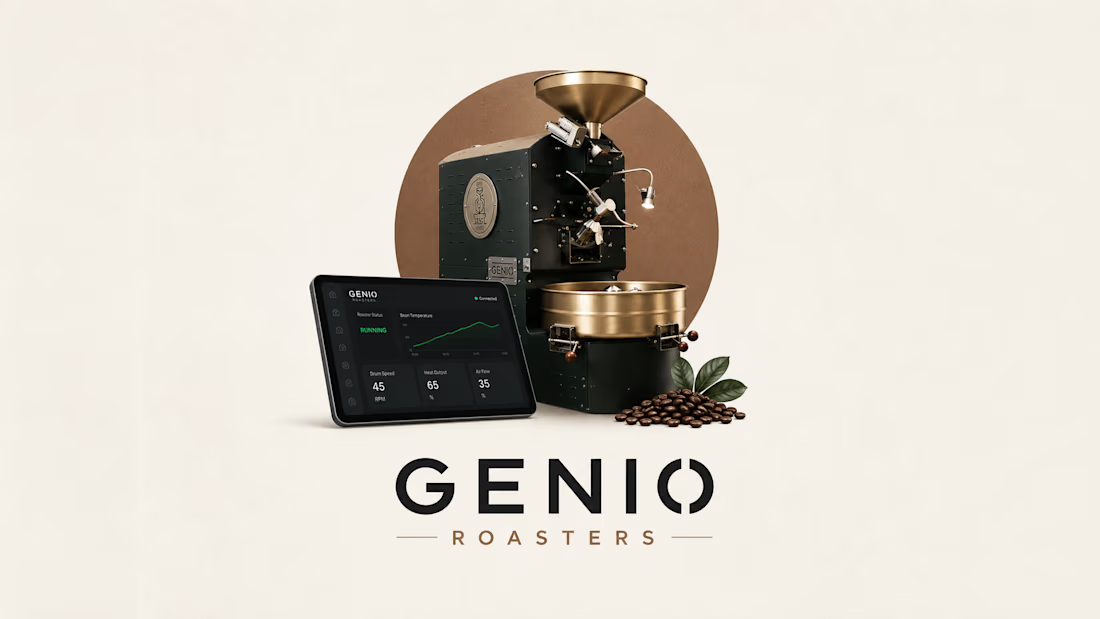
Genio Roasters - NodeRed Dashboard Design


The network for creativity
Join 1.25M professional creatives like you
Connect with clients, get discovered, and run your business 100% commission-free
Creatives on Contra have earned over $150M and we are just getting started





Related posts

A high-impact Webflow experience for an industrial site-selection platform.


Industrial site selection on Webflow lives or dies on map and filter clarity. High impact usually means dense data still scans on mobile.

A bold personal portfolio combining editorial design, 3D elements and modern web development to create a distinctive digital experience and showcase my work as a web developer.

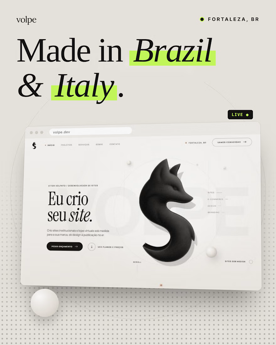

I love the buddy here

Full-Stack Developer & AI Automation Engineer
I build scalable web applications, SaaS platforms, mobile apps, custom dashboards, and AI-powered automation systems that turn complex business workflows into reliable digital products.
My core stack includes Next.js, React, Node.js, NestJS, Python, PostgreSQL, MongoDB, and AI APIs.
I specialize in turning ideas into production-ready systems—from architecture and development to deployment, automation, and optimization.
Available for:
AI Automation • SaaS Development • Web Development • Mobile Apps • Custom Dashboards • API Development • Business Automation


Seeing how you stitch AI APIs into custom dashboards really cuts the manual data wrangling. The stack choice keeps the deployment pipeline smooth.


