The network for creativity
Join 1.25M professional creatives like you
Connect with clients, get discovered, and run your business 100% commission-free
Creatives on Contra have earned over $150M and we are just getting started
Back to feedPost

Building something exciting
Just launched MyBids — a smart bidding & deal management platform that helps users place bids, track offers, and win faster.
Instead of messy spreadsheets or unreliable marketplaces, MyBids gives users a simple, structured way to manage bidding and negotiations in one place.
• Easy bid creation
• Real-time status tracking
• Centralized deal management
• User-friendly dashboard
• Scalable for marketplaces & agencies
Designed and built from scratch using Bubble — from product logic to UI and workflows.
Would love feedback from fellow builders and no-code founders 👇


Great Work
The network for creativity
Join 1.25M professional creatives like you
Connect with clients, get discovered, and run your business 100% commission-free
Creatives on Contra have earned over $150M and we are just getting started





Related posts


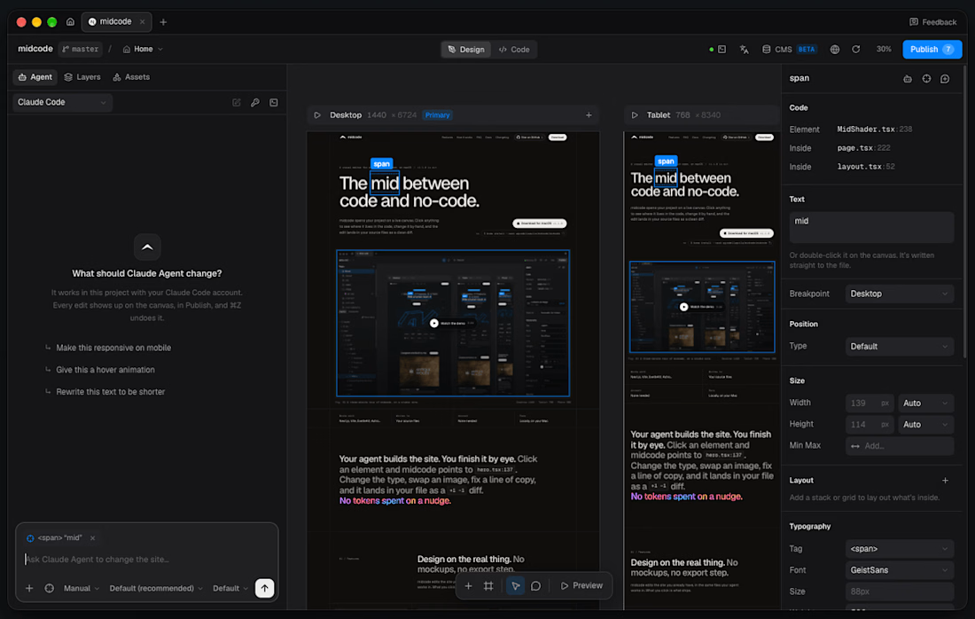
- massively improved the 'builder' part of the app.
-canvas is now functional and you can design directly there (outside of your breakpoints) wip
-your agent in a chat made for midcode
-components and pre-built sections
-much more

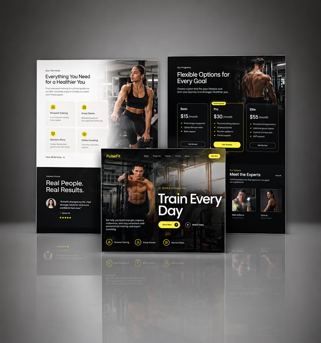
Kajabi Gym & Fitness Landing Page Design
The client needed a focused landing page for their gym and fitness offering that could present the program clearly and encourage visitors to take the next step.
I designed the landing page in Kajabi with a strong visual hierarchy, clear sections for the fitness program, benefits, social proof, and calls to action. The layout was also structured to work smoothly across desktop and mobile.
The result was a clean, focused fitness landing page that makes the offer easier to understand and gives visitors a clear path toward getting started.
#KajabiFitness #KajabiFitnessCoach #KajabiFitnessWebsite #KajabiFitnessLandingPage #FitnessCoachWebsite #FitnessCoachingWebsite #OnlineFitnessCoach #PersonalTrainerWebsite #FitnessLandingPage #GymLandingPage #FitnessProgram #OnlineFitnessProgram #PersonalTraining #WeightLossCoach #FitnessFunnel #FitnessSalesPage #GymWebsite #FitnessWebsiteDesign #FitnessWebDesign




Great work, Hesty. I like how you focused on clear hierarchy, social proof, and strong CTAs instead of just making the page look good. That combination of UX + conversion thinking is what makes a landing page effective.

Heres a project is will soon be starting i wanted to share the web design showcase.


The oversized type and the can bursting out of the peach make this pop. Strong first screen. One small idea: "click now" could say what happens next, like "Shop the 6-pack" or "Find it near you", since a specific action tends to get more clicks than a generic one. If the build...