The network for creativity
Join 1.25M professional creatives like you
Connect with clients, get discovered, and run your business 100% commission-free
Creatives on Contra have earned over $150M and we are just getting started
Back to feedPost


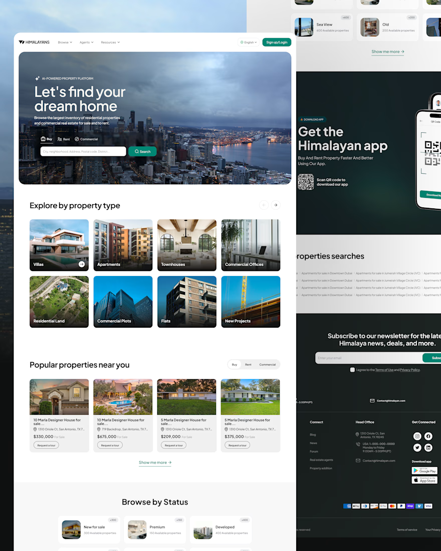
Real estate platforms often see high bounce rates when search results don’t match what people are looking for or when there are too many filters. For the Himalayans web concept, the main goal was to help users find value sooner by making search easier to start, reflecting local inventory, and reducing drop-off between browsing and submitting a lead.
𝗞𝗲𝘆 𝗨𝗫 𝗮𝗻𝗱 𝘀𝘆𝘀𝘁𝗲𝗺 𝗱𝗲𝗰𝗶𝘀𝗶𝗼𝗻𝘀:
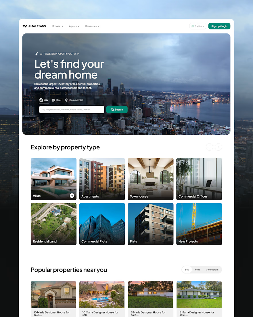
𝗦𝗲𝗮𝗿𝗰𝗵 𝗮𝗿𝗰𝗵𝗶𝘁𝗲𝗰𝘁𝘂𝗿𝗲:Added Buy, Rent, and Commercial options directly to the main hero search bar, so users can switch their intent without navigating through extra steps.
𝗧𝗮𝘅𝗼𝗻𝗼𝗺𝘆 𝗿𝗲𝘀𝘁𝗿𝘂𝗰𝘁𝘂𝗿𝗶𝗻𝗴: Kept core property types, like villas and apartments, separate from added services, like home interiors, and financial products, like Pay on Credit. This helps users understand each category at a glance.
𝗟𝗼𝗰𝗮𝗹𝗶𝘇𝗲𝗱 𝘃𝗶𝘀𝘂𝗮𝗹 𝗰𝗼𝗻𝘁𝗶𝗻𝘂𝗶𝘁𝘆: Matched photography to each target market to create a consistent brand experience and build buyer trust.
𝗖𝗼𝗻𝘃𝗲𝗿𝘀𝗶𝗼𝗻 𝗵𝗶𝗲𝗿𝗮𝗿𝗰𝗵𝘆: Used a direct “Request a tour” call to action on listing cards for users ready to act, while keeping actions in casual browsing sections low-friction.
𝗙𝗶𝗹𝘁𝗲𝗿 𝘃𝗶𝘀𝗶𝗯𝗶𝗹𝗶𝘁𝘆: Placed the main filter pills next to the search bar so users can narrow results by price and other parameters without interrupting their browsing.
Instead of adding redundant UI patterns, this layout makes existing search behaviors work better. It brings regional imagery into alignment, cleans up the taxonomy, and puts useful filters front and center, making it easier to move from discovery to inquiry.


The network for creativity
Join 1.25M professional creatives like you
Connect with clients, get discovered, and run your business 100% commission-free
Creatives on Contra have earned over $150M and we are just getting started


Related posts


The colorful spines on the wood shelf under the big TOKYO STYLE title feel like a real bookstore. When a book slides out, does the shelf close the gap or leave a space?

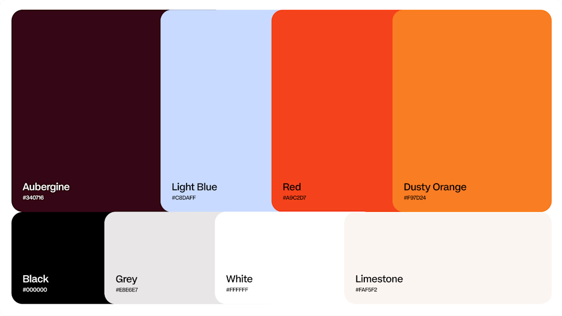
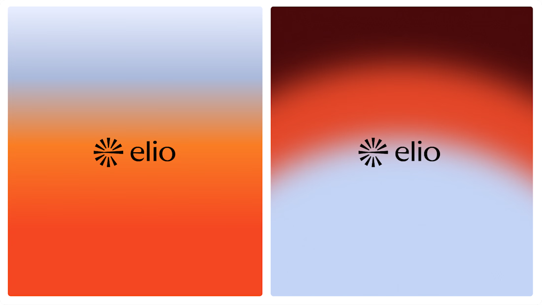
Another very cool brand Identity project I got to work on this year for Elio Mortgage.
Bringing warmth and love to a brand that is usually cold and stressful. Elio are doing things differently to make mortgages easier to deal with. We made a brand that felt more approachable.
Full case study here:



Warm, approachable identity for stressful mortgages.

A few months ago I got to work with Coderhouse, one of the leading education brands in Argentina, and the place where I took several courses myself.
So this one feels like a full circle. A brand that shaped my career and helped me grow as a designer, and now I got to design for it.
The funny part is Chris had no idea I was a former student when he reached out. I was really happy when that message came in.
I built a visual system for their 60+ course covers, made so their team can keep producing them on their own. Today it lives across their app, website and Meta ads.
Thanks Chris for trusting my work and for the opportunity 🧡 And thanks @Contra HQ for making connections like this one possible.


This looks great


