The network for creativity
Join 1.25M professional creatives like you
Connect with clients, get discovered, and run your business 100% commission-free
Creatives on Contra have earned over $150M and we are just getting started
Back to feedPost
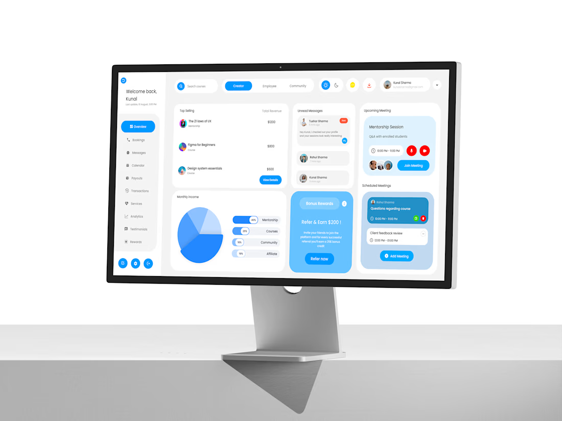
I designed this SaaS dashboard to explore how bookings, messages, payouts, and scheduling can all come together in one clean interface. The goal was to create a seamless productivity flow that feels professional yet easy to use. I focused on consistent dark and light mode design, structured grids, and meaningful empty states to improve the overall experience. This project was created in Figma, with mockups and motion added for presentation. It’s a complete UI/UX case study that highlights process.


The network for creativity
Join 1.25M professional creatives like you
Connect with clients, get discovered, and run your business 100% commission-free
Creatives on Contra have earned over $150M and we are just getting started
Related posts

Just submitted my entry for the Build with Omma by Spline challenge 🌟
A gentle, interactive space to track your time and reflect on your day.
Designed for balance, mental wellbeing, and a calmer approach to productivity.
Keeps your To Do list to 5 tasks, helping you stay focused, take small steps, and avoid overworking.🤪
Fully created with Omma AI.
https://omma.build/p/mental-health-dashboard-interface-sbqbv3


Planning for tomorrow is difficult when important details are missing.
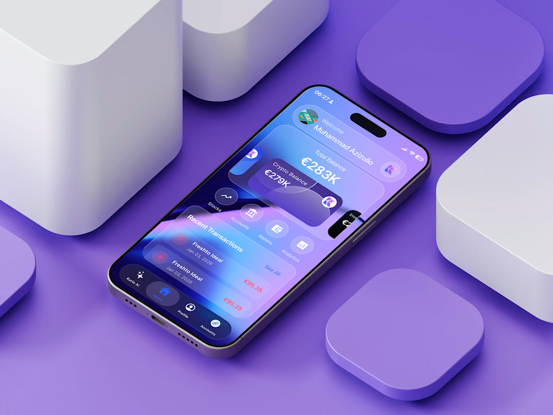
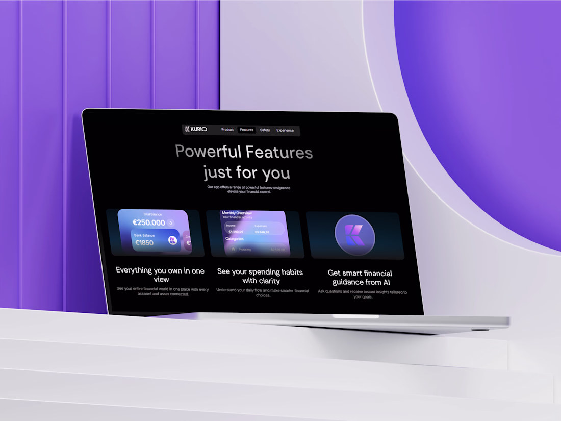
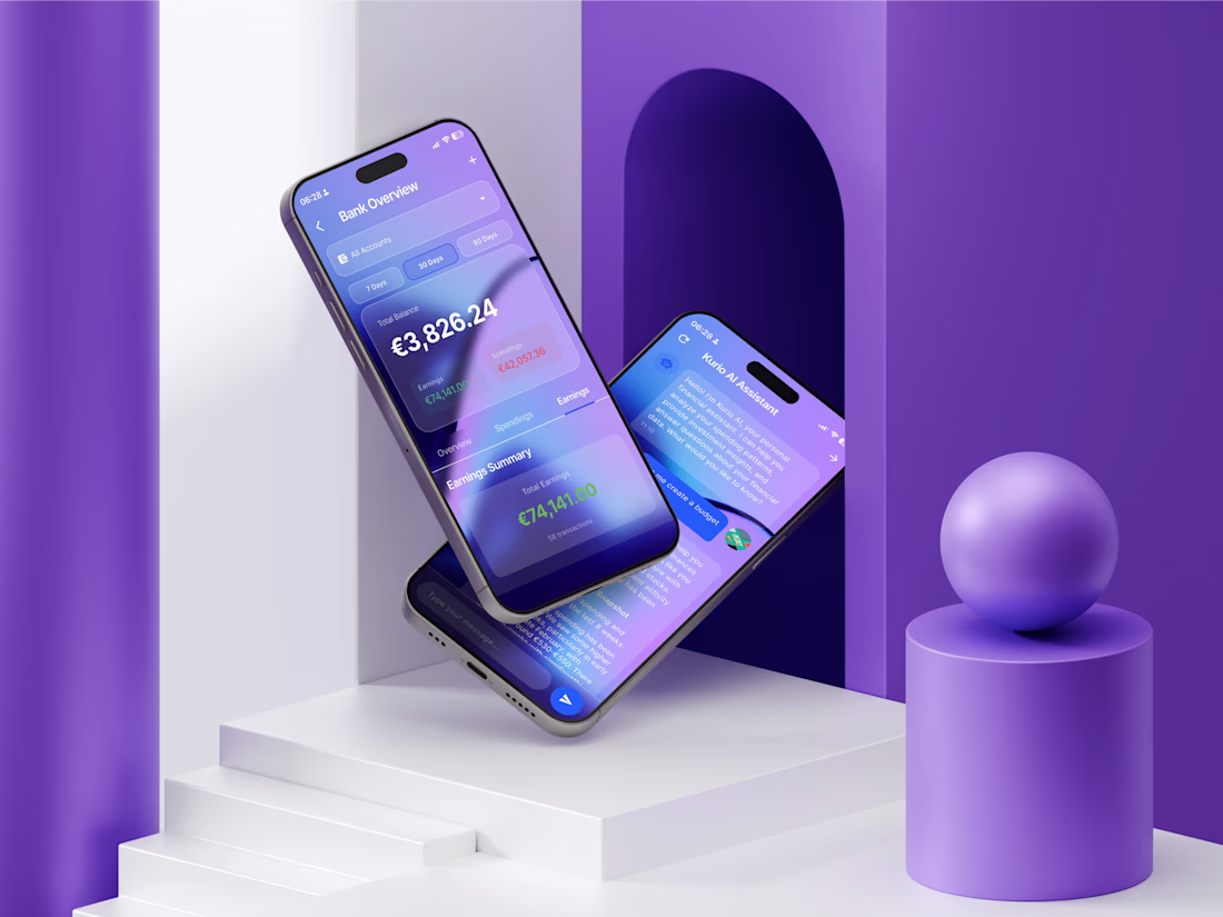
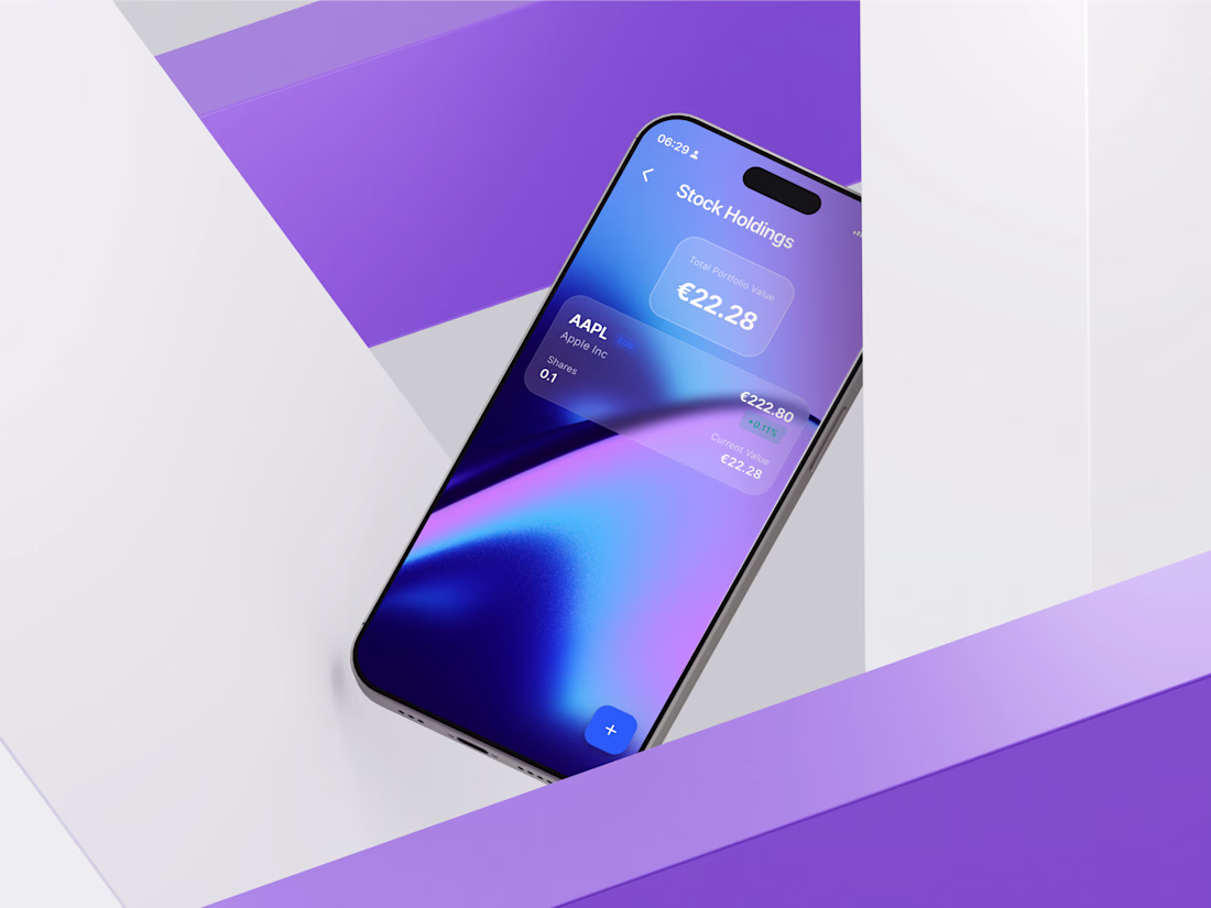
We recently finished working on Kurio.
This platform provides users with a complete view of their financial health. A single dashboard brings everything together so you always know exactly what you have.
Key features to help manage money:
🏦 Link active bank accounts
📈 Follow current stocks
🪙 Watch crypto investments
📊 Consult with the built-in AI assistant
Having accurate information enables people to act confidently.


Great!!

I studied the world’s best mobile patterns on Mobbin. From health rings to social matching, to build a research-backed moodboard. I was inspired by apps like Greg, Apple Health, Shop and Bumble. I translated these high-end UX behaviors into a cohesive design system that prioritizes clarity and local trust.
Then I jumped with all my ideas into Figma Make. Here it comes Pottr, a fusion between quantified plant health with a social graph. It includes plant care tracking but it doesn't stop there. It’s an ecosystem where you match with neighbors based on shared plants, trade seeds or tools, and request community care when you travel. It’s a premium, hyperlocal take on sustainability with custom branding and a neighborhood "open-world" map.


wow crina this is so amazing


Trending


Notion
Notion isn’t just where you work, it’s starting to work for you. What agents are you building?
portfolioreview
The best portfolios tell a story, not just show a grid. Share yours for feedback.
brandguidelines
Brand guidelines are becoming living systems, not static documents. What are you building for your clients?
aivideo
AI video tools are moving at warp speed. Which ones are you experimenting with?
freelancerlife
Freelancer life is wins, pivots, and everything in between. What’s yours right now?