The network for creativity
Join 1.25M professional creatives like you
Connect with clients, get discovered, and run your business 100% commission-free
Creatives on Contra have earned over $150M and we are just getting started
Back to feedPost

Alex Hormozi says a great offer should make people feel stupid saying no.
Most gym websites sell a membership. Price, a few photos, a “Join now” button. That’s not an offer. That’s a price tag.
So I designed FITNEX around his value equation: raise the dream outcome and the likelihood of achieving it, and cut the time and effort it takes.
→ Dream outcome. “Unlock health, energy, and vitality every morning.” It sells how you’ll feel, not a gym floor.
→ Likelihood it works. An assessment, a programme written for you, and coaches with their credentials on show. “Coaching that treats you like an athlete, not a membership number.”
→ Less waiting. Assess. Programme. Progress. Repeat. You can see the whole path before you start.
→ Less risk and effort. Simple plans from $29, no lock-in, and a first session that’s on us. “Bring shoes and an open mind.”
The design is bold and dark with a neon-green accent, so it feels like a gym floor.
When the offer is strong, the website’s job is simple: get out of the way
What’s the best offer you’ve ever seen that made saying no feel silly?
#BuildingInPublic #WebDesign #UXDesign #Hormozi #FitnessBranding


The network for creativity
Join 1.25M professional creatives like you
Connect with clients, get discovered, and run your business 100% commission-free
Creatives on Contra have earned over $150M and we are just getting started







Related posts

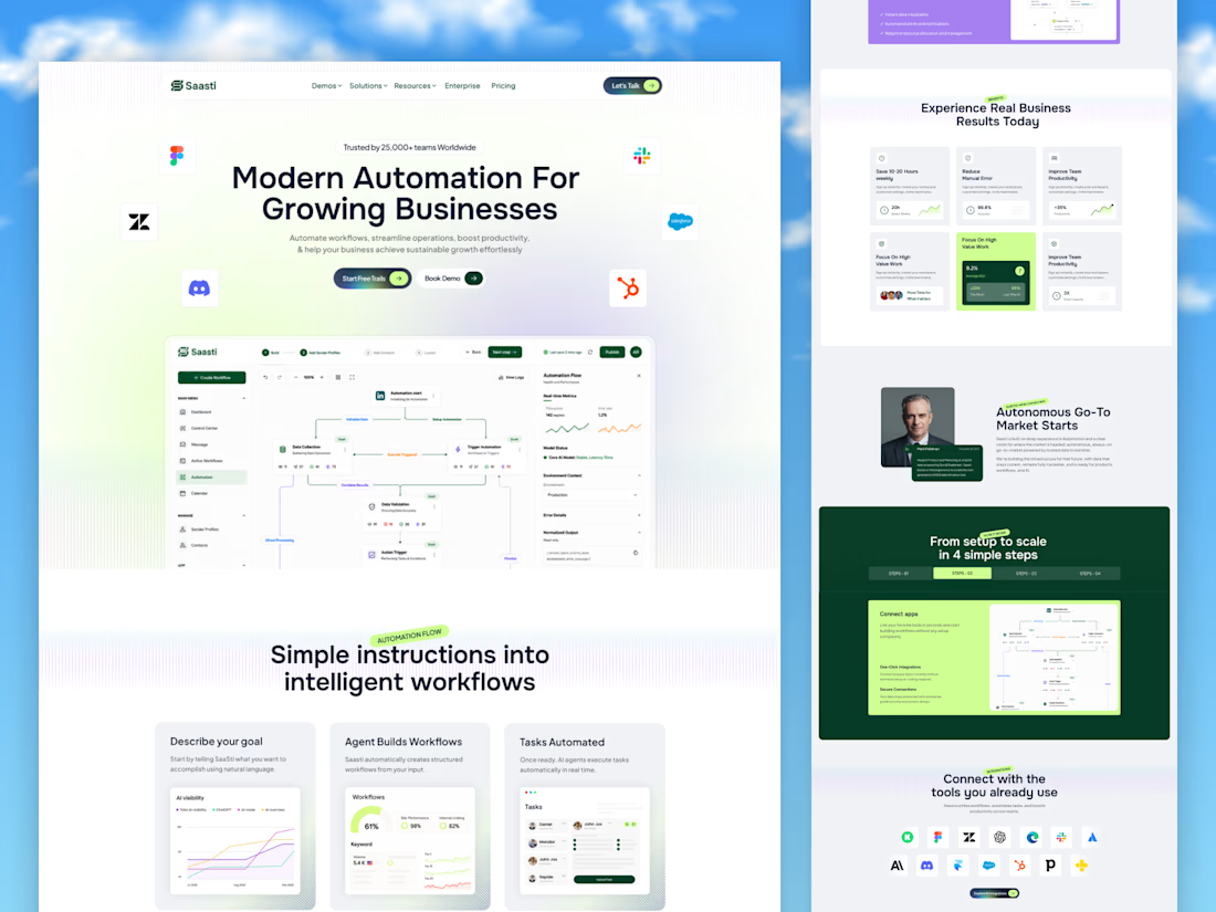
🚀 Saasti — Smart Automation for Growing Businesses
A modern SaaS website concept designed to turn complex automation into a simple, intuitive experience. With clean layouts, interactive workflow dashboards, vibrant accents, and clear messaging, every section highlights the power of smarter business operations.
✨ Modern SaaS UI/UX Design
⚡ AI-Powered Automation Experience
📊 Intuitive Workflow Dashboards
🎨 Clean, Conversion-Focused Layout
Designed by OrdainIT to bring innovation and usability together.
#SaaSDesign #UIDesign #UXDesign #AI #WebDesign #DashboardDesign #OrdainIT



Brilliant execution!

Designed a clean, modern, and responsive business website concept to showcase services, build trust, and help businesses attract potential customers.

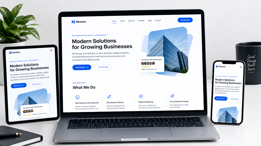

Not only is the design clean, but you also did a great job making sure it works well across different devices with a responsive design.

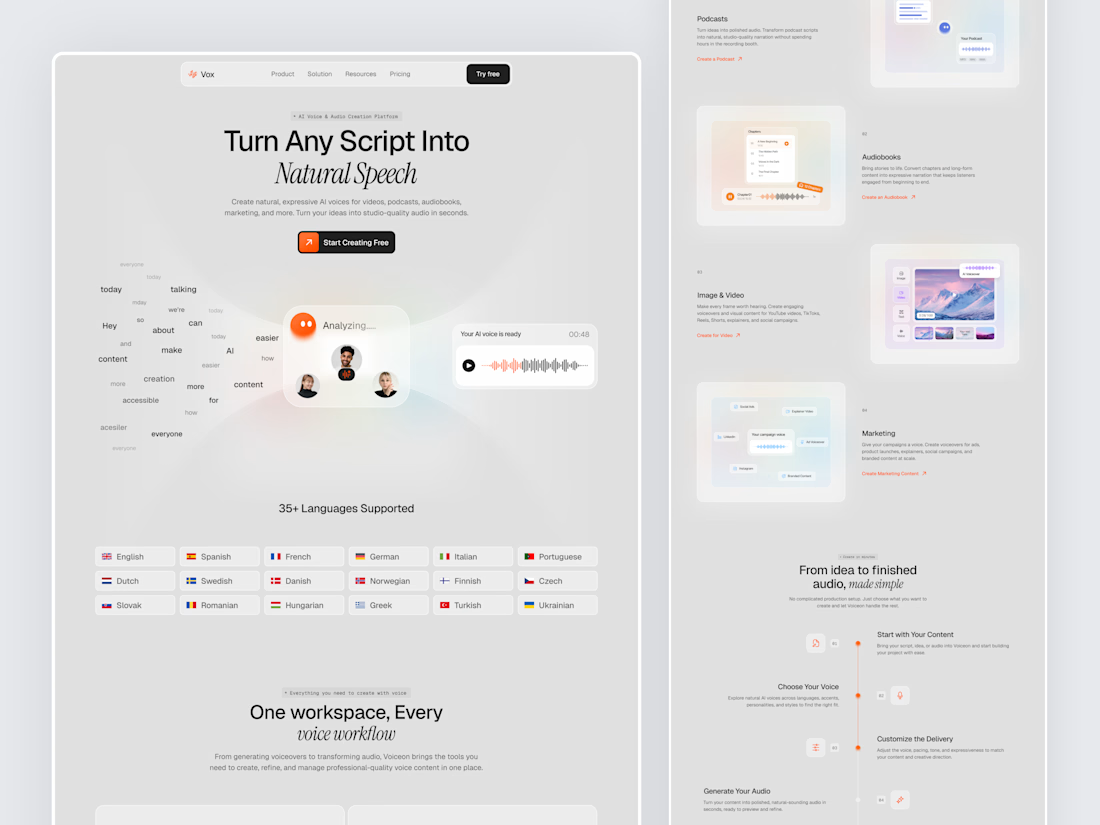
Designed a modern AI Voice SaaS Landing Page.
A soft light interface with gentle color glows, warm orange accents, and elegant italic serif headlines for a calm and creative first impression.
A floating word cloud turning into a voice wave, a language grid, use case cards for podcasts, audiobooks, video, and marketing, plus a simple step by step flow make AI voice creation feel easy to understand. Clean spacing and soft cards keep the whole page light and easy to explore.



Nice UI