The network for creativity
Join 1.25M professional creatives like you
Connect with clients, get discovered, and run your business 100% commission-free
Creatives on Contra have earned over $150M and we are just getting started
Back to feedPost

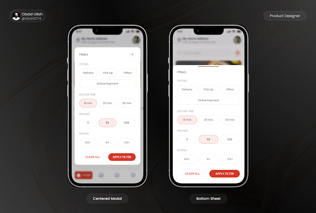
I recently explored two approaches for mobile filter interactions.
The first uses a centered modal with generous spacing.
The second uses a bottom sheet that slides up from the bottom.
The content remains the same:
• Offers
• Delivery Time
• Pricing
The difference is how the interaction feels.
A bottom sheet keeps users closer to the context of the screen, makes one handed interaction easier, and creates a smoother browsing experience. A centered modal works well for focused decisions but can feel disconnected from the current task on mobile.
Small interaction decisions like these have a significant impact on usability.
Which approach would you choose for a mobile shopping experience?
The network for creativity
Join 1.25M professional creatives like you
Connect with clients, get discovered, and run your business 100% commission-free
Creatives on Contra have earned over $150M and we are just getting started





Related posts


Built the StupidFish Design System from the ground up and covering everything from color, typography, spacing, and components to comprehensive documentation.
Designed and documented for both web and mobile, creating a consistent, scalable foundation that makes product design and development faster and more cohesive.
Check out the full case study here →


Really thorough system, nice job

Post
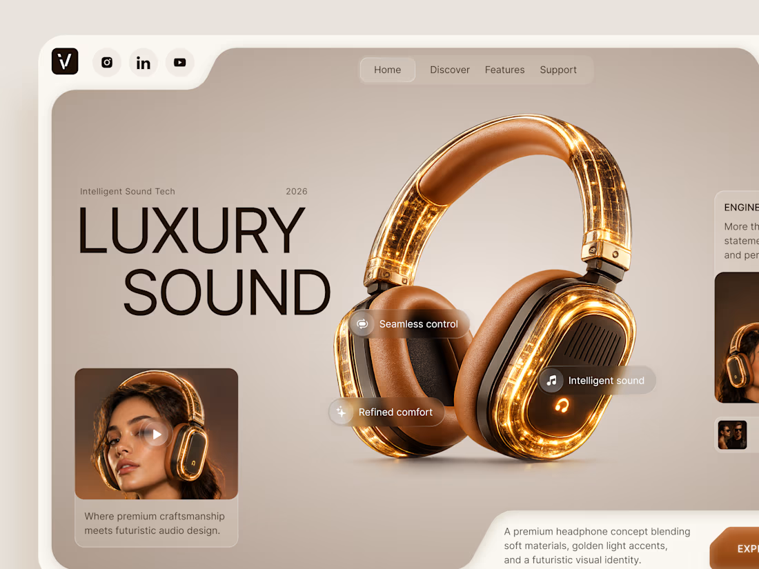
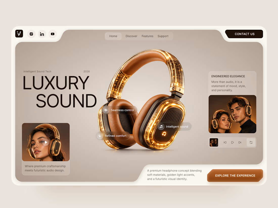
Luxury Sound — Premium Headphones Landing Page 🎧✨
A premium landing page concept for a luxury audio brand, built around a bold headphone design and a refined visual experience
The design combines warm neutral tones, glowing details, oversized product visuals, and minimal typography to create a futuristic yet elegant feel
Special attention was given to:
• Product-first composition
• Premium visual direction
• Feature highlights
• Lifestyle imagery
• Clear CTA placement
• Responsive mobile experience
The result is a clean, immersive product experience that makes the headphones feel like more than tech — they become part of the lifestyle 🔥


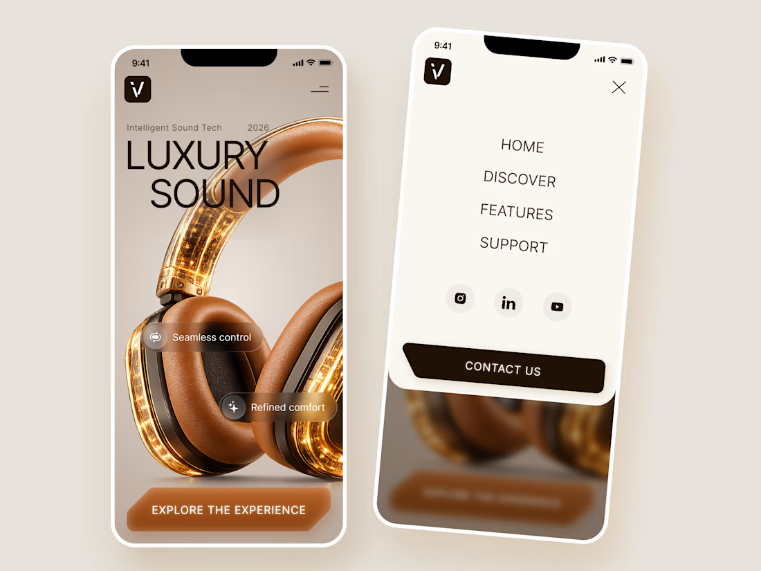

The amber glow on the headphones against that warm beige is lovely. How does the mobile menu handle the product image?

NURV® 🟠
Phase 39/35. Readiness 94%. 4/28 laps.
A swim, nutrition and supplement app where every number is made of dots and the only color is the one that matters.

Dots as the only visual language with one orange accent is a bold, consistent call.