The network for creativity
Join 1.25M professional creatives like you
Connect with clients, get discovered, and run your business 100% commission-free
Creatives on Contra have earned over $150M and we are just getting started
Back to feedPost

As a graphic designer who used to teach English online... I absolutely loved working on this! Check out my project: https://yourenglishtutor.lovable.app/ ✨

yourenglishtutor.lovable.app
Elena Marsh — Personal online English tutoring
Build confidence in English with personal online lessons shown in your local time.

From booking chaos to a calendar you’re excited to open...?
Meet Elena! 👋
She’s an English tutor based in NYC and she loves to teach...
But managing her...
The network for creativity
Join 1.25M professional creatives like you
Connect with clients, get discovered, and run your business 100% commission-free
Creatives on Contra have earned over $150M and we are just getting started



Related posts

Smart Glasses Landing Page
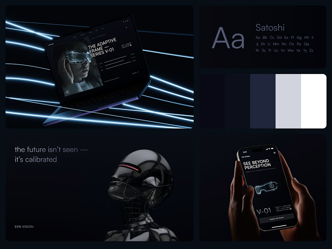
"See beyond perception." Three words on the phone, and the whole page had to earn them.
On desktop, the headline starts over the edge of a tall portrait of the glasses being worn, so the product name and the product in use read as one image. Next to it, reaction, light and depth sit as three thin gauge lines, each with a one-word reading. Specs, without a spec table.
On mobile, a 3D render of the frame sits between the headline and a single Explore the Series button. One image, one next step.
The palette stays in deep navy and soft gray, so the cool light on the frame stands out on every screen.
Designed by the Hue & Machine team.
#WebDesign #LandingPage #ProductDesign #WearableTech #DarkUI #UIDesign #TechProduct #ResponsiveDesign #UXDesign #FigmaDesign



Good work

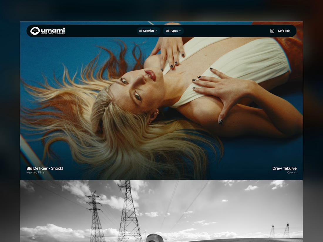
Umami Color & Finishing is an established color-grading studio in LA. Its work and reputation had outgrown its old site, and the studio was ready for one at the level of its work.
I designed and built it around the work itself: every project filterable by type and colorist, and every view with its own link, so the team can send a lead exactly what fits.
Case study
Live site: umamicolor.com

this is amazing work

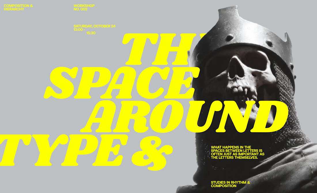
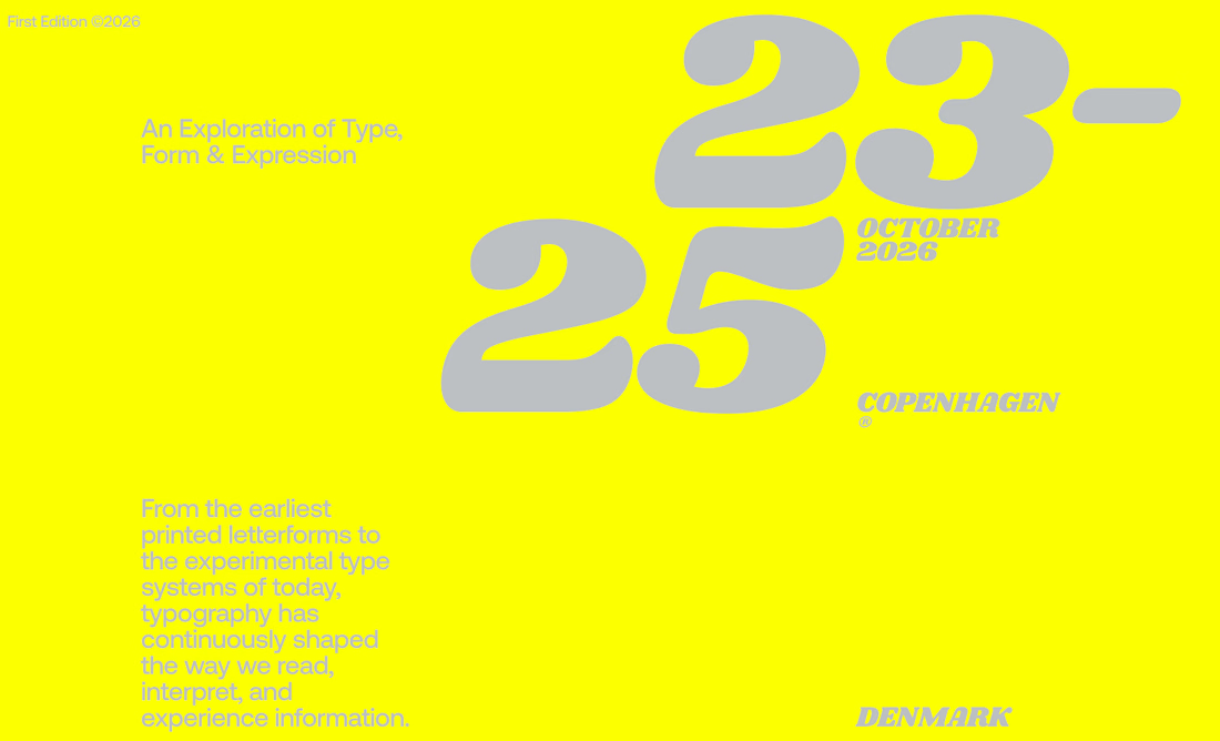
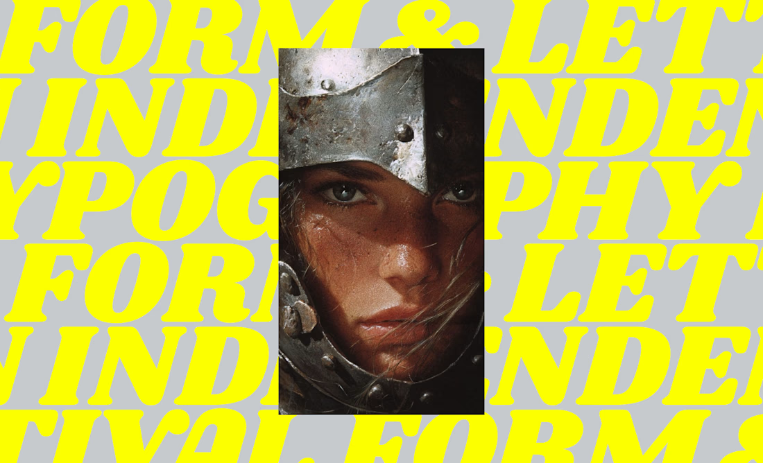
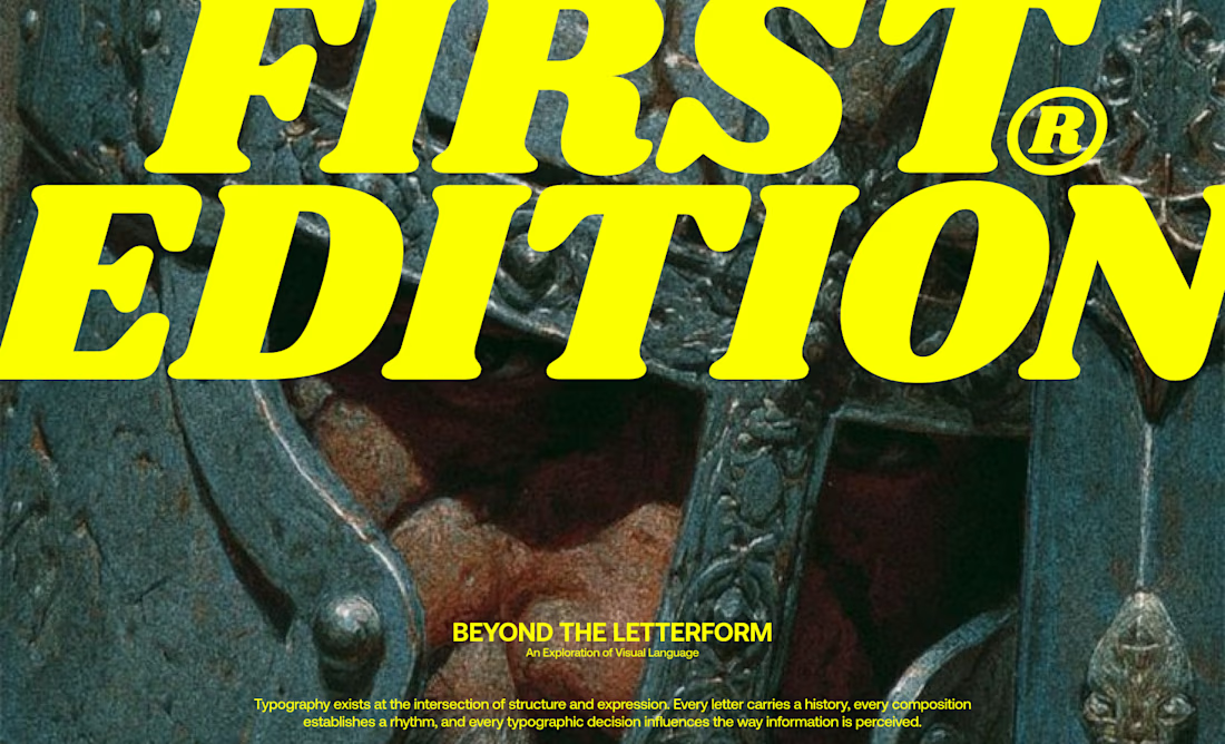
I designed a series of editorial-inspired layouts for a fictional typography event and workshop focused on the history of type.
↳ Master typography & layout - The foundation of timeless web design. Join 350+ designers inside my 13-hour online course https://typomonday.com/course

i love your compositions, always so inspiring:))