The network for creativity
Join 1.25M professional creatives like you
Connect with clients, get discovered, and run your business 100% commission-free
Creatives on Contra have earned over $150M and we are just getting started
Back to feedPost

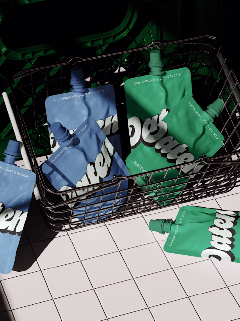
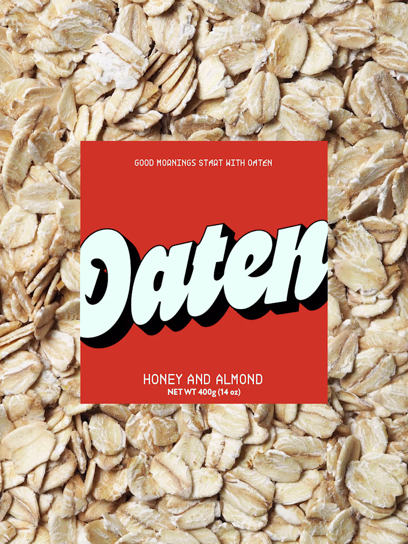
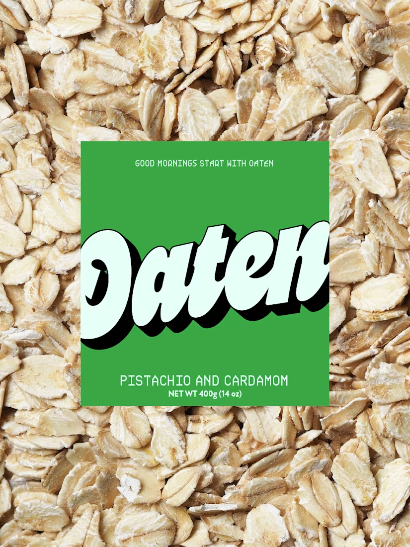
For Oaten, I wanted to break away from the usual neutral oat branding and create something bold and memorable.
I curated a retro inspired colour palette to give it real shelf impact, paired with a playful oversized logo for personality and depth. A clean secondary font keeps everything balanced and easy to read.
The goal was to make an oat brand that feels fresh, distinctive and anything but generic.
The network for creativity
Join 1.25M professional creatives like you
Connect with clients, get discovered, and run your business 100% commission-free
Creatives on Contra have earned over $150M and we are just getting started
Related posts

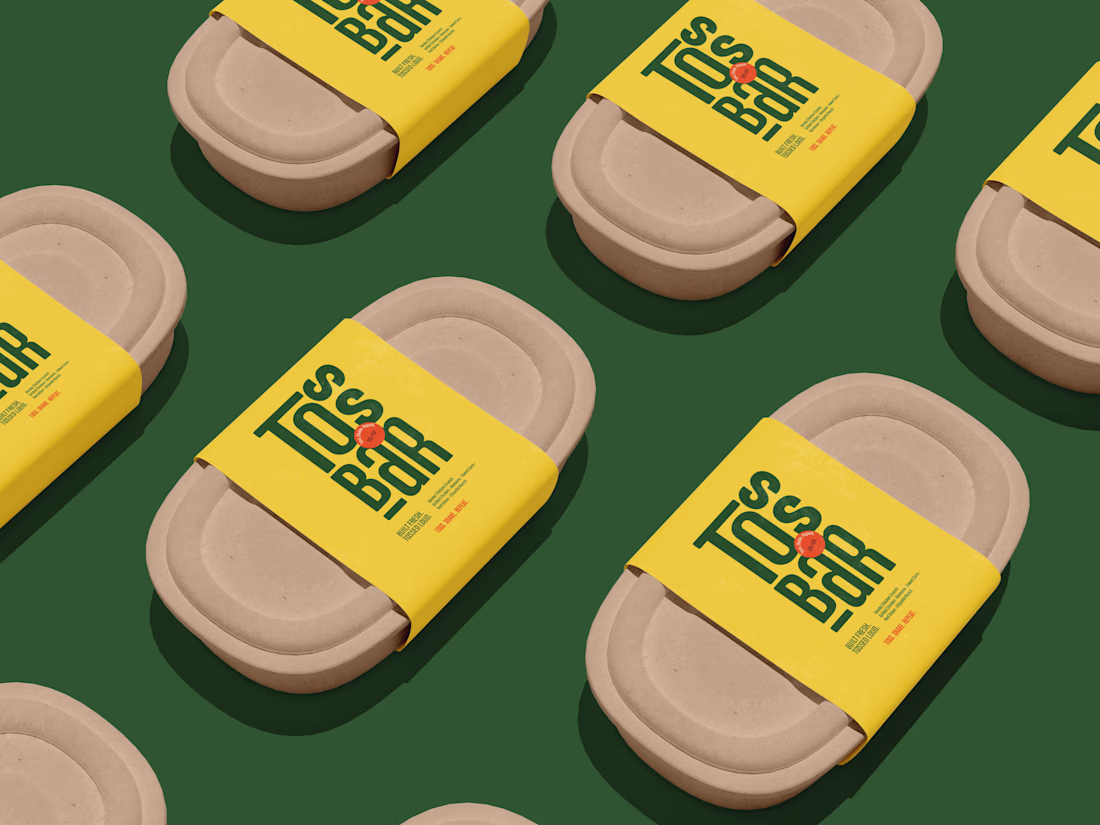
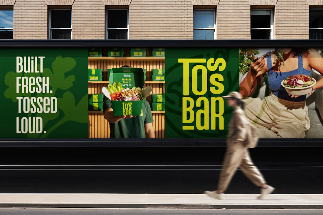
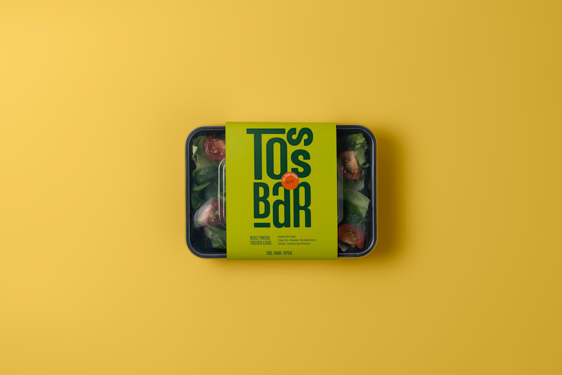
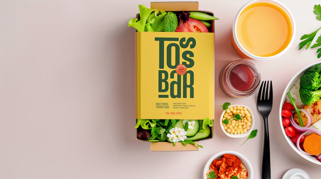
Designed a bold, high-energy identity for a salad concept called Toss Bar.
The idea was simple: healthy food, but make it loud.
Visually, I focused on Bold green tones for freshness
, High-impact yellow for appetite & visibility, Condensed stacked typography for memorability
, Strong color blocking for maximum brand recall
The result is a brand that feels confident, energetic, and modern not soft or generic.
As fellow creatives, I’d love to know does the tagline system strengthen the brand voice?
Share your view in the comments 👇✨


Perfect branding that people cannot ignore, I loved the colors


Social media for a sports-tech brand can easily slip into clichés.
For GRANDS, I wanted something more controlled and more precise. The platform is built around alignment and competitive energy, so the social system had to reflect a structured approach, not chaos.
I designed a modular template system that works like building blocks. Match announcements, player highlights, feature updates, community moments: each format has its own layout logic, but everything lives inside one cohesive grid.
Bold typography creates impact. Clean spacing builds trust. Strong contrast keeps it sharp and credible.

"Love how you turned social media into a reflection of the brand’s precision and competitive energy. The modular template system feels smart structured yet flexible and the bold typography really gives it impact while the clean spacing keeps it credible. This is next-level thoughtful design for a sports-tech brand.


Trending
maxearnings
The next frontier of payments is live on Contra. How are you maximizing revenue?
freelancerlife
Freelancer life is wins, pivots, and everything in between. What’s yours right now?
aidesignflow
AI tools are redefining how designer work. What does your workflow look like?
micrographics
Micrographics started as utility - barcodes, packaging, instruction labels. How would you use them?
aivideo
AI video tools are moving at warp speed. What tools are you using?