The network for creativity
Join 1.25M professional creatives like you
Connect with clients, get discovered, and run your business 100% commission-free
Creatives on Contra have earned over $150M and we are just getting started
Back to feedPost
Taste Test
Working on the identity system for Vaulta, a Web3 wallet where digital ownership feels as premium as it should.
One detail I've been refining: the credential badge. It's not just decorative, it represents the user's verification tier within the ecosystem. Their reputation, distilled into one glowing icon.
The shape carries meaning. A hexagon reads technical and precise. A circle feels clean and universally trustworthy. Both work, but each sends a different message before the user reads a single word.
I know which direction I'm leaning, but fresh eyes always catch what you miss when you've been staring at something too long. Which shape feels more aligned with a premium Web3 credential to you?
🔷 Hexagon
🔵 Circle
2 voted
67%
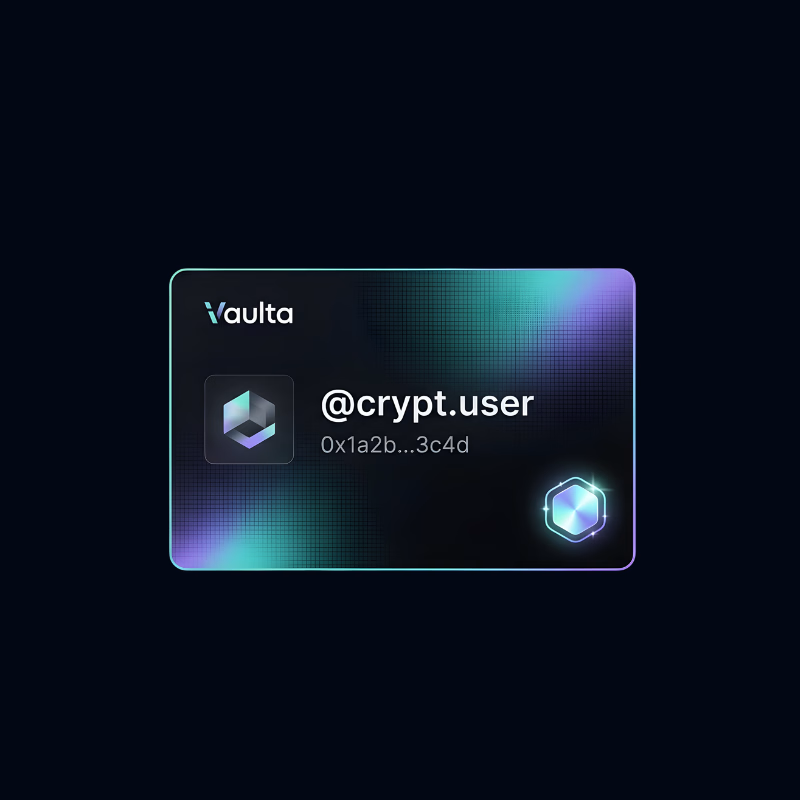
1 voted
33%
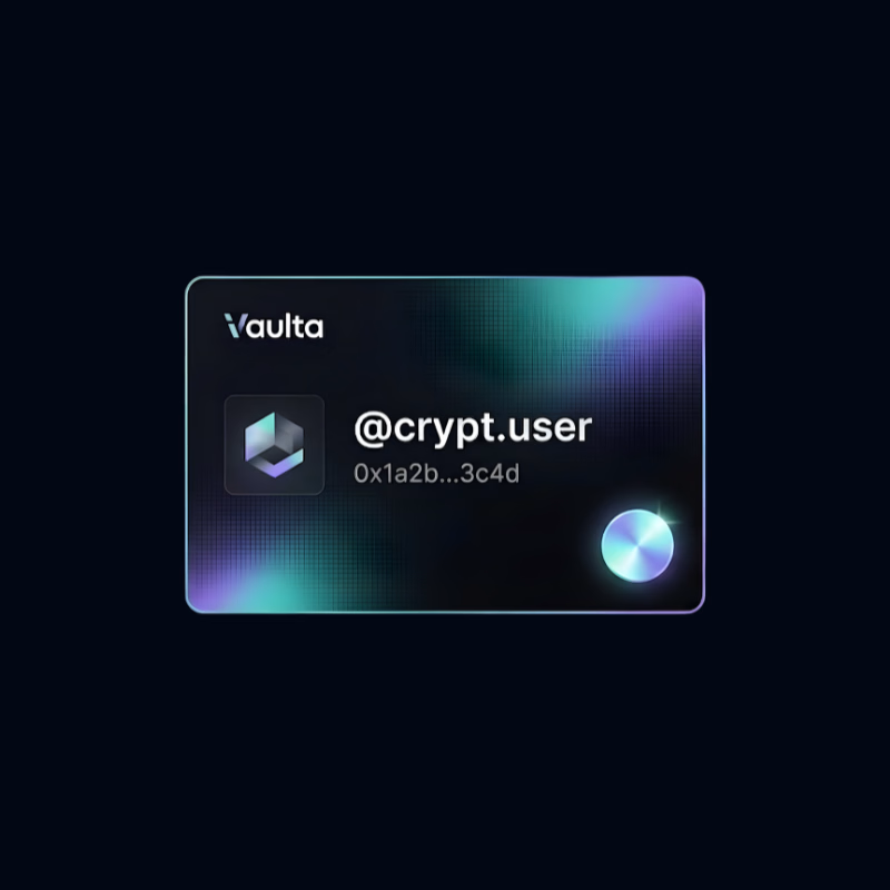
3 votes
Closed


I agree with you namesake!
The network for creativity
Join 1.25M professional creatives like you
Connect with clients, get discovered, and run your business 100% commission-free
Creatives on Contra have earned over $150M and we are just getting started





Related posts

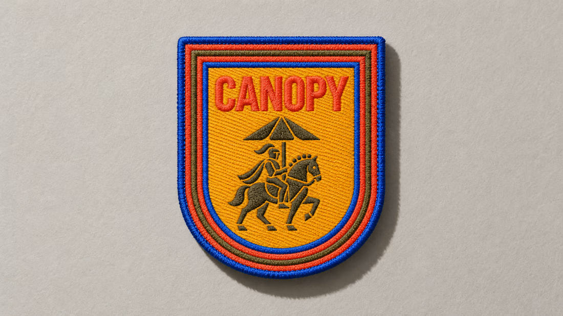
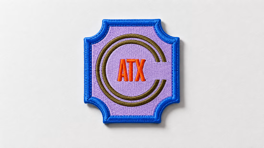
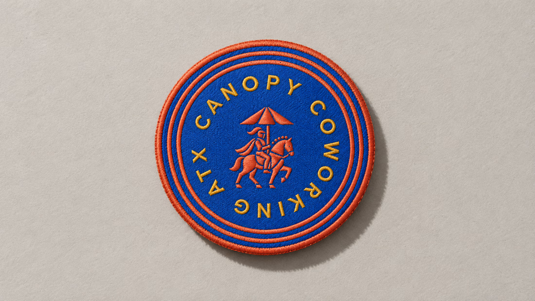
A little preview of something I’m working on.
These embroidered patches are a small part of a much larger brand system, but details like this matter. The challenge is making sure the identity still feels distinct and intentional when it moves from screen to something physical you can hold in your hand.
That’s where a strong brand system starts begins to prove itself. More soon :)

3D Motion Design - A vs B Poll - Minimal White vs Premium Detailed Copper coins with F logo flowing in spiral. Which feels more premium? Rendered in Blender 4.2, 4:3 (1600x1200), 98% photoreal.
2 voted
13%
13 voted
87%
15 votes
Closed


That's really premium 🔥🔥👑👑