The network for creativity
Join 1.25M professional creatives like you
Connect with clients, get discovered, and run your business 100% commission-free
Creatives on Contra have earned over $150M and we are just getting started
Back to feedPost

bi·(h)ome /ˈbaɪ·hoʊm/ · noun
1. a home that holds still yet feels alive. Video that stays composed while its surroundings quietly move, building a depth of field that draws the eye in.
2. design. The meeting of modernism and nature; luxury type paired with script, refined and organic at once.
3. motion. Interface and interactions carried on the same smoothness, eased by a custom spring built for the feel of peace at home. Concept piece. Designed in Figma, built in Webflow, motion with GSAP.
Currently open for architecture and interior projects → send a message


Love this!


Fantastic work !

Structuring the post like a dictionary entry for bihome is a clever way to introduce the concept before showing it. Did the depth of field motion concept come first, or did that follow once you'd locked in the modernism meets nature direction?


the dictionary entry framing is a nice touch

Best shots 🙌

It's cool bro

The network for creativity
Join 1.25M professional creatives like you
Connect with clients, get discovered, and run your business 100% commission-free
Creatives on Contra have earned over $150M and we are just getting started





Related posts

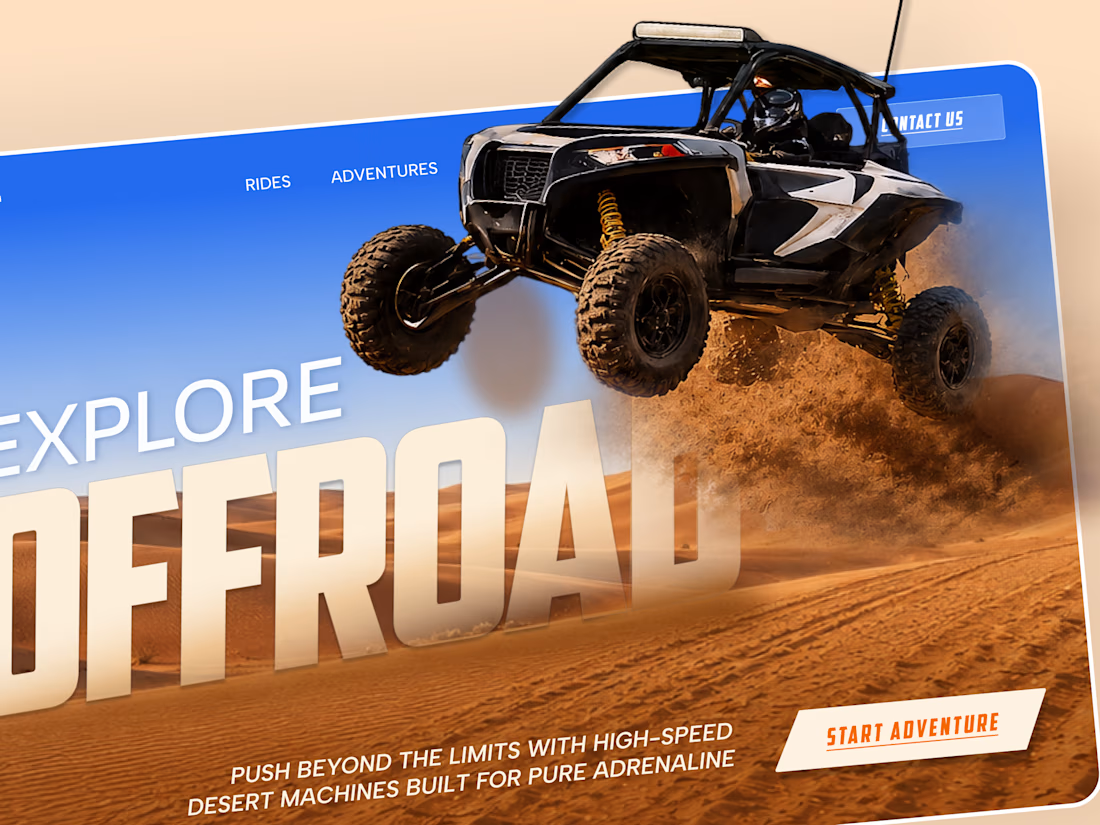
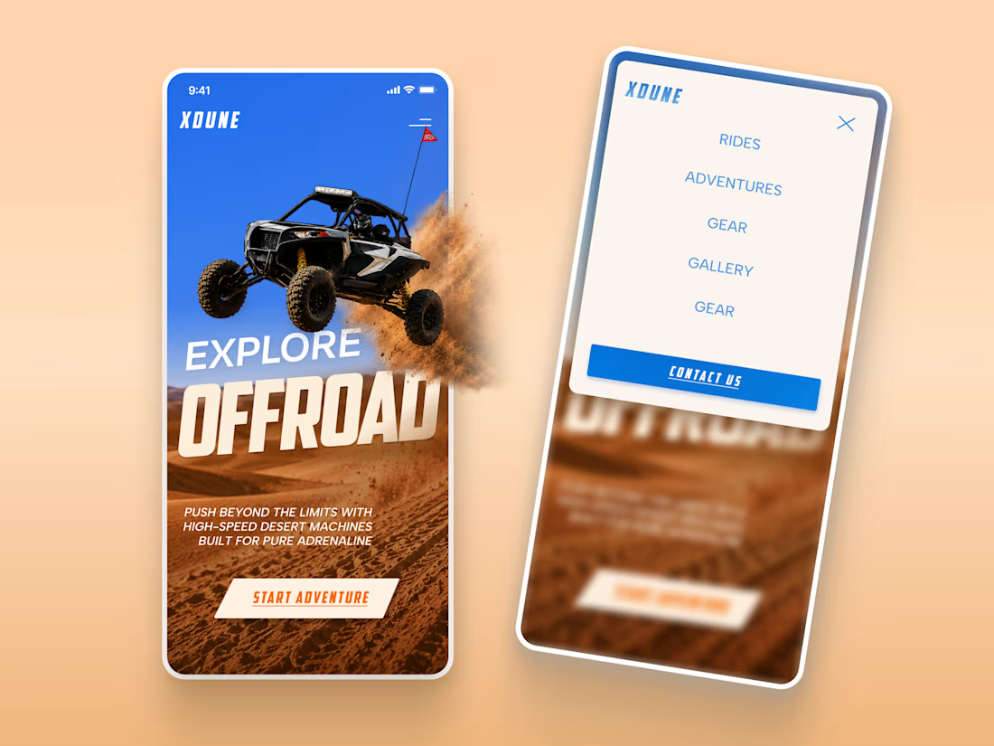
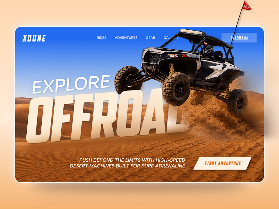
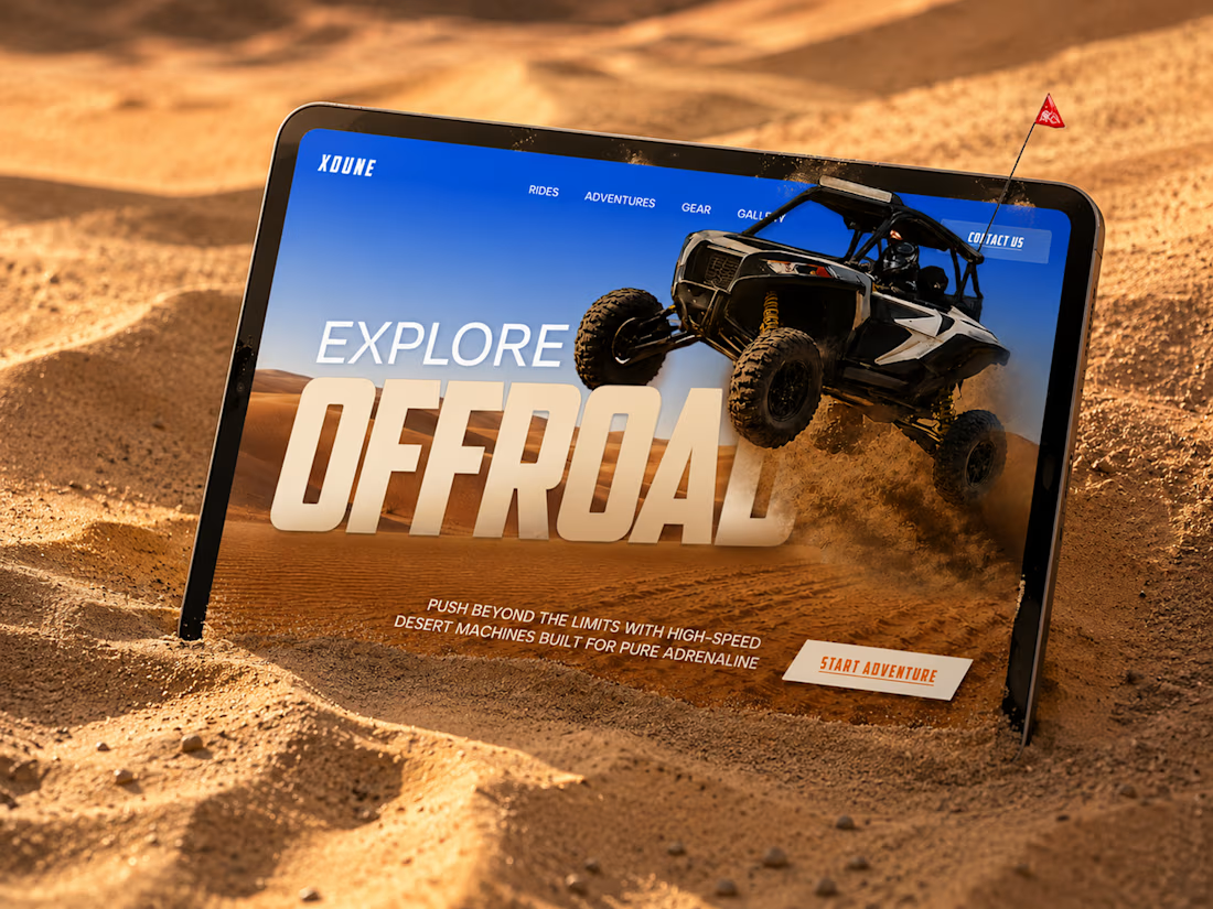
XDUNE — Off-Road Adventure Landing Page
A bold landing page concept built around speed, freedom, and off-road adventure 🔥
The visual direction combines desert landscapes, oversized typography, and a dynamic vehicle composition to make the experience feel energetic from the first screen
Special attention was given to:
• Strong action-focused hero composition
• Bold typography and clear hierarchy
• Desert-inspired visual atmosphere
• Adventure-focused CTA
• Responsive mobile experience
• Simple and clean navigation
The result is a high-energy landing page that feels fast, adventurous, and made for people who want to get off the road
Looking to create a bold website for an automotive, outdoor, or adventure brand? Let’s connect 🚀


love the vibe


New Brand Identity project alert! 🚨
GATE108 is a forward-thinking ecosystem bringing together people, ideas, experiences and new ways of living, working and connecting.
We’ve been their long-term design partner, shaping and continuously evolving a flexible visual ecosystem across visual strategy, brand identity, creative direction, digital experiences, event assets, 3D motion and social media.
Inspired by the idea of GATE108 as a gateway into a multidimensional world of people, ideas and possibilities, we’ve built a brand system designed to move, adapt and grow across physical and digital spaces.
As the brand evolves, we continue to create new expressions while keeping the wider ecosystem cohesive, recognisable and ready for what’s next.


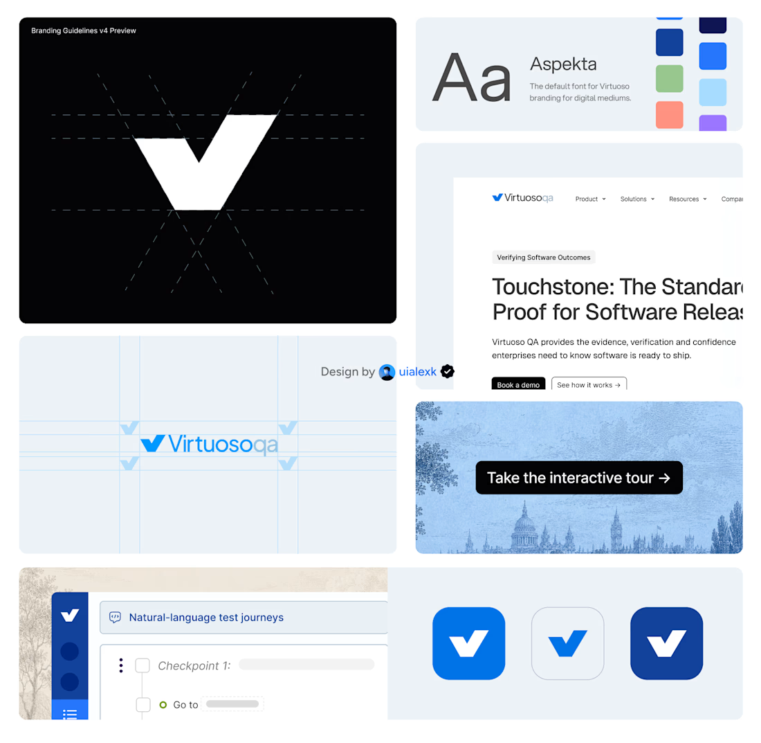
Branding v4 for Virtuoso
This design evolution, made an impact to the brand growth's by:
- Webflow to Framer migration of 150+ static pages and 500+ CMS
- Increasing website conversions
- Having consistent brand presence across digital mediums
- Increase brand awareness


Amazing!


