The network for creativity
Join 1.25M professional creatives like you
Connect with clients, get discovered, and run your business 100% commission-free
Creatives on Contra have earned over $150M and we are just getting started
Back to feedPost
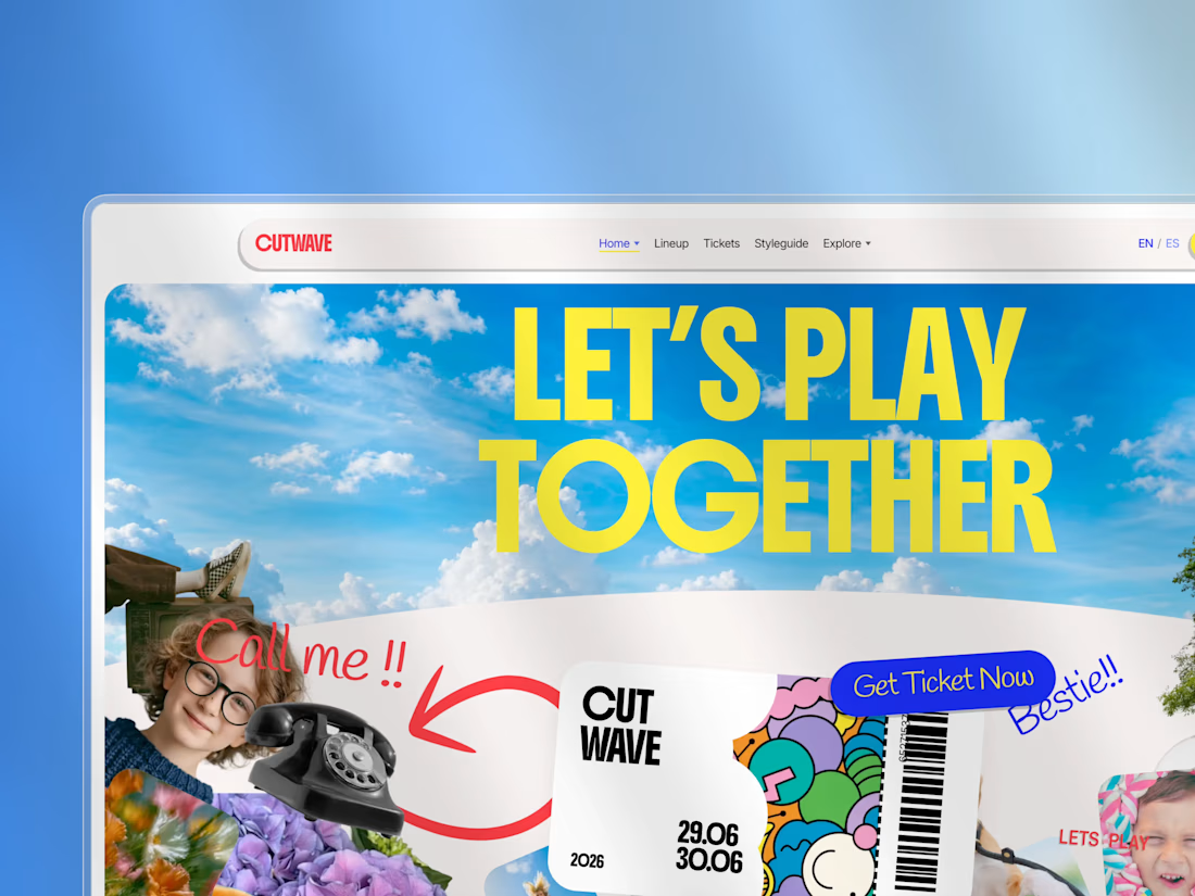
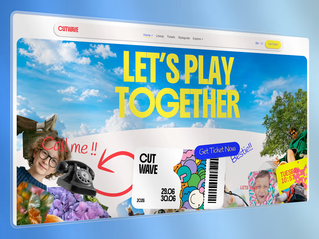
Cutwave is a premium festival & event website theme built with Astro 6. It ships as a static frontend — no CMS or payment provider locked in — so agencies and freelancers can brand it, connect their own stack, and deploy anywhere.
The visual language is a high-energy collage / scrapbook system: rotated cutouts, sticker CTAs, expressive display type, cream card sections, and intentional home-page motion (GSAP + Lenis).
Who it’s for
Festival, rave, conference, and cultural-event organizers
Agencies building one-off event microsites for clients
Freelancers who need a distinctive Astro starter that isn’t another SaaS landing page
What’s included
Pages
Home (collage hero + motion stack)
Alternate home demo (/demos/alt)
Spanish locale demo home (/es/)
Lineup + artist detail
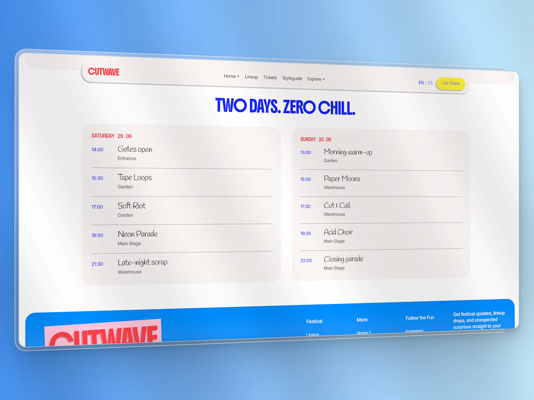
Schedule (two-day timeline)
Experiences
News / blog index + post
Gallery + accessible lightbox
Location (venue + map hook)
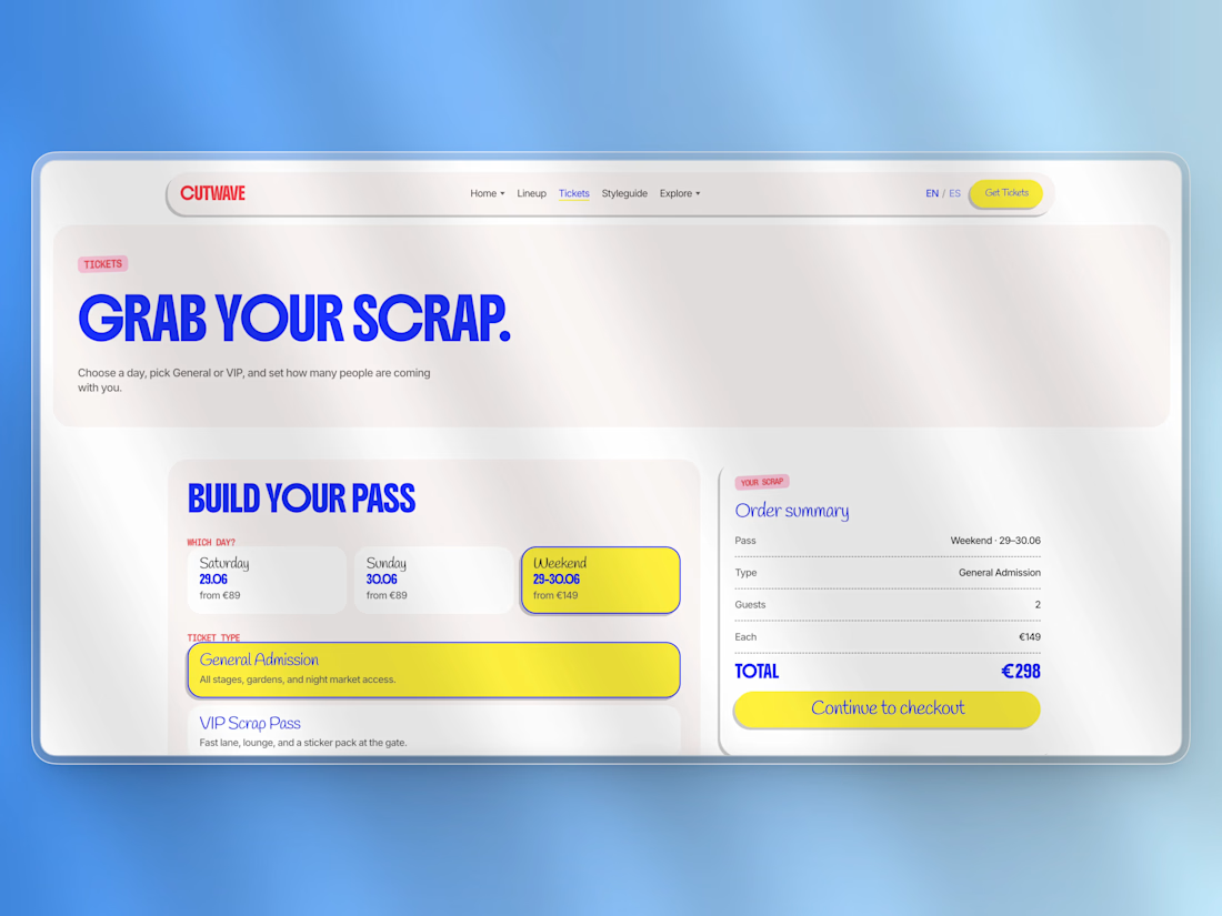
Tickets (picker UI → checkout integration hook)
Contact, FAQ, Privacy, Terms
Styleguide (live tokens & components)
Custom 404
UI & UX
Slim sticky nav with Home variants dropdown + Mega Menu (pages & components)
Mobile drawer / accordion
Design tokens in CSS (colors, type buckets, spacing)
Sticker / pill buttons, ticket graphic, photo cards, widgets
Content
Astro Content Collections (JSON/MD) for artists, schedule, experiences, tickets, posts, gallery
Easy to replace demo copy and images
Motion
GSAP + ScrollTrigger on the home page
Lenis smooth scroll
Documented recipes in docs/ANIMATIONS.md
Integration-ready
Ticket checkout hook: src/lib/checkout.ts
Contact & newsletter form actions via config
Optional Decap CMS starter in extras/
Sitemap + SEO / Open Graph / JSON-LD
Docs for buyers
Installation, customization, integration, site map, animations, credits, commercial license
Tech stack
Astro 6 (static)
TypeScript
GSAP, Lenis
Fontsource (Boldonse, Inter, Handlee, Chivo Mono, Libre Barcode 128)
Deploy: Netlify, Vercel, Cloudflare Workers (workflow included)
Requirements
Node.js ≥ 22.12
npm (package-lock.json included)
What you get in the ZIP
Full source theme
LICENSE (commercial — 1 production project)
Buyer docs + preview screenshots
START_HERE.md quick guide
Demo assets (replace before production — see CREDITS.md)
License (summary)
Commercial proprietary license by USG STUDIO.
One production project per purchase. No redistribution or resale of the template.
See LICENSE in the package for full terms.
Support
Product & licensing: usgstudio.dev
Live demo: usgcutwave.netlify.app




thank you very much @Aminul I. for your feedback, means a lot for our small studio.
The network for creativity
Join 1.25M professional creatives like you
Connect with clients, get discovered, and run your business 100% commission-free
Creatives on Contra have earned over $150M and we are just getting started



Related posts

Photographer Portfolio Website
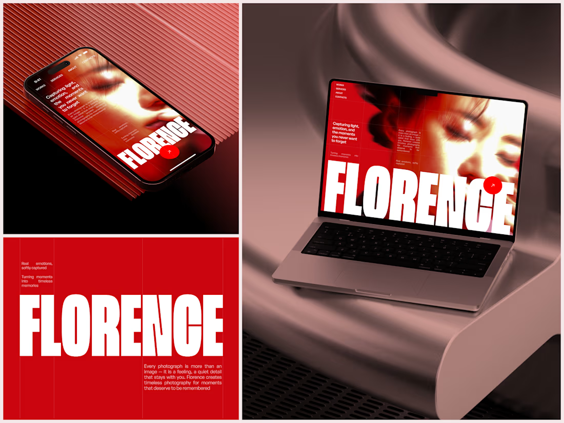
"Capturing light, emotion, and the moments you never want to forget." That line set the tone, and the layout follows it.
The hero is one motion-blurred portrait washed in red. The photographer's name runs across the bottom in a condensed white face, so large the screen cuts it off. The photo keeps its soft focus, and the name still reads first.
Thin grid lines split the page into narrow columns, and the small copy sits justified inside them. The loose photo gets a strict structure to lean on.
A single round red button with an arrow sits right on the letters and marks where to go next.
Designed by the Hue & Machine team.
#WebDesign #Photography #PortfolioWebsite #EditorialDesign #Typography #UIDesign #ProductDesign #CreativeDirection #ResponsiveDesign #FigmaDesign



The heavy condensed white FLORENCE over the red portrait is bold, and keeping the same red across phone, laptop and type tile makes the case study read as one system. Did the red come from the photographer's own work, or was it your call?

Rebuilt my portfolio with AI and added new case studies.
Brand, web, and product UI. All custom coded, all in one page.

One page with brand, web and product UI together is a strong move. Clients see the range without clicking around. Rebuilding mine with AI coding tools taught me the same thing: the speed lets you spend the saved time on the case study writing, which is what actually wins work.

A website hero and motion identity concept for Cycle.
The experience takes the viewer through seven historical eras in one continuous forward journey, while the logo, camera path and core composition remain consistent.
The concept explores how a static identity can become a living digital experience through motion, environment and interaction.
Workflow included Spline, Claude via MCP, Midjourney and SeaDance.
Available for brand identity, motion and digital design projects.


I fall in love, It is like Encarta, but 1000% better