The network for creativity
Join 1.25M professional creatives like you
Connect with clients, get discovered, and run your business 100% commission-free
Creatives on Contra have earned over $150M and we are just getting started
Back to feedPost

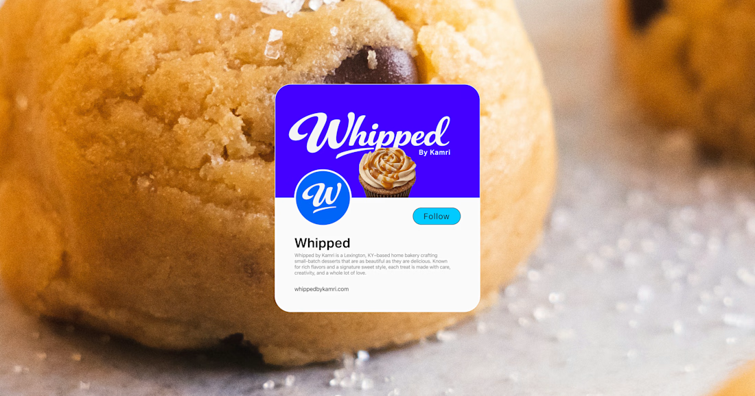
A fresh identity for Whipped, a small-batch bakery based in Lexington, Kentucky.
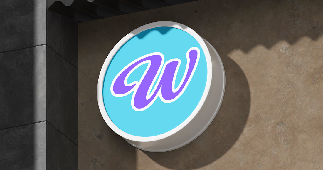
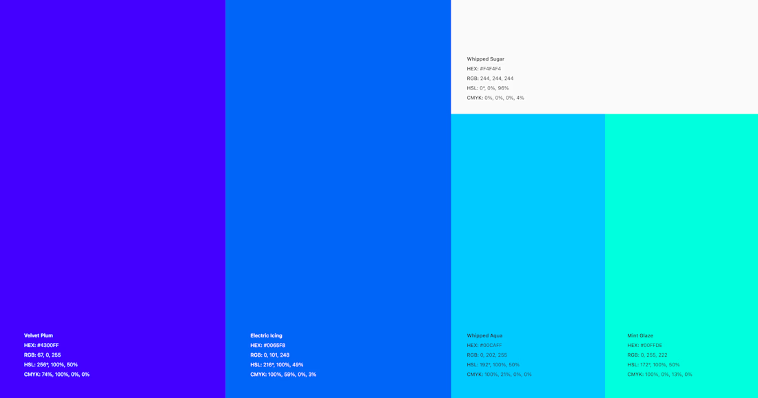
The brand was built around custom lettering drawn by hand to give it the same personality as the desserts themselves: playful, expressive, and impossible to overlook. The script wordmark is paired with a bold, energetic color palette and a simplified “W” mark that can flex across packaging, signage, social media, and digital touchpoints.
The goal was to create something that feels homemade without looking small, giving Whipped a recognizable identity that can grow alongside the business.


The network for creativity
Join 1.25M professional creatives like you
Connect with clients, get discovered, and run your business 100% commission-free
Creatives on Contra have earned over $150M and we are just getting started





Related posts

Bring back mascot logo's 🙌
Ram logo 'Stagepaid'.

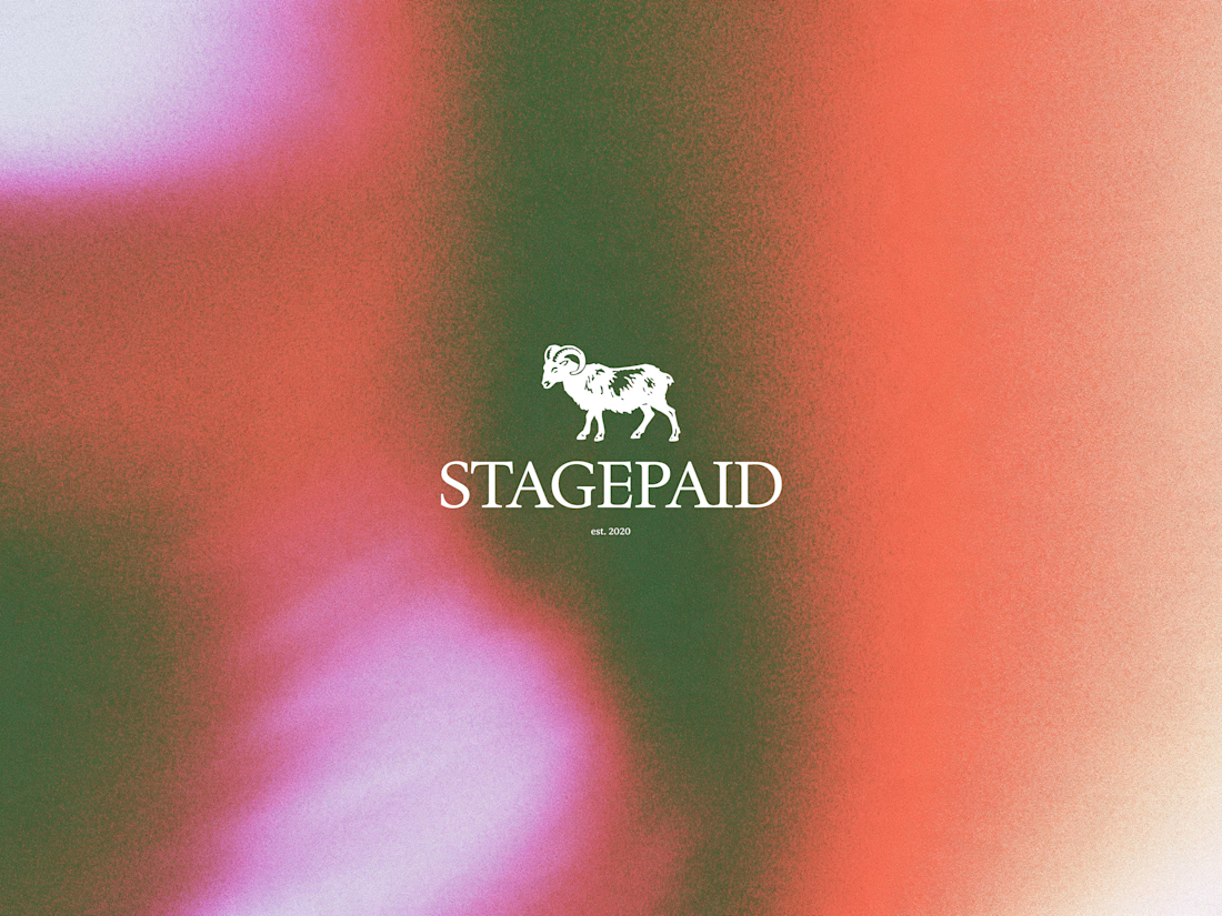


cool work! love mascot logos :D


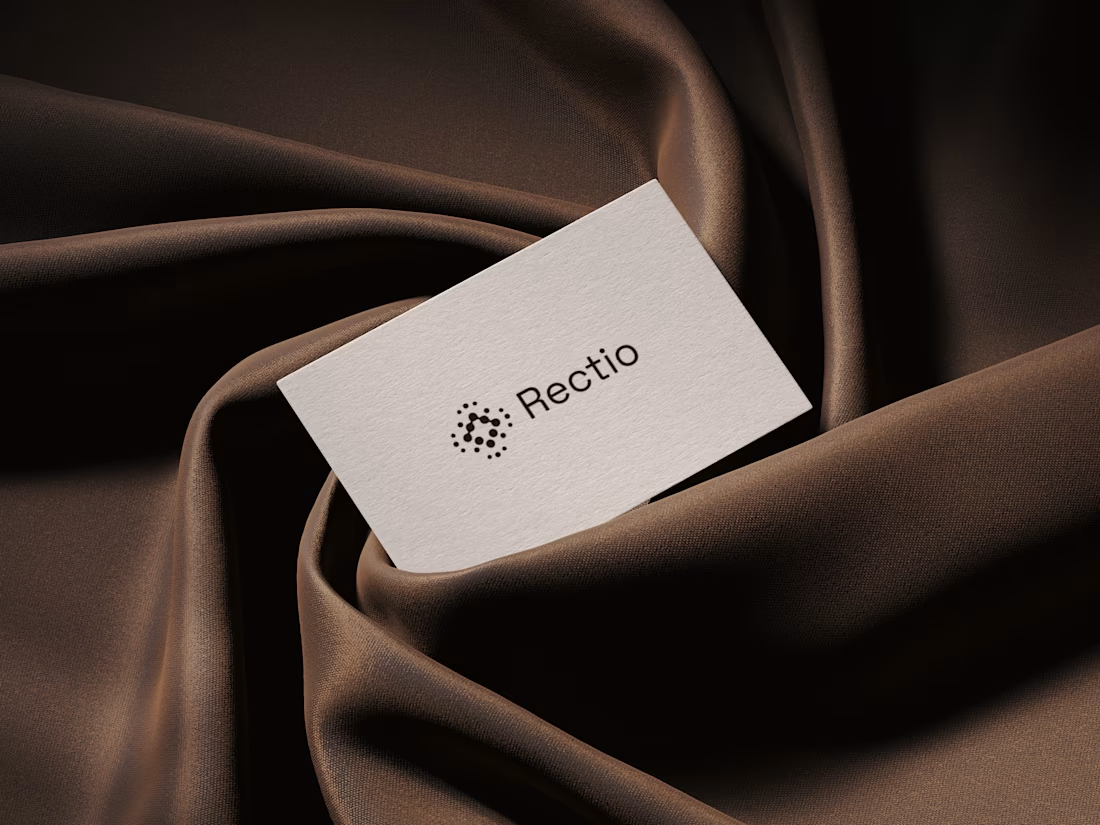
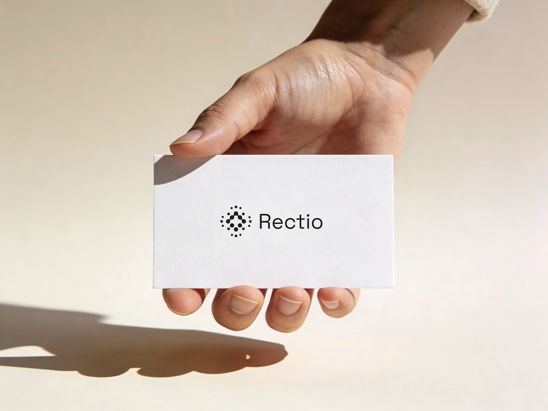
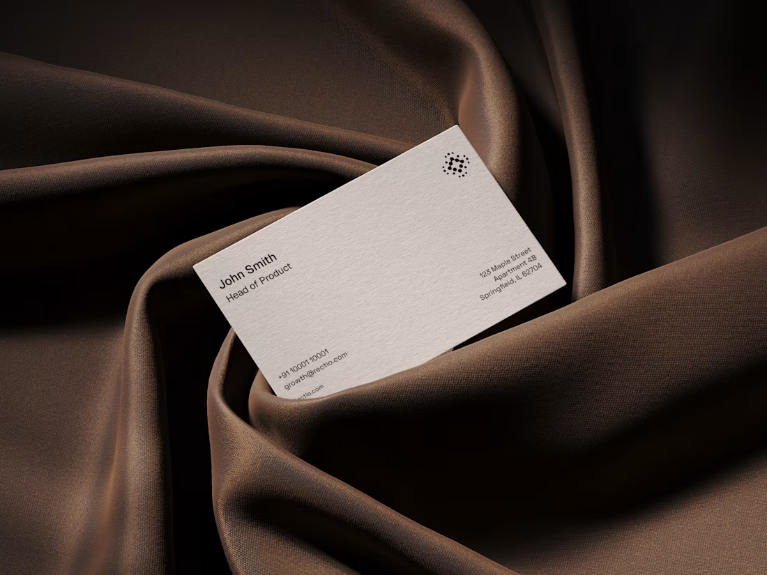
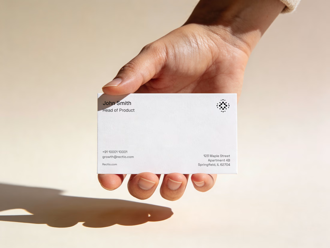
Rectio — Brand Identity
Brand Identity • Visual Direction • Business Cards • Mockups
A modern and minimal branding direction for Rectio, from visual identity to business card applications.
Created by Artonest Design Studio — artonest.design






Great work!