The network for creativity
Join 1.25M professional creatives like you
Connect with clients, get discovered, and run your business 100% commission-free
Creatives on Contra have earned over $150M and we are just getting started
Back to feedPost

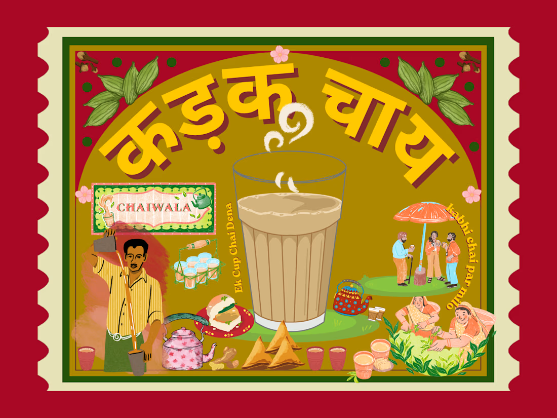
Kadak Chai - Indian Funky Advertisement Banner / Flyer.:


The network for creativity
Join 1.25M professional creatives like you
Connect with clients, get discovered, and run your business 100% commission-free
Creatives on Contra have earned over $150M and we are just getting started





Related posts

Light or refined - which E-Bike product breakdown section design would you choose?
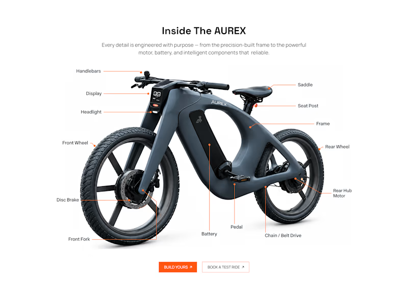
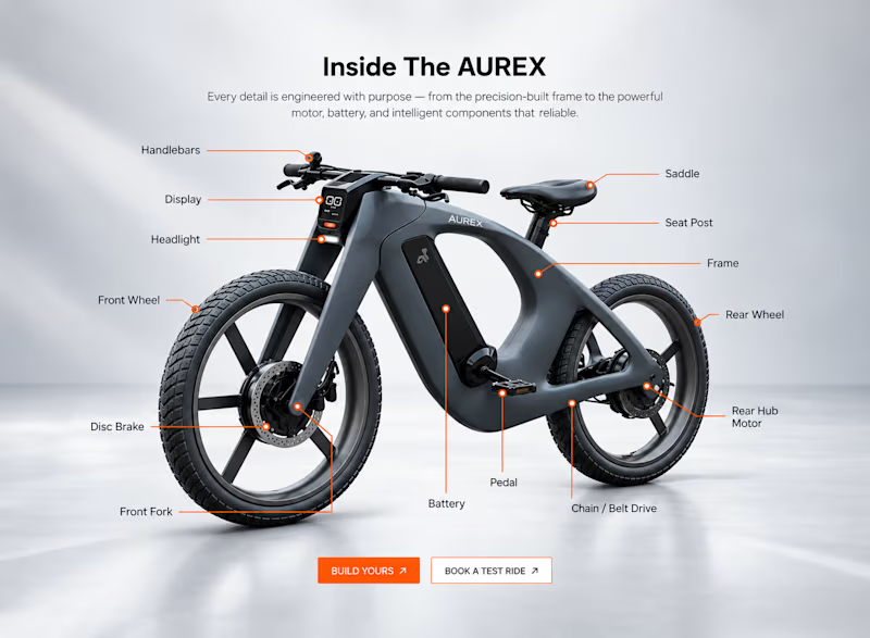
Two concepts for the same AUREX e-bike. Same product, same components, two different presentation styles:
A - Soft Studio: subtle gray depth, larger product focus, and a more premium visual feel.
B - Clean Minimal: bright white background, tighter spacing, and a more technical editorial layout.
Which direction feels stronger for a premium e-bike brand and why?

5 voted
31%
11 voted
69%
16 votes
Closed

A feels more premium to me. The soft gray depth and bigger product focus make the bike feel like something special. B is great for specs, but A sells the feeling

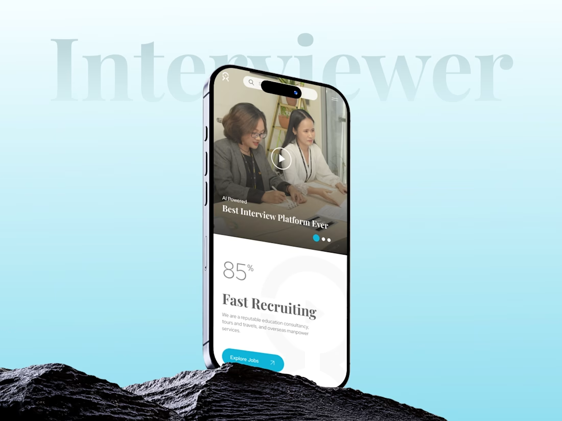
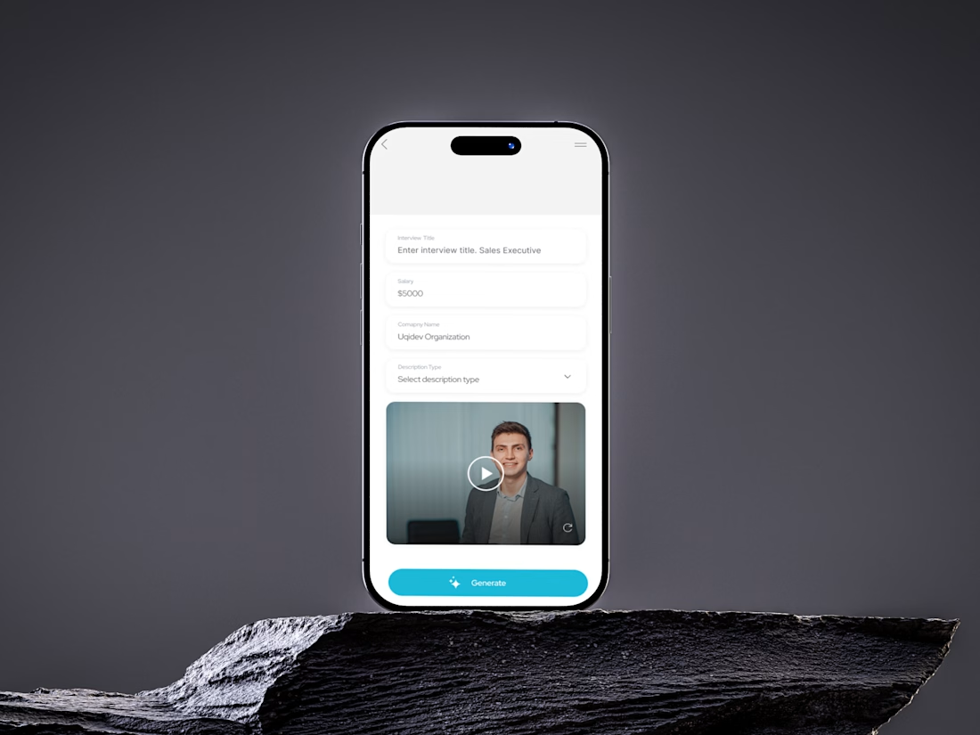
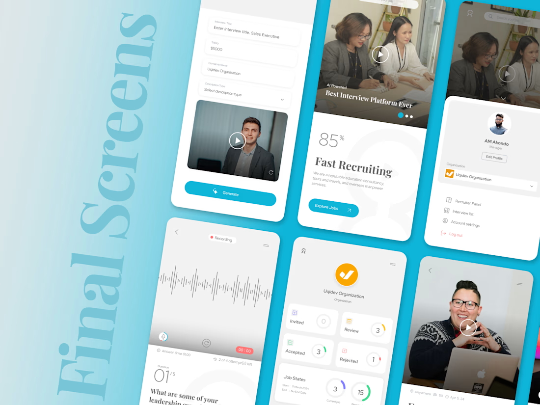
INTERVIEWER — AI-Powered Recruitment & Interview App
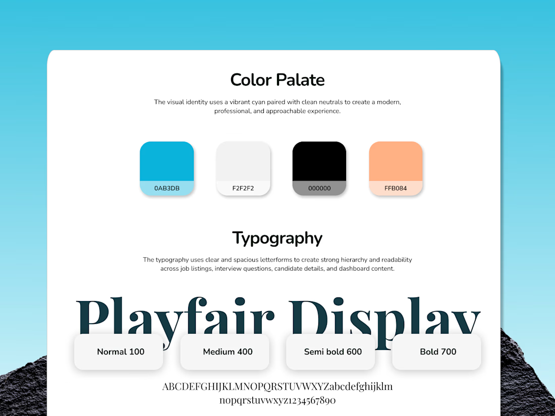
Designed a clean, modern mobile app experience with a bold blue visual identity, intuitive layouts, and a strong focus on usability.
From concept & branding to AI-powered interview flows and recruitment screens, every detail was crafted to create a simple, engaging, and seamless hiring experience.
What do you think of the direction? 👇

This is really well done!






the message is wonderfully direct