The network for creativity
Join 1.25M professional creatives like you
Connect with clients, get discovered, and run your business 100% commission-free
Creatives on Contra have earned over $150M and we are just getting started
Back to feedPost

Ed-Tech landing page for a client 🚀
What do you think?
The network for creativity
Join 1.25M professional creatives like you
Connect with clients, get discovered, and run your business 100% commission-free
Creatives on Contra have earned over $150M and we are just getting started



Related posts

Recently completed this landing page for a client, then i decided to try this motion design for the page promotion.
How did I do, guys?
Kindly rate this😊


Nice 3D tilt into the booking card, a clever way to show the page. One note: the yellow bits at the start move too fast to read, a slower first second would help. Is it for the client's launch?

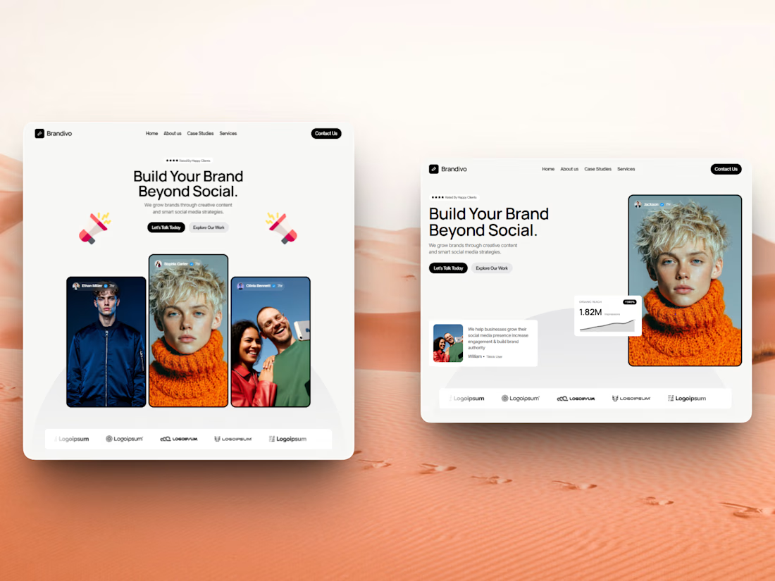
I'd pick the right one. The headline and image split is cleaner and the stats card gives proof right away, the left feels busier with three portraits. Is this template for Webflow?


The cobalt blue gradient with the soft cloud backdrop gives such an open, clear horizon feel to financial planning! The dashboard mockup floats cleanly and keeps the focus right on that runway visualization. Super slick execution, Kevser!