The network for creativity
Join 1.25M professional creatives like you
Connect with clients, get discovered, and run your business 100% commission-free
Creatives on Contra have earned over $150M and we are just getting started
Back to feedPost

Stories that make brands feel premium, memorable, and impossible to ignore.


The network for creativity
Join 1.25M professional creatives like you
Connect with clients, get discovered, and run your business 100% commission-free
Creatives on Contra have earned over $150M and we are just getting started


Related posts


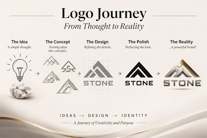
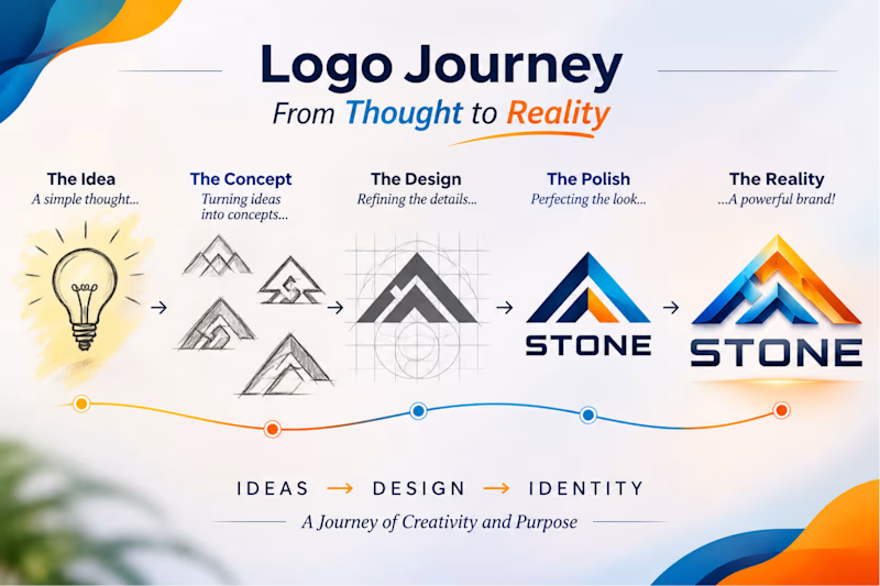
Logo Journey – From Thought to Reality-Every Great Brand Begins with an Idea.
Both versions tell the same design story but create two different visual impressions:
“Which direction would you choose for a modern brand identity — A or B?”
1 vote
Ends in 1d

You should show how you get the logo mark. What was a idea of behind it. I mean, like actual Stone + Mountain or what is the meaning. Because now it looks mountains.
About the color palette, first one is more Stone color.


A premium website isn’t about adding more.
It’s about knowing what to remove.
You can have the most expensive fonts, beautiful photography and a carefully chosen color palette and still end up with a website that feels… ordinary.
So what actually makes a website feel premium?
1. Less noise
2. Strong typography
3. Intentional hierarchy
4. Details that don’t ask for attention
5. Confidence
Premium websites don’t try to prove they’re premium. They simply look like they know exactly what they’re doing.
The goal isn’t to make a website look expensive. It’s to make it feel intentional.
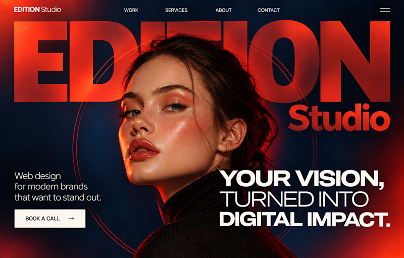
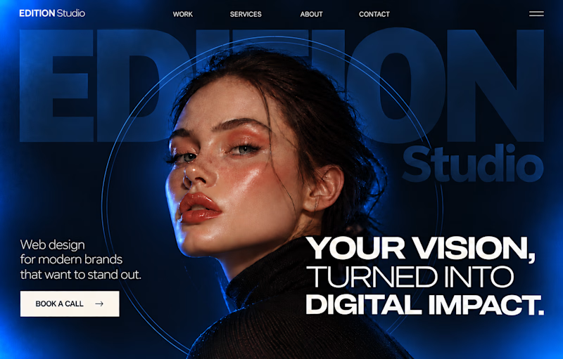
Both versions of the Hero section are created for a premium website. Which one do you like better?
30 votes
Ends in 1d