The network for creativity
Join 1.25M professional creatives like you
Connect with clients, get discovered, and run your business 100% commission-free
Creatives on Contra have earned over $150M and we are just getting started
Back to feedPost

🚀 Framer Website Project for FlexSales.org
Recently built a modern company landing page in Framer for flexsales.org, focused on helping students start their journey from sales to leadership and business ownership.
The site features a clean layout, strong CTAs like “Start Your Career Path”, smooth animations, and a fully responsive design optimized for conversions.
#Framer #FramerDeveloper #FramerWebsite #NoCode #NoCodeDevelopment #LandingPageDesign #WebDesign #WebsiteDevelopment #StartupWebsite #ModernWebDesign #UIUX #ResponsiveDesign #DigitalDesign




amazing bro it look stunning.


Amazing work!
The network for creativity
Join 1.25M professional creatives like you
Connect with clients, get discovered, and run your business 100% commission-free
Creatives on Contra have earned over $150M and we are just getting started







Related posts

I turned my own portfolio into a free Framer template: meet Visualfolio.
For the last few weeks I’ve been rebuilding my product designer portfolio in Framer. Along the way I kept making decisions I wished someone had made for me: how to present case studies, how to make an About section feel human, and how to keep a portfolio calm without it looking empty.
So I packaged it up. Visualfolio is a minimal portfolio template for product designers, UX/UI designers and freelancers who work with SaaS and AI teams.
👉 Get Visualfolio free: https://www.framer.com/marketplace/templates/visualfolio/
👀 Live preview: https://visualfolio.framer.website/
If you use it, send me your version. I’d love to see what you build. And if you’d rather have it customised, or need a product designed and built end to end, that’s what we do at Reyload.

Looks amazing!!

Building a multi-page website in Framer?
Use Templates for elements you need on multiple pages, like your navbar, footer or FAQ section.
Instead of updating each page separately, you can edit the Template once, and the changes will apply everywhere it’s used.
This saves time and makes it easier to keep everything consistent across your website.

Do you let clients edit the shared Templates after handoff?


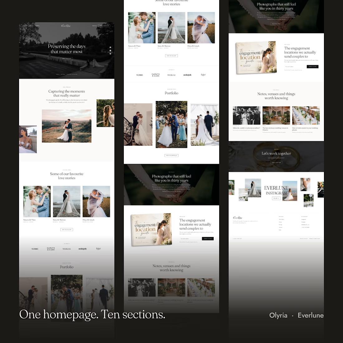
One homepage. Ten sections.
Everlune packs everything a wedding photographer needs into a seamless, story-driven homepage layout from featured galleries to press logos and lead capture. Built for effortless publishing in @framer.
Get the template: https://framer.link/thi0CPi
#Framer #WebDesign #WeddingPhotography #FramerTemplate #PortfolioWebsite #PhotographyPortfolio

The photo galleries have such lovely spacing, Hamim! Really elegant 🤍