The network for creativity
Join 1.25M professional creatives like you
Connect with clients, get discovered, and run your business 100% commission-free
Creatives on Contra have earned over $150M and we are just getting started
Back to feedPost

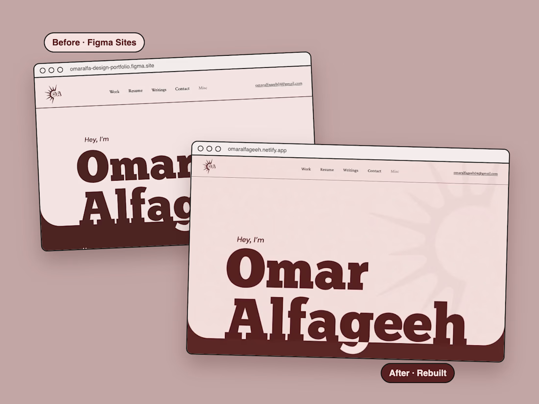
Same identity, better feel.
My portfolio used to live on Figma Sites. It was quick to publish, but heavy, mostly static and hard to push any further. So I rebuilt it, keeping every part of the original identity (the type, the colors, the logos and every asset) and adding what Figma Sites couldn't: motion, real interactions, and pages that load in a fraction of the time. The homepage went from 1.27 MB to 0.23 MB!
It went from a janky Figma Site to a hi-fi, whimsical showcase of my work, directed from brief to launch with Claude Code in under 2 days.
Here's the short before & after case study, side-by-side recordings and all: omaralfageeh.netlify.app/misc/portfolio-revamp



Lovely design

Figma Sites is great for speed until you hit performance and flexibility walls — rebuilding with intent usually pays off.
The network for creativity
Join 1.25M professional creatives like you
Connect with clients, get discovered, and run your business 100% commission-free
Creatives on Contra have earned over $150M and we are just getting started





Related posts

$10K earned on Contra. 🎉💸
Grateful for every client who took a chance on me. This is just the beginning. More great products, more real partnerships, more milestones to hit. 🙌
Thank you to everyone who's been part of it. Onward. 🚀
#10k #contraearnings #Freelance #Webflow #Framer #Webdesign


Congratulations nice job 🎉🎉


Hero exploration for an AI Startup - Orbio.
- Editorial serif caps
- Marble statue as the hero
- A live 01 grid reacting to mouse
- Different highlight color for each division


a different highlight colour per division is such a clean system move. the live 01 grid reacting to the mouse is a nice touch too

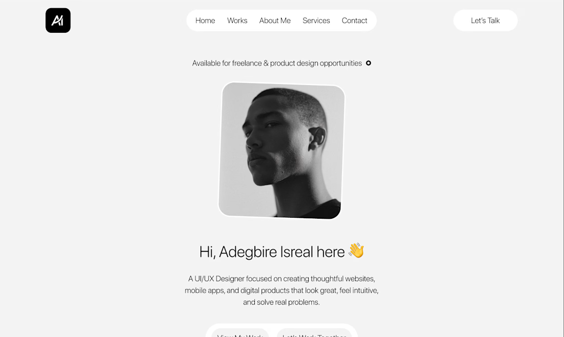


the portfolio direction looks clean. what piece are you building first?