The network for creativity
Join 1.25M professional creatives like you
Connect with clients, get discovered, and run your business 100% commission-free
Creatives on Contra have earned over $150M and we are just getting started
Back to feedPost
My design thinking behind one of the winning entries of the Framer Agent Hackathon.
Check it out


This is what true modernism looks like, the design has reached the peak of modern aesthetics.

Peeling back the layers on design strategy is always the best part of a showcase. What was the most unexpected insight during your discovery phase?

For me, I found the agent especially helpful for improving and pushing my concept further. During the discovery and design phase, it helped me explore and generate more unique interactive components that I hadn’t initially thought of.

This is such a strong visual direction. The terminal inspired UI gives the portfolio a ton of personality without sacrificing structure or usability. Definitely feels like a hackathon winner 👏
The network for creativity
Join 1.25M professional creatives like you
Connect with clients, get discovered, and run your business 100% commission-free
Creatives on Contra have earned over $150M and we are just getting started





Related posts



Dropped our next premium framer template for AI automation agencies, workflow consultancies & the people selling agents to businesses that still run on copy and paste.
Check it out
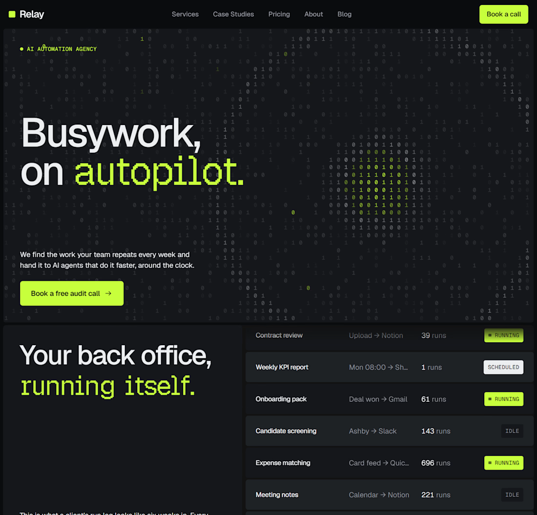
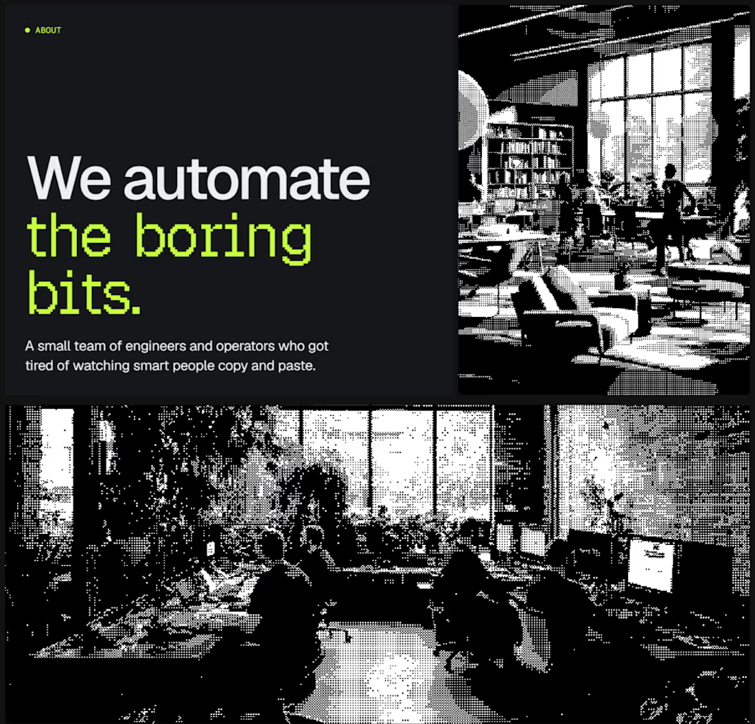
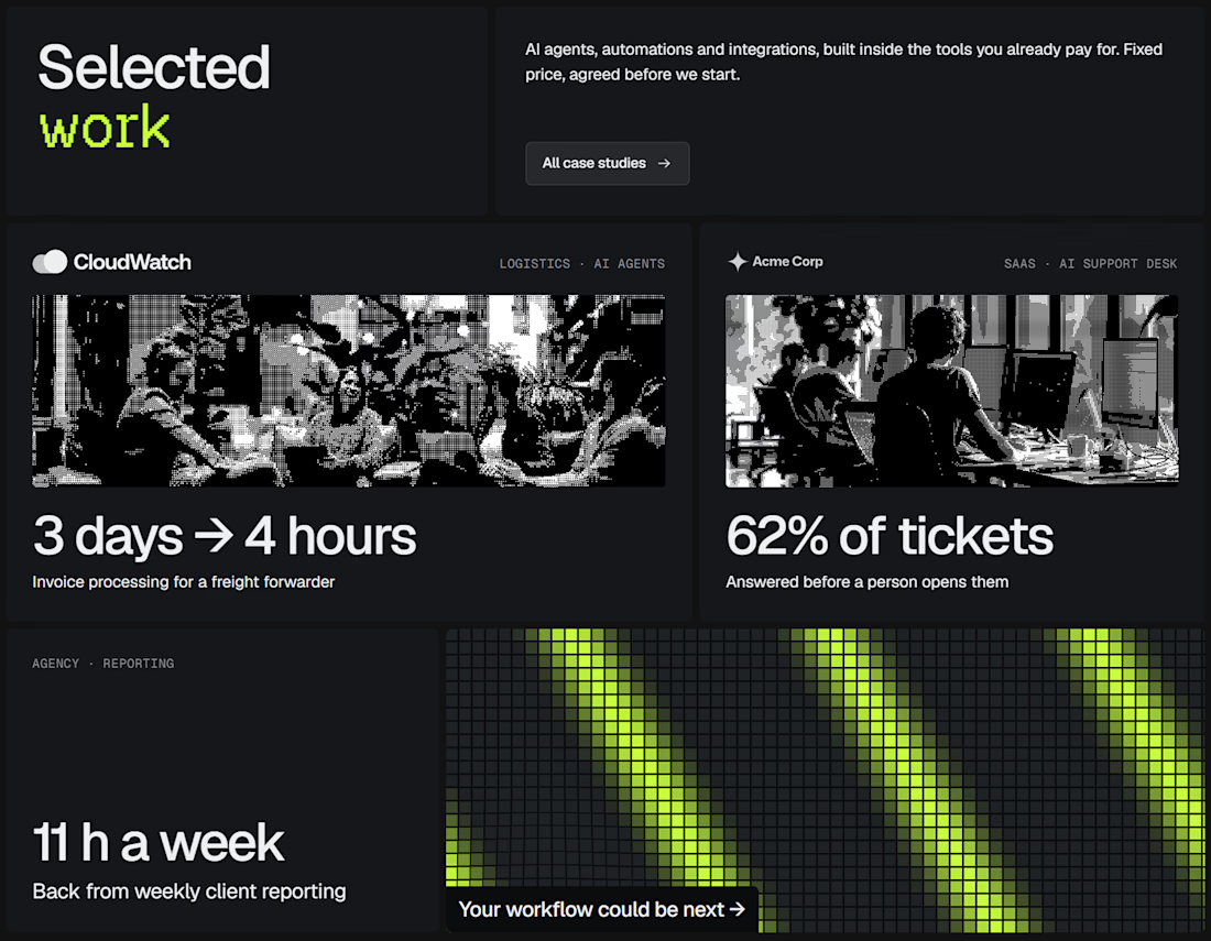
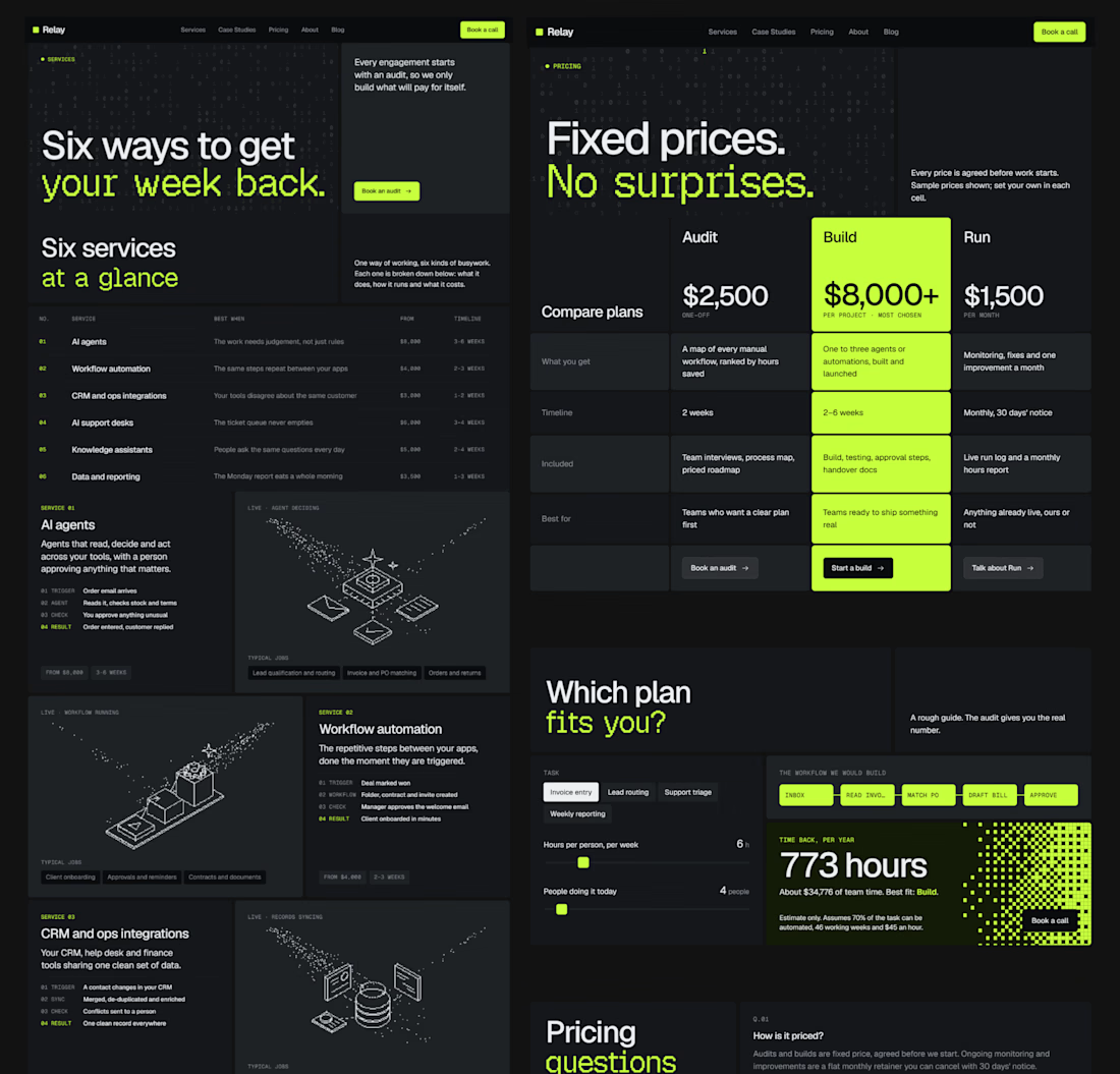

good work!!


We are testing two ways to browse a large template library.
Load More
Users initially see 9 cards. After clicking the button, 9 more are added while the previous results remain visible. Browsing feels continuous, but the page gradually becomes longer.
Pagination
The catalog is divided into numbered groups. When users select the next page, the current 9 cards are replaced with a new set. They can jump to a specific part of the catalog and easily return to where they were.
Load More creates a smoother browsing experience, while pagination offers greater control.
Which option would you choose for a template library?

17 voted
68%
8 voted
32%
25 votes
Closed

Load more