The network for creativity
Join 1.25M professional creatives like you
Connect with clients, get discovered, and run your business 100% commission-free
Creatives on Contra have earned over $150M and we are just getting started
Back to feedPost
Taste Test

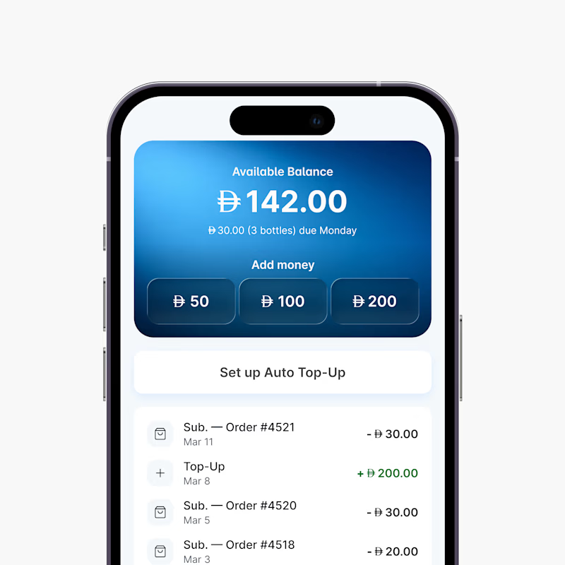
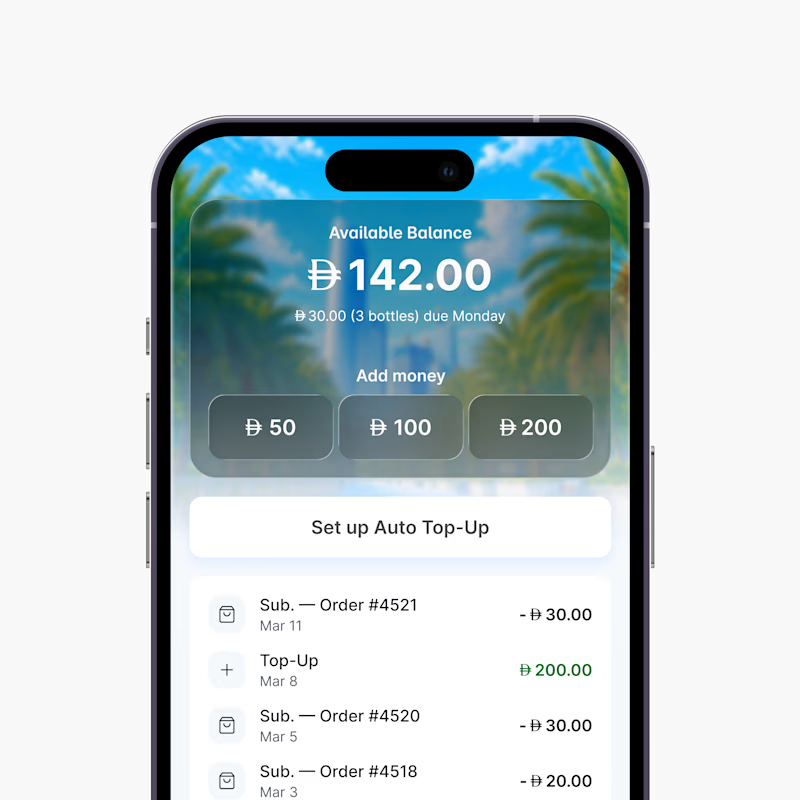
Wallet Page versions for a delivery app 🇦🇪. Which one is better?
4 voted
80%
1 voted
20%
5 votes
Closed

Gradient version for me, Faizan. It keeps the balance card much cleaner and makes the amount feel like the clear focal point. The landscape version looks nice, but the background starts competing with the wallet UI a bit.


Went with the gradient version, the palm tree photo behind the balance card makes the number harder to scan at a glance and that's the one thing a wallet screen can't compromise on.
Went with the gradient version, the palm tree photo behind the balance card makes the number harder to scan at a glance and that's the one thing a wallet screen can't compromise on.
The network for creativity
Join 1.25M professional creatives like you
Connect with clients, get discovered, and run your business 100% commission-free
Creatives on Contra have earned over $150M and we are just getting started





Related posts


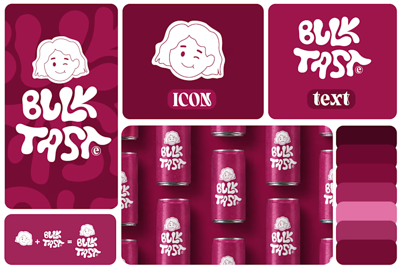
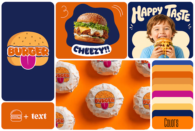
Which One Brand Identity Is looing good? A or B..
7 voted
50%
7 voted
50%
14 votes
Closed

Both look good, but I’d go with B. The colors and playful visuals feel more energetic. 🔥

Same prompt. Two builders.
One site made with Lovable, one with Google AI Studio. A Flemish still-life snack brand, gilt frames, GSAP scroll, the works.
Which one is better?
33 voted
67%

16 voted
33%

49 votes
Closed

Minimal vs Detailed - Which coin design feels more premium for a fintech brand?
9 voted
27%
24 voted
73%
33 votes
Closed

I like the premium gold version