The network for creativity
Join 1.25M professional creatives like you
Connect with clients, get discovered, and run your business 100% commission-free
Creatives on Contra have earned over $150M and we are just getting started
Back to feedPost
Taste Test
3D scroll animation📲
1 voted
100%
0 voted
0%
1 vote
Closed

The layered 3D scroll treatment gives the automation story real momentum—especially the way the interface cards build depth as they move. The restrained dark palette keeps the motion feeling premium instead of noisy.

Hi Rohan, thank you so much for your feedback! 🙏🏽


the 3d scroll animation looks so cool
appreciate your comment, thanks Benjamin!
The network for creativity
Join 1.25M professional creatives like you
Connect with clients, get discovered, and run your business 100% commission-free
Creatives on Contra have earned over $150M and we are just getting started








Related posts

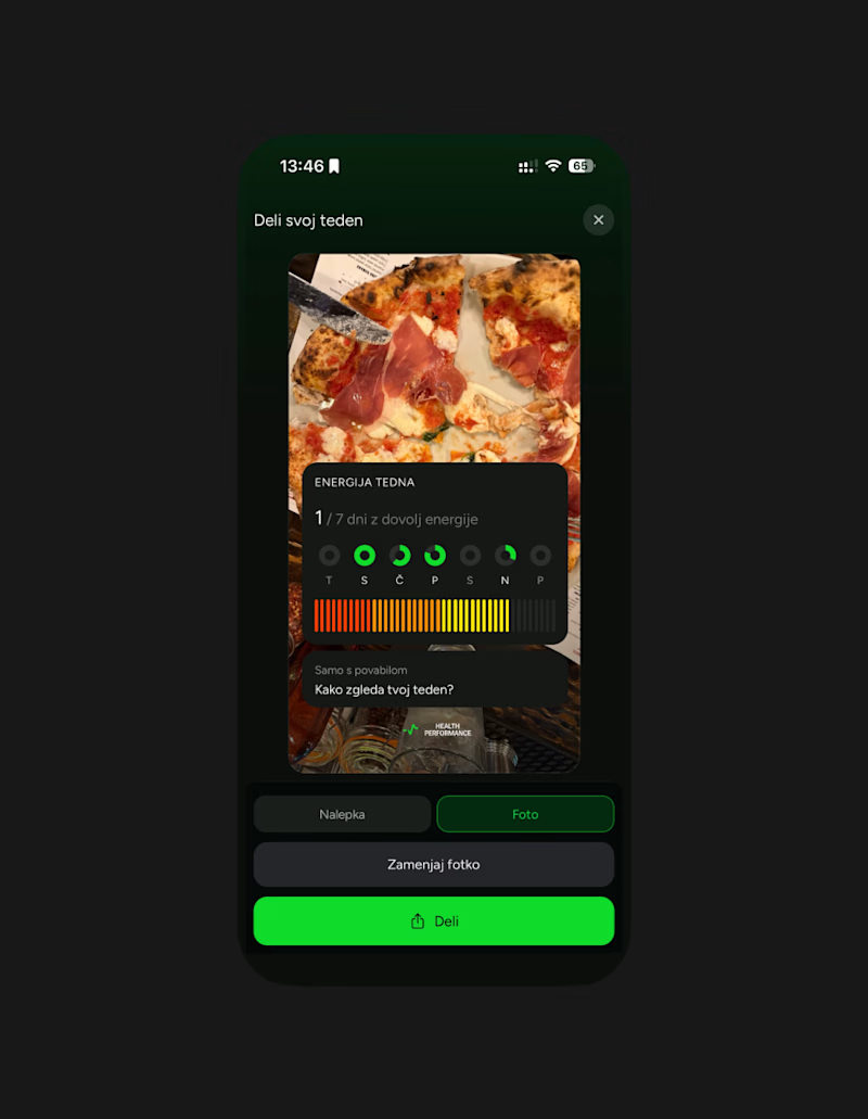
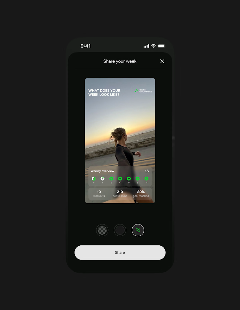
This week client came to me with a new idea for their app's share feature. They were trying something with Claude... But let's simplify this thingy:)
Let's remove all the buttons that confused me already - imagine what they'd do to a user...
Take our predefined bottom sheet and give our users 3 simple choices.
GOALS:
make it as simple as possible for our target persona (35-55 y/olds that aren't necessarily as modern and advanced in tech)
Create an aesthetically pleasing UI frame for stories, that makes people want the app & their lifestyle.
Which one would you go with?
SPOILER ALERT 🚨 we absolutely went with the after result😆
0 voted
0%
5 voted
100%
5 votes
Closed

Afterrrrr😊

Exploring two hero sections for Timmly 🛠️
A - split with the app
B - centered, just the words
Which one would you ship? 👀
Designed with Claude

6 voted
100%
0 voted
0%
6 votes
Closed

Love both! But I'd ship Option A - split with the app! 🚀 It gives instant context and shows the product right away. More visual impact! Great work with Claude!

Help us decide between two different page loaders
0 voted
0%
3 voted
100%
3 votes
Closed
Both look interesting! Curious to see the animations - page loaders set the whole vibe for the site! Which one feels more on-brand for you? Can't see the preview clearly but excited to see the motion!