The network for creativity
Join 1.25M professional creatives like you
Connect with clients, get discovered, and run your business 100% commission-free
Creatives on Contra have earned over $150M and we are just getting started
Back to feedPost

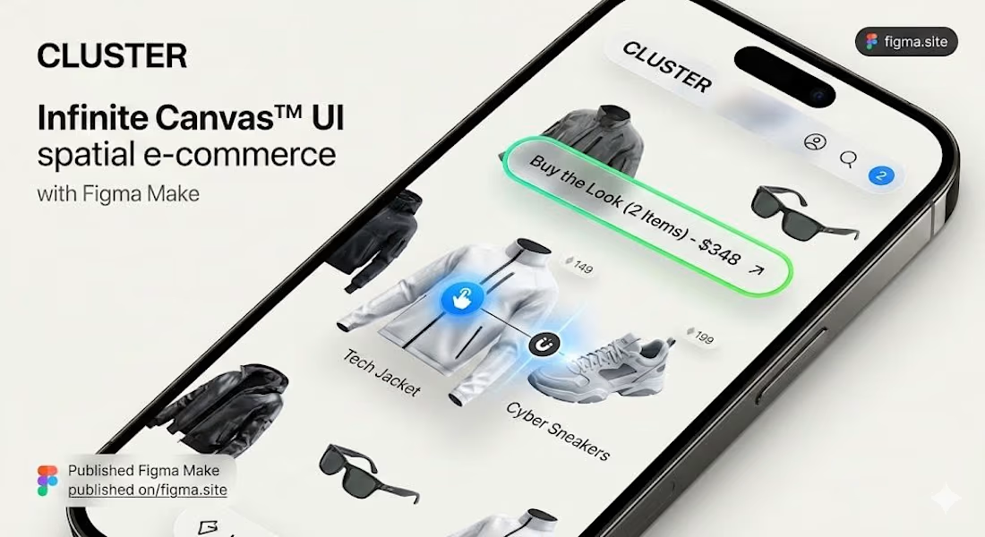
After a 10 years of designing interfaces, I'm exhausted by standard e-commerce. We are still forcing users to doomscroll through rigid lists, clicking uninspired "Add to Cart" buttons. It kills product discovery and limits Growth Design.
So, I built something completely different: Cluster. 🔥
It’s an infinite spatial canvas that ditches the traditional product card. Instead of scrolling, users curate.
We shouldn't just design pages anymore; we should design spaces.
Check out the interactive prototype and let me know what you think of the vibe:
Interactive Prototype: https://cluster-ecommerce.figma.site/
Built entirely using @Figma

Clean and minimal design!
The network for creativity
Join 1.25M professional creatives like you
Connect with clients, get discovered, and run your business 100% commission-free
Creatives on Contra have earned over $150M and we are just getting started





Related posts


Working on apple watch experience. How else do I keep myself from getting bored when there’s interaction design involved? That’s honestly one of my top priorities.
Can’t wait to share the full case study for this project. For now, here’s a little sneak peek at some of the animated screens I’ve been working on for the fitness experience. ⌚️


This deserves only praise. wonderful execution

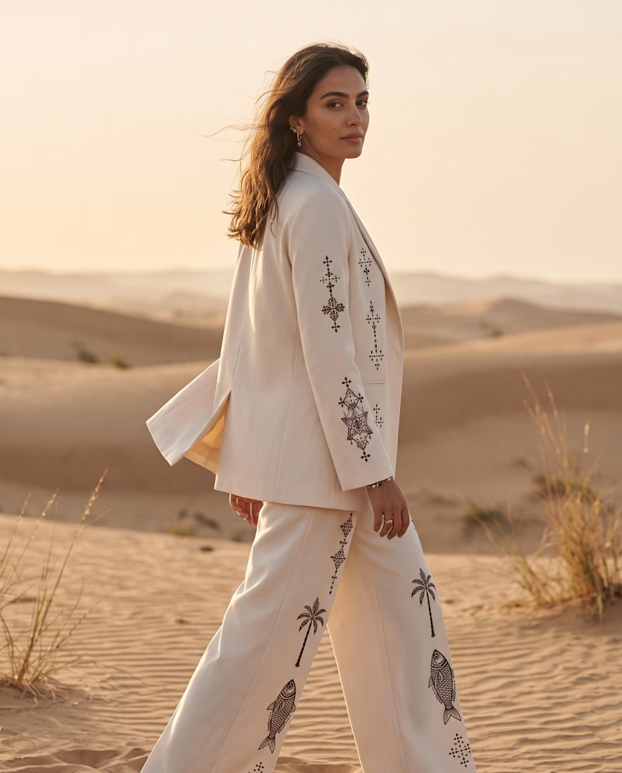
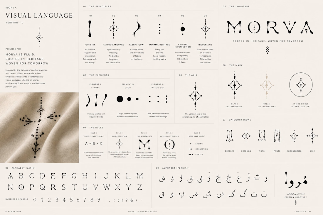
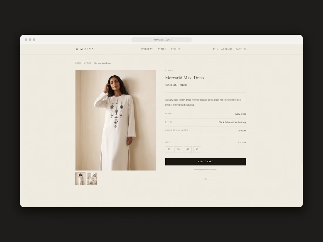
MORVA: Brand Identity & Next.js E-Commerce Store


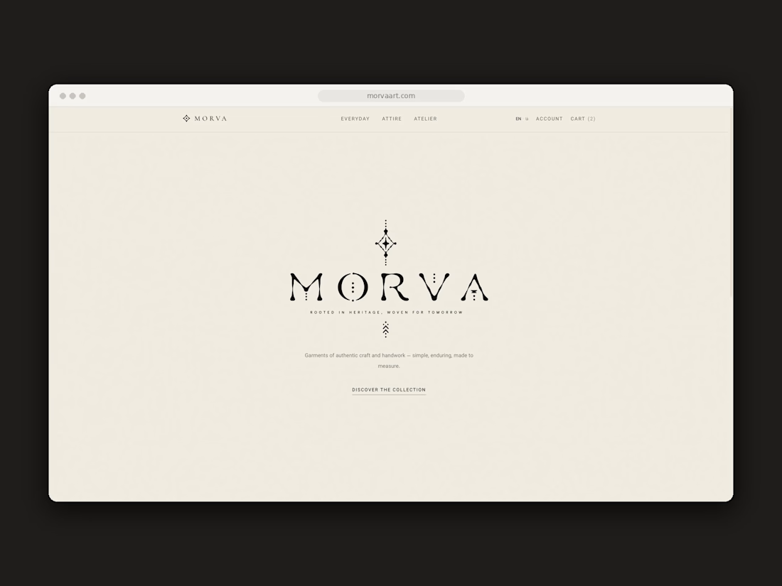

This is nice 👌

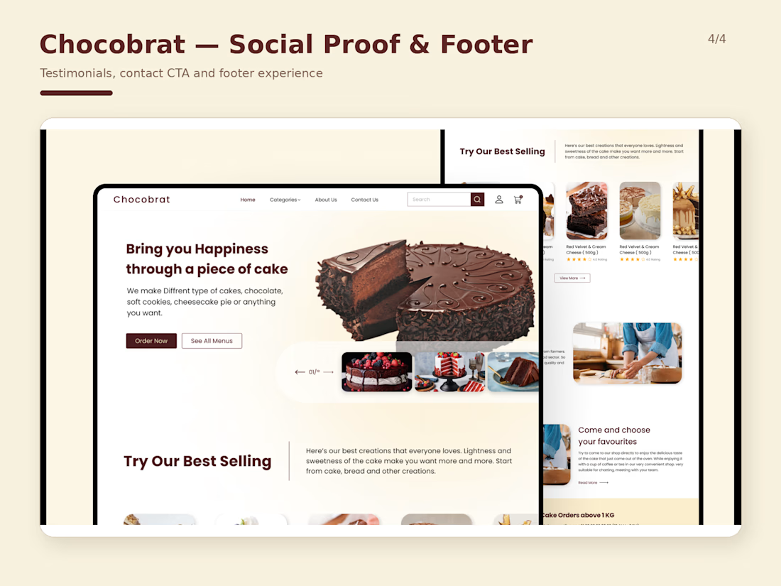
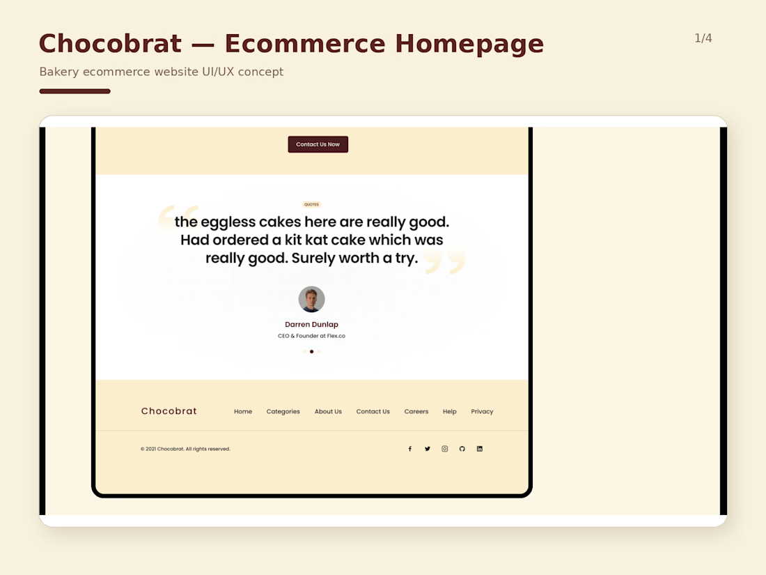
Designed a complete ecommerce website concept for Chocobrat, a bakery brand focused on cakes and desserts.
The main goal was to make the website feel warm and inviting while keeping the shopping experience simple and easy to follow.
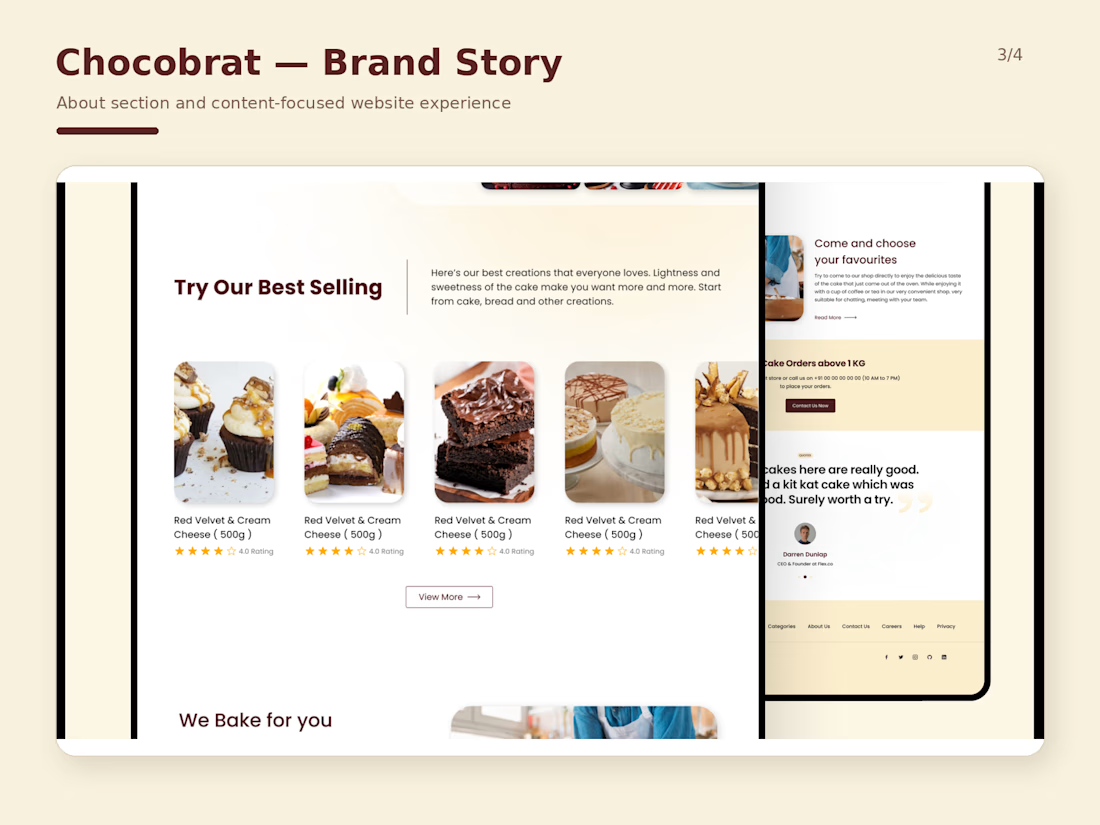
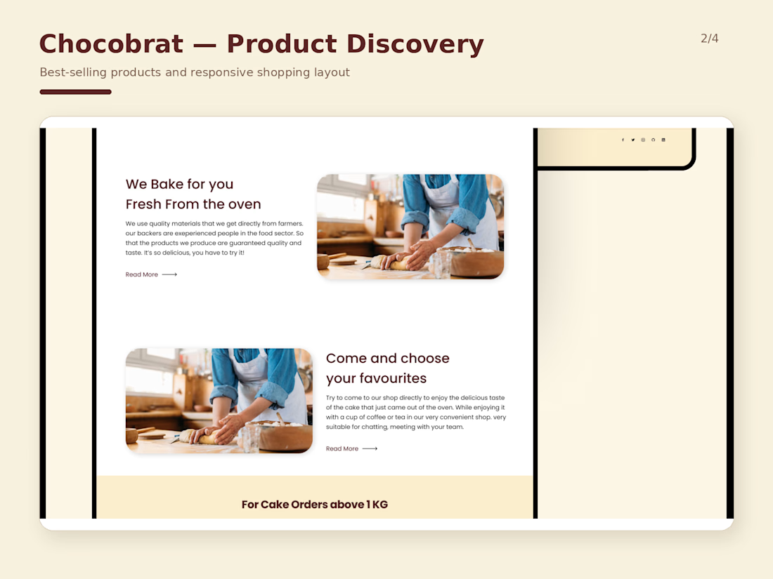
I worked on the full page structure, including the homepage hero, best-selling products, product cards, brand story, testimonials, contact CTA and footer experience.
A big part of the design direction was balancing strong food imagery with clear navigation and conversion-focused sections, so the site feels visual without becoming cluttered.
The final design uses a warm cream and chocolate-inspired palette, bold headings, rounded imagery and plenty of spacing to give the brand a friendly and modern feel.
This project was designed in Figma with both desktop and responsive layouts in mind.
#WebDesign #UIDesign #UXDesign #Ecommerce #Figma #BakeryWebsite #WebsiteDesign

Brilliant execution!