The network for creativity
Join 1.25M professional creatives like you
Connect with clients, get discovered, and run your business 100% commission-free
Creatives on Contra have earned over $150M and we are just getting started
Back to feedPost

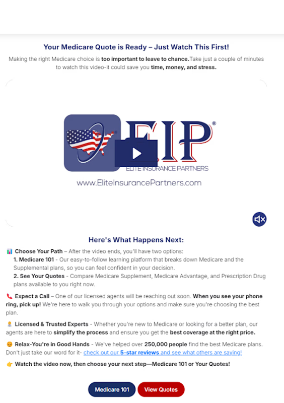
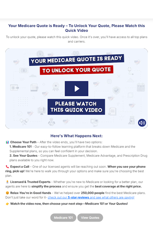
Video Thumbnail Design A/B/C Experiment
Problem: After launching the Medicare Thank You Video, watch rates were lower than expected, the default thumbnail wasn't compelling enough to pull users into the video.
Action: Designed and tested 3 new high-contrast thumbnail variations against the original, optimizing for visual interrupt and click-to-play intent.
Result: All 3 variations beat the control on lead-to-policy, with the winning thumbnail lifting LtP from 4.3% to 5.9%.



The network for creativity
Join 1.25M professional creatives like you
Connect with clients, get discovered, and run your business 100% commission-free
Creatives on Contra have earned over $150M and we are just getting started


Related posts

The brief was simple. Show a new personalized news feature.
The obvious solution was to show a few clicks in the UI as you choose your topics. Clear, but not very interesting.
So I pulled that moment out of the interface first and turned it into a cloud of topics. You get the idea before you even see the product, then the video drops you back into the real UI and shows where it lives.
I really like these tiny decisions. The feature stays the same, but it feels easier to get and a lot more fun to watch.


Pulling the topic cloud outside the UI makes the feature instantly clearer.


This UI was really great nice job Piotr🔥🔥🔥