The network for creativity
Join 1.25M professional creatives like you
Connect with clients, get discovered, and run your business 100% commission-free
Creatives on Contra have earned over $150M and we are just getting started
Back to feedPost
Frustrating UI Design – Making Users Suffer (Case Study & Visual Graphic)
This concept project highlights common UI/UX pitfalls and bad design practices that result in a frustrating user experience. It visually breaks down how poor navigation, inconsistent visual hierarchy, and confusing workflows negatively impact user retention.
Key Issues Highlighted:
Confusing Navigation: Unclear menu labels and hard-to-find search bars that hinder user navigation.
Inconsistent Design: Mismatched fonts, chaotic color choices, and conflicting button styles.
Time-Consuming Flow: Overly complex multi-step processes for basic actions.
User-Unfriendly Layout: Misleading error prompts and ambiguous action buttons.
Tool Used: Adobe Photoshop

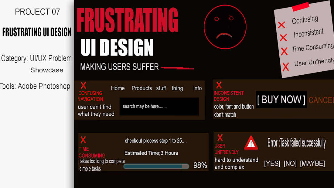

Designing bad UI on purpose is harder than it looks — you have to know exactly why a pattern works before you can break it in a way that still reads as plausible rather than just random. Were these pulled from interfaces you'd actually run into, or invented from the pitfalls list?

"Thanks Artur! It's a mix of both—some are inspired by real apps I've struggled with, while others were invented to test specific UI design pitfalls. Spotting the difference is half the fun!"
The network for creativity
Join 1.25M professional creatives like you
Connect with clients, get discovered, and run your business 100% commission-free
Creatives on Contra have earned over $150M and we are just getting started
Trending
retrofuturism
Share your favorite designs from the past exploring the distant future. Or your own take on the aesthetic 🚀
halftone
Dots. Texture. Grain. Let's see your designs using the halftone technique.

Midjourney
Creatives are showing off what they're making with Midjourney.
colorgrade
Video editors sound off: How do you enhance the mood of your video in color grading?





Related posts

Same layout but two completely different feelings🙂↔️
This is a vault app. The design has one job: make it feel safe to open.
🧮 The red one is alert.
🐊 The dark one is calm.
Which one would you trust with your collection?
52 voted
57%
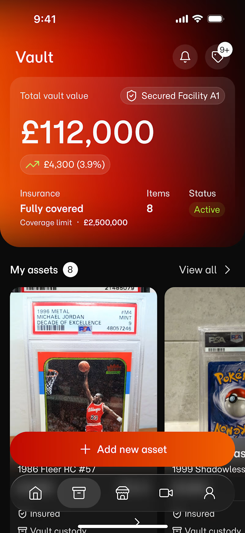
39 voted
43%
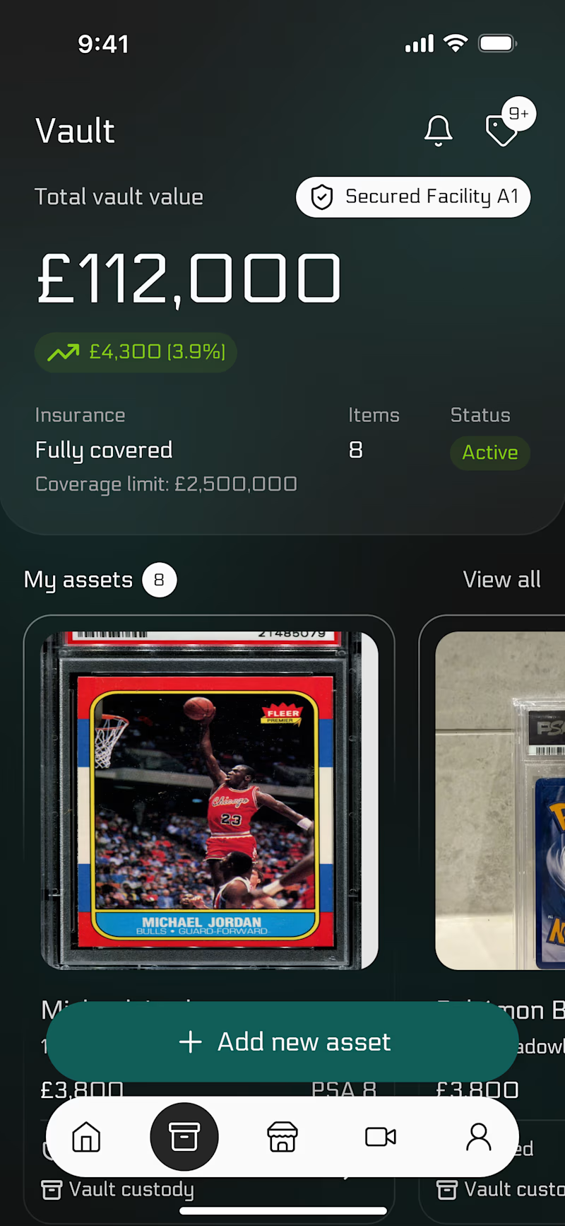
91 votes
Closed

Red usually reads as 'something's wrong' rather than 'high value,' so my gut says the dark concept builds more trust when there's real money on screen. Have you tested this with actual users yet, or is this poll your first read on it?

MARKS & FORMS — 2026
A curated collection of logos and marks exploring identity through form, concept, and visual precision.
MARKS & FORMS returns with its 2026 edition, continuing an ongoing exploration of logo design, visual identity, and the many ways a simple mark can communicate an idea.
This volume brings together a new selection of logos developed throughout the year, ranging from commissioned identities to independent explorations. Each mark represents a different approach to form, typography, symbolism, and reduction, while sharing a common pursuit: creating identities that are distinctive, intentional, and built to last.
Rather than following a single visual style, MARKS & FORMS celebrates the diversity of logo design. Monograms, custom lettering, abstract symbols, geometric constructions, and expressive marks coexist within the same collection, revealing how different visual languages can emerge from the same fundamental discipline.
Every logo begins with an idea. Through refinement, proportion, balance, and thoughtful reduction, that idea becomes a recognizable form. The process is not about adding more, but about discovering what is essential and giving it enough strength to stand on its own.
The 2026 edition reflects another chapter in that process — a growing archive of marks shaped by different challenges, industries, concepts, and creative directions. Together, they document an evolving approach to identity design and a continued commitment to creating work with clarity, character, and purpose.
MARKS & FORMS is an ongoing study of the relationship between form and meaning. Each edition captures a moment in that journey, preserving selected marks not simply as finished logos, but as records of experimentation, refinement, and creative growth.
Now live on Behance
2026© - Enmanuel Jimenez V. — Jv® Studio. All rights reserved.


Turning it into a yearly edition instead of a one-off drop is smart, it gives people a reason to come back each year. Looking across the marks in this volume, is there a theme or constraint that ties this year's batch together, or were they picked more on individual merit?

Most empty states feel like a dead end. These nine make you smile before you notice nothing loaded.
One cat. Nine moments - mailbox, error, timeout, vacation, setup, and more. A complete illustration system that turns every broken state into a brand moment.
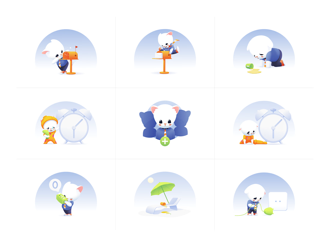

Creative Illustration Sets, Amazing Work ✨