The network for creativity
Join 1.25M professional creatives like you
Connect with clients, get discovered, and run your business 100% commission-free
Creatives on Contra have earned over $150M and we are just getting started
Back to feedPost


Looking for a Framer designer to help build a clean, modern SaaS landing page.


Hey Shaan,
built a quick demo for SeasonFlow to show what I can do
seasonflow-demo.netlify.app
happy to chat to take it further!
The network for creativity
Join 1.25M professional creatives like you
Connect with clients, get discovered, and run your business 100% commission-free
Creatives on Contra have earned over $150M and we are just getting started





Related posts

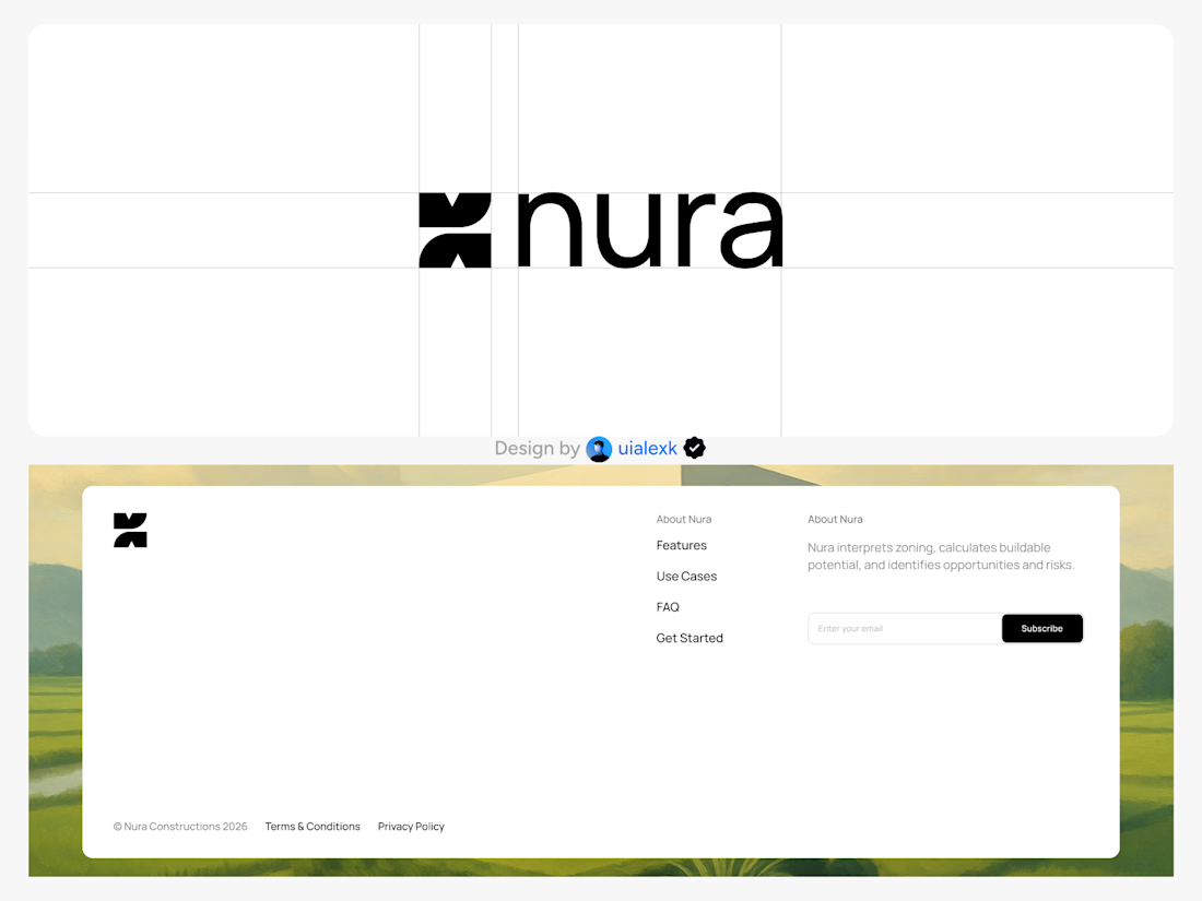
Branding design and Framer Development for an AI real estate tool
See full Case study


amazing work!🚀


Eave is a new Framer template for interior design, architecture and creative studios. Nine pages built around photographed case studies: a hero slider that cycles through your projects, an endless projects showcase, a before-and-after reveal on every project page, and a pop-up contact form. Projects live in the CMS, so adding one is data entry.
Preview: eave.framer.website

Creative animation
the scroll recording felt too plain, so i had opus 5.5 make a launch film for eave. it used the real pages, wrote a storyboard and coded every frame
sound on 🔊

