The network for creativity
Join 1.25M professional creatives like you
Connect with clients, get discovered, and run your business 100% commission-free
Creatives on Contra have earned over $150M and we are just getting started
Back to feedPost
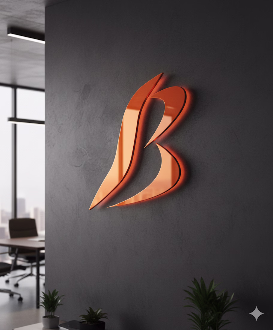
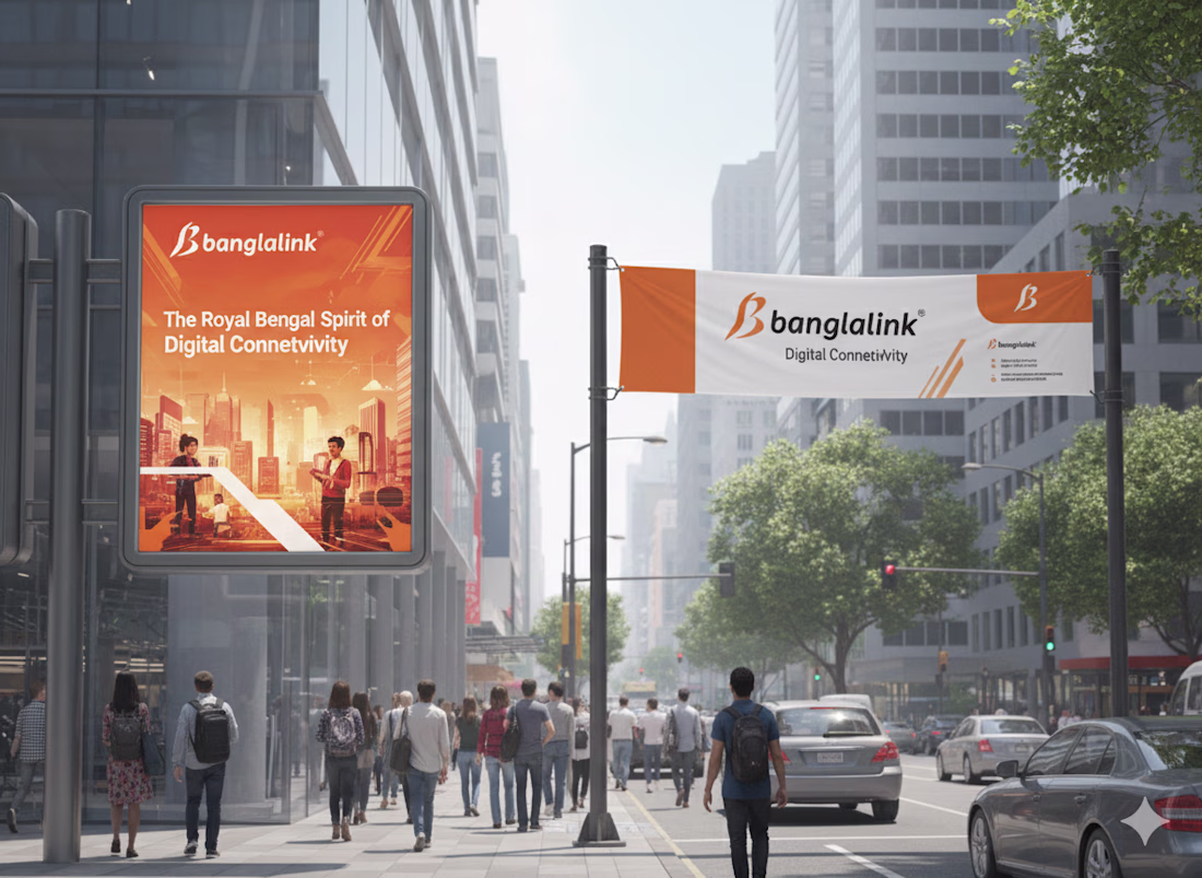
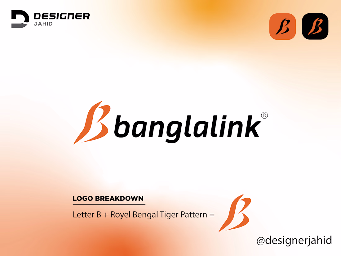
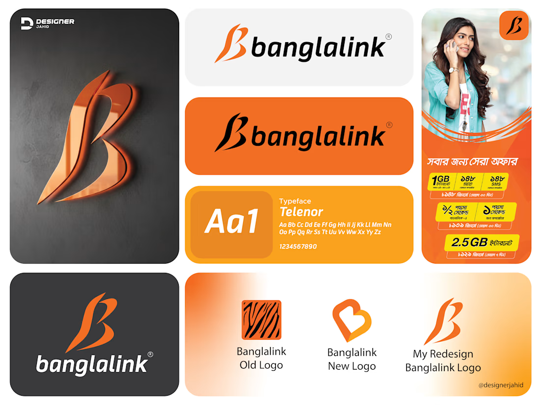
This Banglalink logo redesign is my take on refreshing the brand while keeping its identity intact. I started with the letter B, then shaped it using the flow and sharpness of the Royal Bengal Tiger pattern. Since the tiger has always been an important part of Banglalink’s branding, I wanted to bring that symbolism forward in a cleaner, more modern way.
The curves you see in the logo come from the motion and energy of tiger stripes. They make the mark feel fast, bold, and confident, which matches Banglalink’s personality as a dynamic telecom brand. I kept the signature orange tone because it’s instantly recognizable and gives the logo a strong visual presence.
#banglalinknewlogo #banglalinklogoredesign #letterblogo #monogramlogo #combinationmarklogo #letterlogo #alphabetlogo
i like the letterform
Thank you so much❤️
The network for creativity
Join 1.25M professional creatives like you
Connect with clients, get discovered, and run your business 100% commission-free
Creatives on Contra have earned over $150M and we are just getting started
Trending
Runway
AI video generation is exploding. What are you dreaming up in Runway?
Contra University
Learn from expert creatives how to earn more using next-gen AI tools.
creativeaiflow
Creative AI workflows are evolving. What tools do you use, and what are their strengths and weaknesses?
portfolioreview
The best portfolios tell a story, not just show a grid. Share yours for feedback.
freelancerlife
Freelancer life is wins, pivots, and everything in between. What’s yours right now?