The network for creativity
Join 1.25M professional creatives like you
Connect with clients, get discovered, and run your business 100% commission-free
Creatives on Contra have earned over $150M and we are just getting started
Back to feedPost

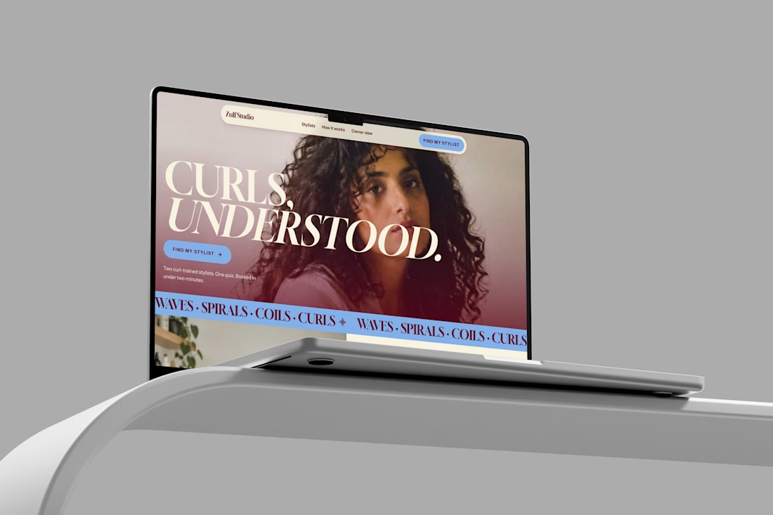
Zulf Studio: A Better Booking Experience for Curly Hair
I joined the Lovable Challenge but unfortunately couldn’t complete and submit it within the deadline. Instead of leaving the work unfinished, I decided to share what I built and the problem I was trying to solve.
The Problem
For many salons, especially specialized salons, most customers still reach out through WhatsApp and Instagram DMs.
They ask questions like
Do you do curly cuts?
Which stylist should I book?
How much does it cost?
Are you available on Saturday?
For a salon owner like Sana, who runs a curly-hair salon in Gulberg, Lahore, answering these messages while working with clients can become difficult.
A message that comes at 11 PM might not get a reply until the next morning—and by then, the customer may have already booked somewhere else.
The Idea
I designed Zulf Studio, a booking experience focused specifically on curly-hair clients.
The goal was simple:
Help customers find the right stylist and book an appointment without the usual back-and-forth messaging.
For the Customer
The customer starts with a short quiz about their hair.
Based on their answers, they get a Curl Passport that includes:
Curl pattern
Hair length
Hair goals
Porosity
Previous salon experience
They can then see stylists who are trained for their specific curl needs, along with their methods and before-and-after work.
From there, they can:
Choose a stylist → Select a time → Pay a Rs. 1,500 deposit → Get confirmed
The whole process is designed to take less than two minutes.
For the Salon Owner
Sana gets a simple front-desk view where she can see:
Today’s bookings
Customer Curl Passports
Stylist information
Cancelled-slot waitlist
Reminders
Weekly booking numbers
Instead of managing everything manually through WhatsApp and Instagram, the important information is organized in one place.
Design Direction
I wanted Zulf Studio to feel more like a modern beauty brand than a typical booking dashboard.
I used:
Editorial-style typography
Maroon, ivory, and periwinkle
Large, full-bleed photography
Simple layouts with clear hierarchy
A warm and confident visual style
The idea was to make the experience feel as confident and intentional as the salon itself.
What I Built
🔗 Customer experience:
https://pixel-perfect-clone-66151.lovable.app
🎥 Demo video:
📄 Booking-flow guide:
Note: The payments and messages are simulated, and the bookings use sample data for a fictional salon.
Built with @Lovable.
I’d love to hear your thoughts and feedback. ❤️
#lovablechallenge #productdesign #uxdesign #uidesign #figma

The network for creativity
Join 1.25M professional creatives like you
Connect with clients, get discovered, and run your business 100% commission-free
Creatives on Contra have earned over $150M and we are just getting started



Related posts

What if sending money felt a little more like giving a gift?
For Nova, I explored a banking app that brings payments, cards, and a bit of personality together. You can check your balance, browse recent transactions, send or request money, top up, and pay bills.
My favorite part is the digital postcard feature. Before sending a transfer, you can add a little illustrated card—a heart, a birthday greeting, or a playful character. A simple way to make birthday money or a thank-you feel more personal.
I carried that same 3D character into onboarding, pairing it with bold red gradients and large, clear payment details. There’s room for play, while the recipient and amount stay easy to check.
Would you add a postcard to a transfer? I’d love to know what occasion you’d use it for.






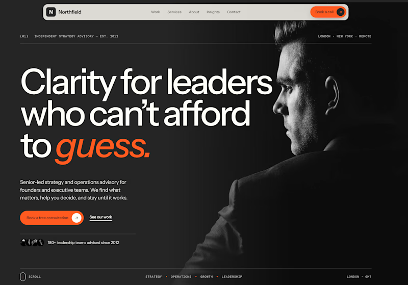
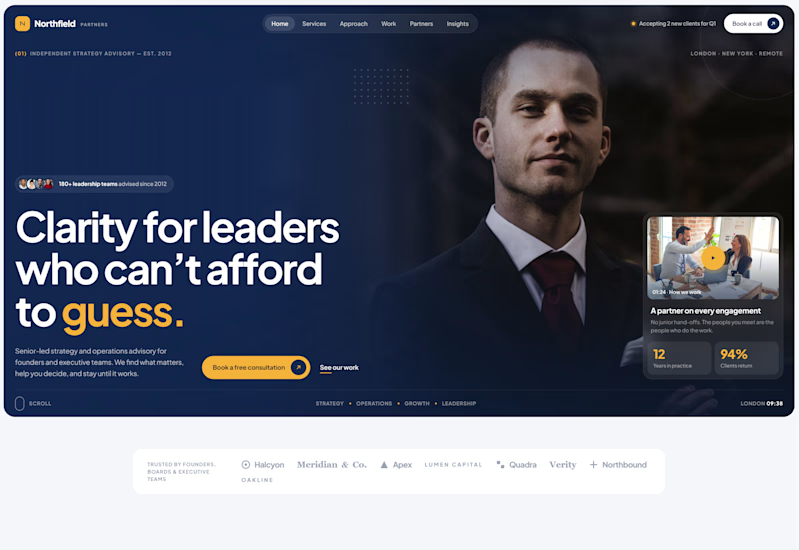
Exploring two different hero directions for a new project.
Same message, two completely different visual approaches.
Which one makes a stronger first impression?
A or B? Curious to hear your thoughts!

36 voted
90%
4 voted
10%
40 votes
Closed

Both are strong. I lean towards the dark version, because the orange accent on the italic "guess." pops and the profile portrait gives it a more editorial, confident feel. The navy one reads a bit more corporate, which could suit a more conservative audience. Nice exploration!

AI-Powered Physiotherapy Clinic Dashboard | Smart Appointment Scheduling
A modern AI-powered dashboard concept designed for physiotherapy clinics to simplify appointment scheduling, therapist management, and daily operations. The interface focuses on improving workflow efficiency with an intuitive calendar, smart booking experience, patient scheduling, and a clean visual system.
The design features an elegant and minimal UI, helping healthcare professionals manage appointments, therapists, and patient availability with ease. Every screen is crafted to deliver a fast, accessible, and user-friendly experience while maintaining a premium SaaS aesthetic.


so nice work